WIP Asian Street
Hi everyone, I am choosing to do an environment of an outdoor city from mulitple angles, and it will be able to be walked around in, in UDK. I'm not planning on making it playable (unless there is a cool mod that would like to have it as a level). I started this about 1 month ago, not including the holidays. Right now I'm in the texturing phase, and then I will add more detail where I see fit once the textures are applied. Most of them will be tileable. This will be the second city I've tried, and I've got a lot better since the first one :thumbup:. This will be a test to push my own skill to the limit.
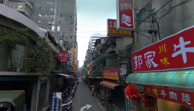
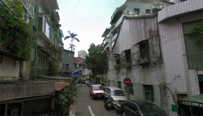
I am doing an asian city with a couple of ref images I've found online. The street section was so different than what I see daily here in Austin, that I felt urged to want to do something challenging. The images are pretty bland, so I'm only using them as a skeleton to get my work started, I'm planning on creating my own textures and lighting, so that it will have more mood.
Here are the ref images:
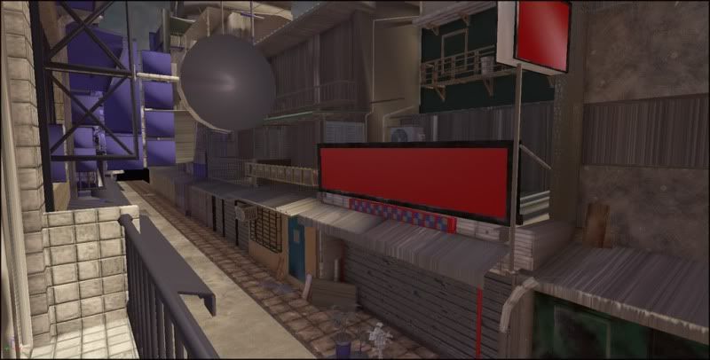
And here are some compositions I'm thinking about (3DS Max):
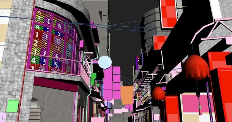
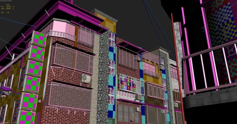
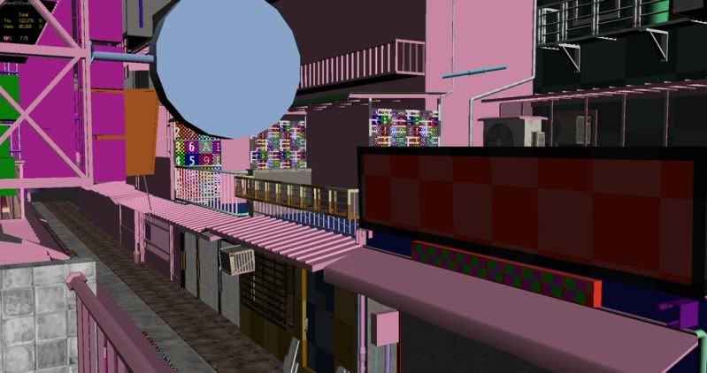
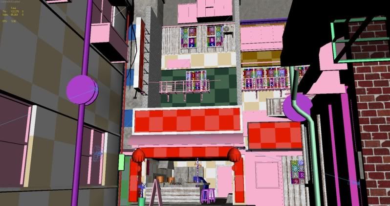
The colored checkers are placeholders for instanced submats I will be using in UDK to recolor similar surfaces. I'm going back and forth between max and UDK to make sure everything looks good in engine.
The UDK stuff with quick lighting:
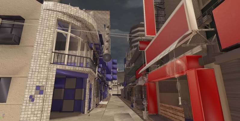
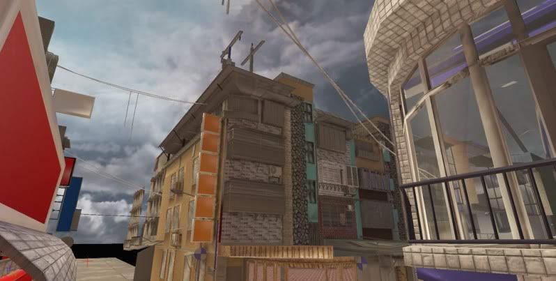
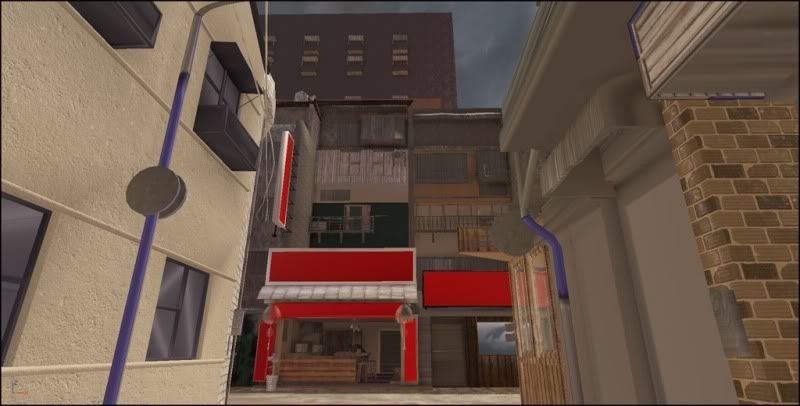
Let me know if you've got any ideas to make the scene more out-of-the-ordinary, or if you've got some tips on conserving textures and such. I'll update this when I've made some more progress.
I am doing an asian city with a couple of ref images I've found online. The street section was so different than what I see daily here in Austin, that I felt urged to want to do something challenging. The images are pretty bland, so I'm only using them as a skeleton to get my work started, I'm planning on creating my own textures and lighting, so that it will have more mood.
Here are the ref images:


And here are some compositions I'm thinking about (3DS Max):


The colored checkers are placeholders for instanced submats I will be using in UDK to recolor similar surfaces. I'm going back and forth between max and UDK to make sure everything looks good in engine.
The UDK stuff with quick lighting:


Let me know if you've got any ideas to make the scene more out-of-the-ordinary, or if you've got some tips on conserving textures and such. I'll update this when I've made some more progress.
Replies
And i second the UV channel 2 idea. thats how it should have been done on the OOOVERRUN!
LlamaJuice
Thanks for the tip. I knew that I could use a second set, but I thought that it had to be laid out the same as the first...so I was just copying and pasting uvs from channel 1 to 2 for the lightmap. I will definitely check that out!
Right now the scene is around 100,000 tris and 80,000 verts. I think most games go by vert count now. I split it up into 7 major sections so it's easier to import.
I referenced Tekkonkreet a LOT. Remember to put lots of vending machines, wires, and air vents
Thanks for the advice
I didn't want that default cloud texture taking away from the actual silhouette of the objects on the ground. I will be finishing the textures pretty soon, and adding some low poly buildings in the background so that it's not just empty space. Lately, I have been catching myself observing real-life objects a lot more, gazing lovingly into chipped paint and scratched metal whenever I go out somewhere
Any suggestions to make the lighting more interesting? I'm thinking of doing a night shot too, so that way I can experiment with some more moody lighting. Comments welcome!
Jonathan
You seem to know what you're doing modeling and texture wise. Just keep pushing and show love for the other maps, especially the spec/gloss/reflection if you use a lot. Push the materials and polish it off with lighting. You'll be golden, just like my noodle i'm eating right now.
I'd just get rid of the fog. Hot days with clear skies have a higher visibility, so right now the fog looks n64-ish. You could use less-saturated textures for those buildings far away.
I like the lighting. You could make some really saturated signs so lightmass can bounce their color around. Make some see-through drapes, colored glass bottles, stuff like that
If you want a good tutorial on vertex painting, I would refer you to this: http://www.chrisalbeluhn.com/UDK_Advanced_Vertex_Painting.html. I have done a pretty good deal of work with shaders so it was pretty easy to pick up, it may be harder if your a beginner with the unreal shader setup. Mainly, you have your diff, spec and norm for 2 or more textures (like usual), then you set up a lerp to blend each of the two diffs, specs, and norms using a vertex color modifier. Just use one color from that into the alpha of the lerps, and paint away! There's a tool called mesh painter in unreal for that. Good luck
@ Tim Deneau
I understand what your saying with the noon setting. They are pretty hard to make interesting. The shadows will be better, I have just not lightmapped anything yet and it's solely relying on the realtime ao. The street is the only part I have experimented with lightmapping so far. I will see how a different lighting setup will work, but I am growing to like the color palette.
kaburan
I have been trying to go all out with refletion and parallax maps anywhere I see fit. I believe that good environments use a combination of glossy/reflective materials juxtaposed next to matte objects (Fallout 3 comes to mind). The shaders are a little subtle, though, and are more noticeable when running around in game. I'm planning on releasing a video when this is finished of me running around
fonfa
Thanks! Yes, the fog I am still playing with. It's hard because I don't want to be able to see too far into the distance. I will most likely put a big building at the end of that street and I will decrease the fog. I am trying to simulate some atmospheric perspective, and I can probably play with the colors of those distant buildings. Thanks for the tip.
roosterMAP
What would you suggest I do to make the tree look better? I have tried to make it low poly and keep it pretty detailed with those leaves. There are mini-trees all over the place and they can't be too high poly.
I've got a scene capture reflect actor and a TextureRenderTarget2D, because I am planning on having real-time reflections for the water. The only problem is that the scene capture does not fill the whole texture space, and ends up with a lot of that bright green border. Does anyone know how to fix this (or a better way to do real-time water in UDK)?
I've created a material out of existing normals for the lanterns and added a faked subsurface scattering. I also added new lightmaps for all the sections for the global illumination. I finished vertex painting everything as well. It would be difficult for me to make any further alterations, since the vertex painting is destroyed when you add or remove geometry from the objects. Realtime reflections are also working now in the water... I just had to reload UDK and that green was gone
Here's a link to a flythrough:
http://jonarm.com/Downloads/AsianStreet_Flythrough.mov
youtube version (just in case :poly124:):
[ame]
Thanks for looking,
Jonathan
P.S. That crazy looking building (with the square cutouts in the roof) in the background is a skyscraper I did from memory that resembles this cool building in downtown Austin.
Thanks
Daniel Doerksen
For the signs, I hand-drew those large characters from looking at those reference pictures I have and random asian font online. I mixed and matched the colors and sizes to get different results. For the one's with custom pictures and logos, I pretty much made up all those or got inspiration from everyday signs, but I hand painted them from scratch in Photoshop (I even have an Irish-Pub-esque chalk sign that doesn't have any asian characters
only thing i'd change is the rock texture overlay on the sky :>
Also, I agree with the rocky sky comment, it confuses me but does add an interesting feel. I would like to see the video set to this song:
[ame]
And lastly i think that the rock texture in the 2nd image of this last post looks to tiled and out of place for that piece of architecture. it seems more like walkway stone. i would like to see plates of sheet rock or maybe some rounded cement lattus work to offset the linear geometry.
But if you take anything away from this, take the song.
Thanks for the compliment divi! This is a screenshot taken directly from game with the same compression as the last uploaded images.
thevossman
Thanks for the suggestions. I do agree that the stone could probably be of a better variety, those are all useful suggestions. It's such a small area and the stone is only used there. I have seen the video you sent me but don't think that song would highlight the work.
What does everyone think? Is this one better than the one in the last post? I'd like to know your opinion
Thanks, Stefan, I agree that it indeed has come a long way. It was great fun!
Old
New
...will this be released? I would love to walk through it and check it out, even if there is no game play.
Looks amazing.
Thanks. Yes, I agree that the DOF was holding it back. I actually was inspired driving near downtown Austin one morning and noticed how the buildings looked from a distance.
Ged
Thanks!
anoon
I have got a couple of offers to take this into a mod or small project but they have not been that serious. Some have been saying that they'd like to see it playable. I'm still thinking about it.