The BRAWL² Tournament Challenge has been announced!
It starts May 12, and ends Oct 17. Let's see what you got!
https://polycount.com/discussion/237047/the-brawl²-tournament
It starts May 12, and ends Oct 17. Let's see what you got!
https://polycount.com/discussion/237047/the-brawl²-tournament
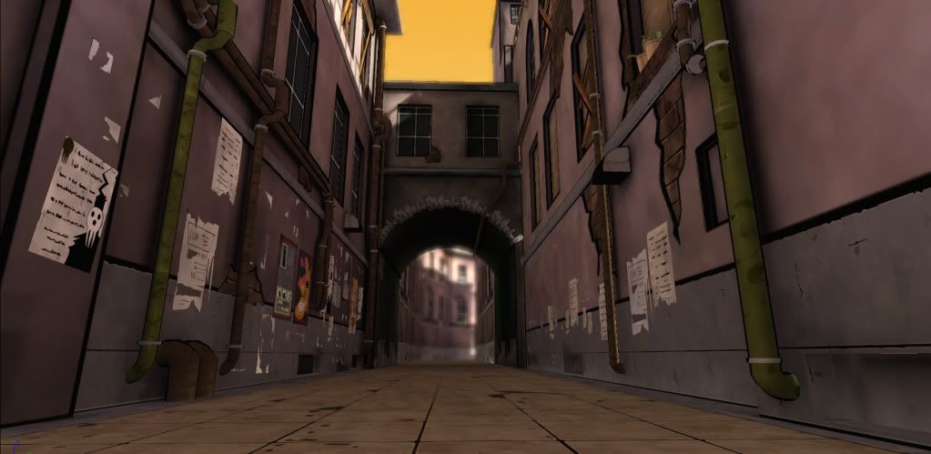
Soul Eater Alleyway ^^
Hey everyone! I've been frequenting the forums for a while and get a lotta help from the threads and have asked a couple of q's on the Modelling Sub-D's massive thread that's helped me understand a lot on that topic.
As for this thing here, I wanted to work on hand-painting stuff in the Soul Eater style. Some might be familiar with the anime/manga, but I think it's got a great visual style and it's what got me into it (plus some of the animation is pretty cool in the fight scenes).
Anyhow, here's what I've got so far on this thing. Been learning a buncha things here. Special thanks goes out to turpedo and drachis for the help and support they've given me on this personal project!
Currently still gotta:
- Bake out AO map for bottom section of walls
- possibly make some of the cracks on the textures a bit thicker
- Make some decals for cracks and paint dabs (these are gonna be tricky)
- darken the outline on some of the ads on the wall some more
- and one thing that maybe you guys can help me on....
I painted the outline look on some of the walls, but as you can tell, I'm getting pixelation on it. I'm using an RGB map through LERP to get the tiling on the wall right and then painting out the outlines with the green channel. If anyone knows a more efficient way or better way to make these outlines, I would appreciate it, but overall it looks fine on straight edges.
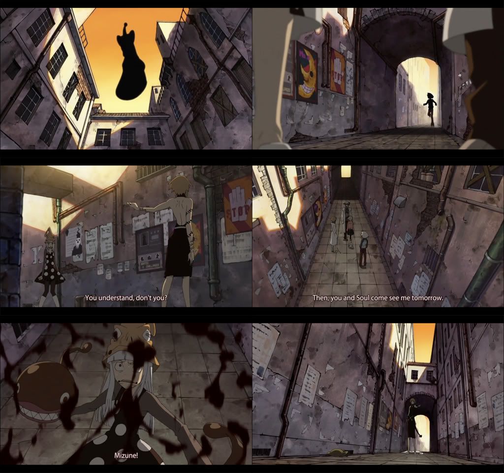
BTW, as you can see in the moodboard, things are placed differently in every shot so I kinda just made it my own on some of the things and the placement of things as well. CnC are most welcome, go at it!
Screengrabs from anime

UDK Rendered Shot

As for this thing here, I wanted to work on hand-painting stuff in the Soul Eater style. Some might be familiar with the anime/manga, but I think it's got a great visual style and it's what got me into it (plus some of the animation is pretty cool in the fight scenes).
Anyhow, here's what I've got so far on this thing. Been learning a buncha things here. Special thanks goes out to turpedo and drachis for the help and support they've given me on this personal project!
Currently still gotta:
- Bake out AO map for bottom section of walls
- possibly make some of the cracks on the textures a bit thicker
- Make some decals for cracks and paint dabs (these are gonna be tricky)
- darken the outline on some of the ads on the wall some more
- and one thing that maybe you guys can help me on....
I painted the outline look on some of the walls, but as you can tell, I'm getting pixelation on it. I'm using an RGB map through LERP to get the tiling on the wall right and then painting out the outlines with the green channel. If anyone knows a more efficient way or better way to make these outlines, I would appreciate it, but overall it looks fine on straight edges.
BTW, as you can see in the moodboard, things are placed differently in every shot so I kinda just made it my own on some of the things and the placement of things as well. CnC are most welcome, go at it!
Screengrabs from anime

UDK Rendered Shot


Replies
Nice job though!
GCMP: Thanks man! Love your Fried Chicken Shack progress BTW, I gotta do something like that!
Jackwhat: Haha, sorry, I am planning on doing something else from Soul Eater, this was just a practice >_^ Yeah it's most likely the FOV that's doing that. I'll deal with that once I finish adding in some of the remaining elements and polish. Any ideas on how to get that to work in Unreal, haven't done anything like that yet.
- ditched the LERP effect on the black cracks and have started decal-ing it up
- changed the wall texture a bit and added just a wee bit more
grime...don't want the tiling to get noticeable with it, splotches and
cracks will make it
look nice, i'll do my best
Things to do:
- still need more paper/posters on walls for bottom blank areas closer to
camera
- need FOV for that depth into the alleyway
- making decal splotches
- fixing AO map for left wall (I'm getting some weird blotches, it might be
that)
- place a different building for "skybox" BG since it looks like it's repeating
And I think that's about it for the most part unless some people can recommend anything based on the moodboard I posted from the anime. It's getting close!!
Oh and just for kicks I'm gonna add this lil fella in the sky at the end. THE LAUGHING SUN!!
New WIP
Looking good so far keep it up!
took into consideration some things and did it to it. there are some things i could still fix but i gotta call this done for now and move onto something else, this thing's been taking up my time when i wanna do 3D.
the delay in finalizing it was due to a buncha stuff that's come up including a job at a game studio! currently in training and awaiting further details these next few weeks but i'm stoked! so ive been spending my days at the studio learning some workflow and trickery.
Great job getting a job, haha
And now I have the theme stuck in my head.
As for the FOV thing, I dunno if you can change it in the world settings or not, but if you make a new camera you can change that camera's FOV... so that might work for ye.
add some more grunge to the textures and maybe narrow the entire alley a little bit since it looks a smidge too wide in the renders. All together you have a great thing going, this could be wonderful portfolio peice. Look forward to seeing your progress ounce you nail the lighting.