The BRAWL² Tournament Challenge has been announced!
It starts May 12, and ends Oct 17. Let's see what you got!
https://polycount.com/discussion/237047/the-brawl²-tournament
It starts May 12, and ends Oct 17. Let's see what you got!
https://polycount.com/discussion/237047/the-brawl²-tournament
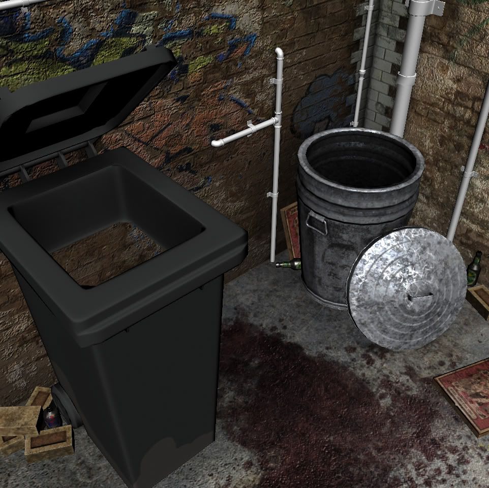
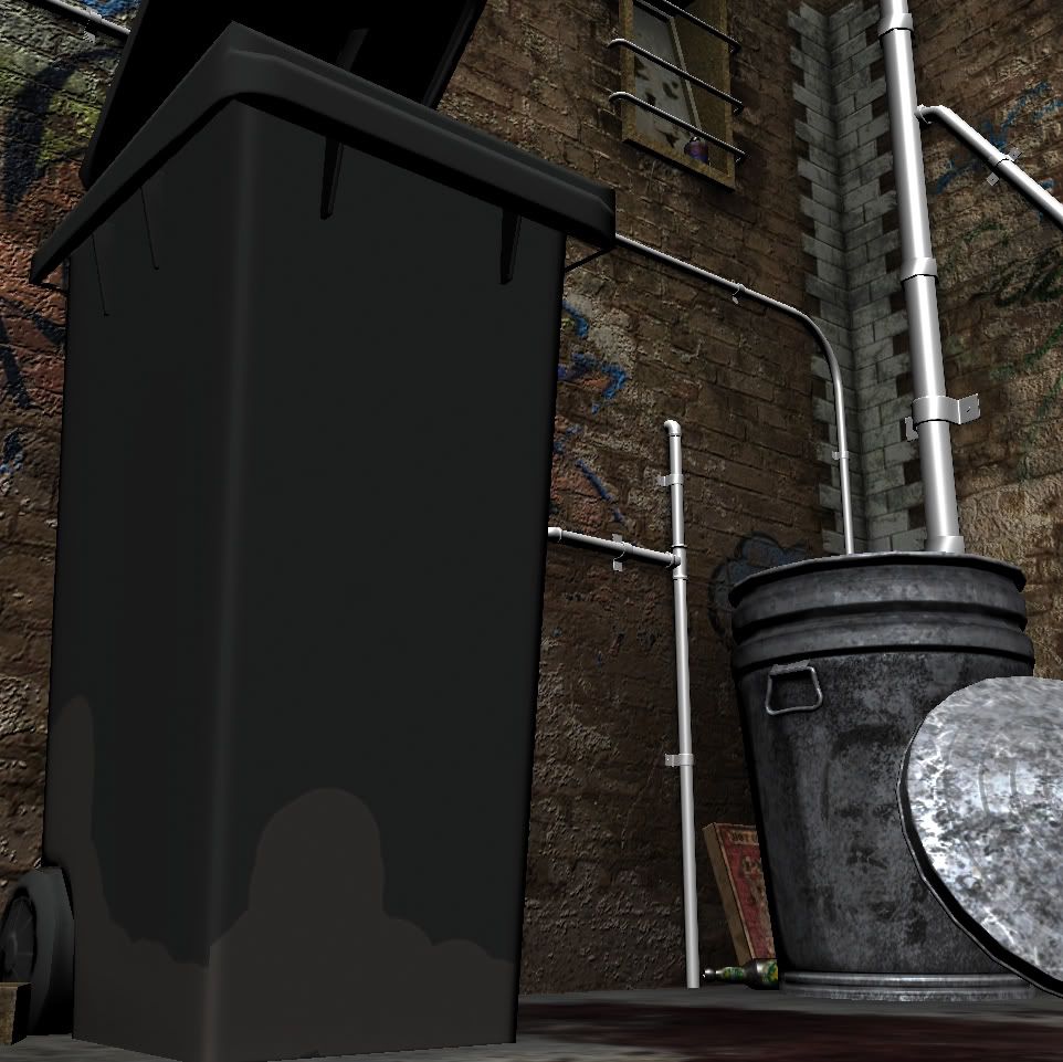
WIP - End of the Alleyway
Hi All
Also posted on gameartist.net, but looking for some more crits so here goes...
Currently around 6000 tri's, haven't done any lighting yet. The next step is to make some garbage bags inside the bins and then model some dude's legs and feet hanging out from behind the wheely bin. And the pipes and wheely bin still need texturing...


Thanks
Also posted on gameartist.net, but looking for some more crits so here goes...
Currently around 6000 tri's, haven't done any lighting yet. The next step is to make some garbage bags inside the bins and then model some dude's legs and feet hanging out from behind the wheely bin. And the pipes and wheely bin still need texturing...


Thanks
Replies
Thanks everyone
You've got some weird shadows happening on the wall. And the spec on your garbage can, the silve one, looks a little too intense - that is also a mighty thick garbage can..
I would also bevel the corners of the plastic garbage bin.
Keep working hard!
I feel crammed into this scene. It's a tight perspective, starring into a corner. Instead of saying "hey I'll model 2 trash cans and a brick texture and call it an alleyway." get a solid reference and recreate a scene.
http://www.flickr.com/photos/eviloars/3464541482/
http://www.istockphoto.com/file_closeup/architecture-and-buildings/8293317-trash-alley.php?id=8293317
http://farm1.static.flickr.com/9/78237555_9ea7933e54.jpg
2. odd scaling, reference
The trash bin is very narrow, yet it's details are very thick. The trash can also has this exaggerated thickness around the top.
http://img.en.china.cn/0/0,0,20,16450,1500,1086,3d574211.jpg
3. technical errors
everyone of the trash bin's rounded edges has a hard edge seam. This looks like a normal error.
specular of metal trash has none of the dirt or grime so it's perfectly polished reflective.
For more technical feedback, textures and wireframe shots would help.
To cholden - Thanks for taking the time to critique it so much, it's what I need!
I understand the scene is very tight, I did this on purpose to reduce the amount of stuff needing to be modeled. I haven't finished anything for my folio yet and thought I would have better luck finishing a smaller, focused scene. The final version will have a body / legs sticking out from behind the wheely bin, hence the blood on the ground. I guess I'm trying to tell a bit of a story rather than just model an alleyway.
I'm loathe to pull the camera back because a lot of stuff isn't modeled outside the immediate fov, so do you think there is anything than can be tweaked within the scene to reduce the cramped feeling?
As far as your other comments go, I agree 100%. I'm going to tweak the trash can and I think I'll just ditch the wheely bin and start it again from scratch, widening the overall shape and reducing the thickness, as well as getting a better normal map.
Thanks again for the comments!
http://boards.polycount.net/showthread.php?t=68206
Look at that scene, and you can see how little he really had to create, but how well it works because of the small changes he made between the models.
this isn't the greatest ref and it's very old work.. but you don't have to have a lot of stuff in your scene to pull back.. you can also duplicate objects and rotate them and have another object. Here's a similar scene I did a couple years ago when I was learning.
The two barrels are one object, the cans are all one object. the windows are the same objects, and the wood crate thingies are one object. Just a little more effort and you can come away with a much stronger piece.
I'm playing around with the comp, trying to address the issues. Can anyone comment on this paintover?
Just trying to expand the scene a bit, introduce a few more elements and taking advice from everyone here.
Not sure I like the ladder on the side, might make it a proper fire stair instead, or maybe put something else there to fill the blank space.
Thanks everyone