The BRAWL² Tournament Challenge has been announced!
It starts May 12, and ends Oct 17. Let's see what you got!
https://polycount.com/discussion/237047/the-brawl²-tournament
It starts May 12, and ends Oct 17. Let's see what you got!
https://polycount.com/discussion/237047/the-brawl²-tournament
Random kitchen and restaurant stuff
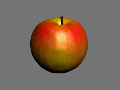
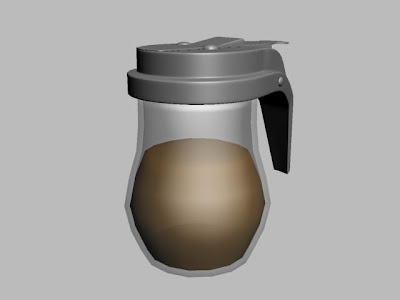
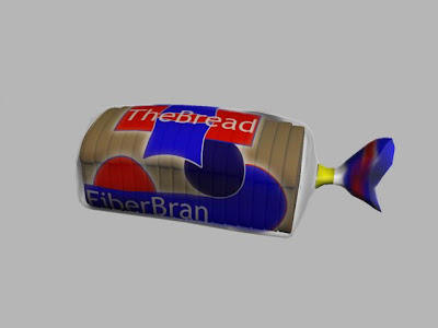
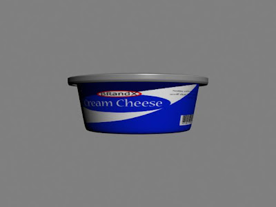
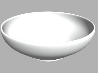
A series of random kitchen/restaurant props that will be used in some architectural design model. Nothing to exciting but these were quick models. Only had 2 days to model and texture them so used a lot of procedural maps to make things easier.
The fruit I sculpted in zbrush and then decimated them to import them into max. I did them in zbrush mainly as a means for me to learn the basics a bit better with this amazing tool. I could have easily done them in max too and used a displacement map to get the fine pours, but they were the perfect simple models to learn the basics with.
These images are just showing the models in standard scanline renders with very basic shaders, but the final models will be done out in mental ray, so all the metal and glass will look a lot more like it should when they are done.


Replies
The apple: Needs more specular shine, the stem looks like a candle wick because it's too black.
The orange: Far too dull, oranges are bright orange! The bump is poor, orange peel/skin has pits that are a densely packed repeating symmetrical pattern. Seek real reference.
The banana: The ends are black which is suggesting it is very ripe BUT the skin is telling a different story.
The bagel?: Classic bagels have holes in the middle and it looks like you modelled the sesame seeds?!
The waffles: Too dark and dull, waffles are a light yellow colour with some browish hints where the grill has toasted. Are those marshmallows? Butter would appeal to the bigger percentage of people, well I hope!
The coffee: Liquid should be almost black and mostly opaque, the glass should be way more shiny and glossy. The silver lid doesn't look so hot, try making it dark brown to compliment the contents.
The pop/soda: Has been commented on but would like to add that they look already opened because the level of liquid is too low. Colour variation would help the coke, other than that the bottle plastic is way too dull in both.
The bread: Packaging plastic is far too dull.
Juice bottles: Glass too dull again.
Untensils: Look okay if they're meant to be plastic.
These models are mostly good but it's the textures/materials that really need work. If you gave them all nice textures and material setups and rendered a few together with a nice renderer, it'd look great!