Hey,
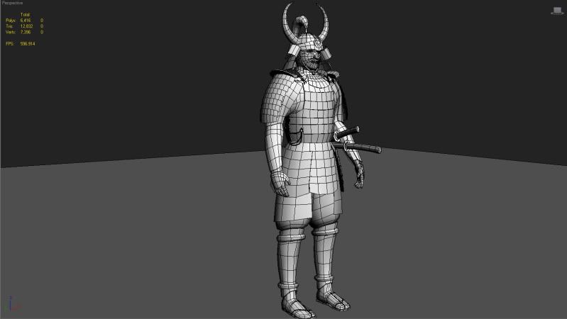
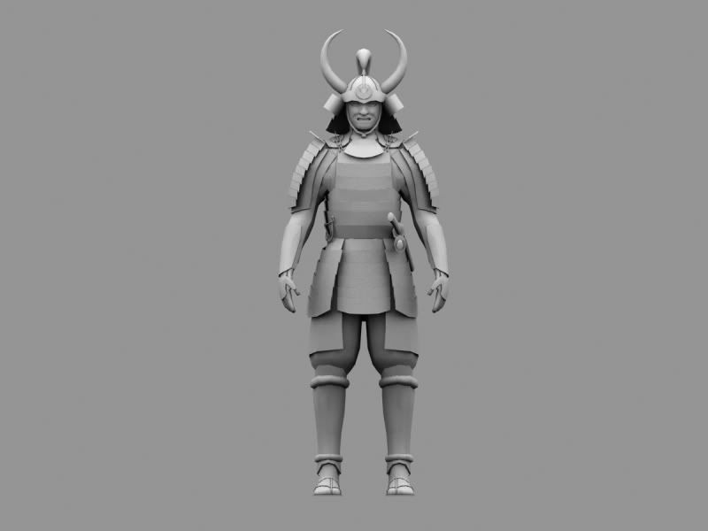
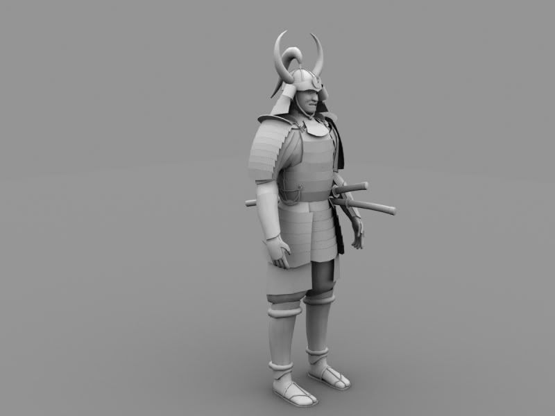
This is my latest work, been working on it for about 2 days. So far I,ve only been modelling, no textures, no normal maps, no alpha channel, nothing.
Please comment and crit!
I will be filling in the big details with a good normal map. The mempo (mask) is copied from a replica I have with me and a few references I've found on the net. It doesn't look scary yet, but once I get the details in with Mudbox, it will look significantly better.
That is indeed the low poly. However I haven't optimized at all yet. I have not deleted any of the face beneath the armor. Just haven't had the time. The polycount will be cut down for sure. The polycount also includes both the Katana and the Wakizashi, which aren't quite part of the character.
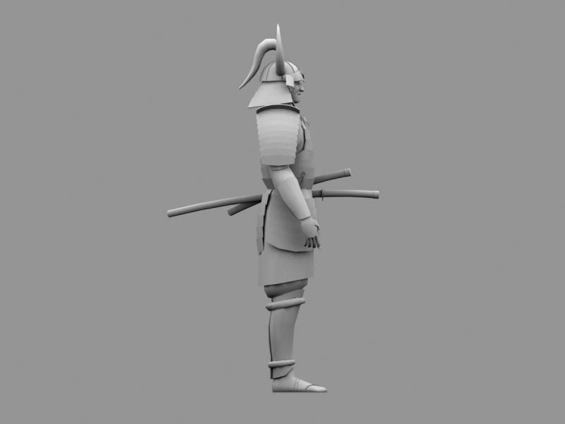
I think it looks good. The side silhouette shocked me a little bit because it looked like his back is caved in. This looks like either the shoulder pad/arm being too far back or the back armor being flat; can we see a reference?
The side silhouette might seem strange because of the shoulder armor. There are various styles and patterns of armor, many of them were rather huge, others comformed more to the body.
I have modified the mempo (facemask) a little bit, optimized the edgeflow, and changed a few proportion issues. Please C&C, it is very appreciated! Thanks!
His feet need some loving. Maybe this image will help you out a bit.
Other than that, I think the silhouette is a little boring. While I respect that your trying to keep as close as possible to what ever reference your working from, I think you need to use some artistic judgment and make it a little more interesting to look at.
Heres a really quick paintover i did. maybe it will give you some ideas.
Basically I would just accentuate his armor, make it stick out a little more with some sharper angles.
Anyway, hope that helps a bit. If not, sry =\ lol.
Replies
I have modified the mempo (facemask) a little bit, optimized the edgeflow, and changed a few proportion issues. Please C&C, it is very appreciated! Thanks!
Other than that, I think the silhouette is a little boring. While I respect that your trying to keep as close as possible to what ever reference your working from, I think you need to use some artistic judgment and make it a little more interesting to look at.
Heres a really quick paintover i did. maybe it will give you some ideas.
Basically I would just accentuate his armor, make it stick out a little more with some sharper angles.
Anyway, hope that helps a bit. If not, sry =\ lol.