Space Junk
Hi all,
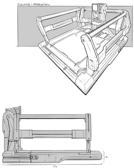
Here is some work i have been doing for a sci-fi scene ill eventually be putting into unreal for my portfolio. This is a lift design done by Paul Richards which im going to be using as a Tram/Trolley.
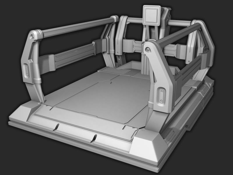
This is my first proper go at normal mapping so please point out any obvious errors in the bake that i have missed. There are a few areas where i have changed the design slightly. the front bolts of the base but im still undecided as to whether or not ill change these to match the concept. I also made the screen a bit bigger but looking at it now i don't know whether to make it smaller again or not...?
Concept by - Paul Richards
High Poly Model:
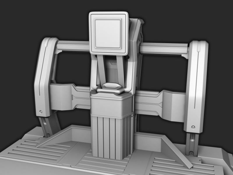
Console (high poly)
Low Poly Model:
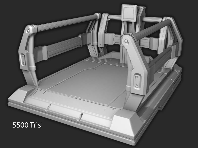
Wire:
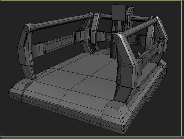
Here is some work i have been doing for a sci-fi scene ill eventually be putting into unreal for my portfolio. This is a lift design done by Paul Richards which im going to be using as a Tram/Trolley.
This is my first proper go at normal mapping so please point out any obvious errors in the bake that i have missed. There are a few areas where i have changed the design slightly. the front bolts of the base but im still undecided as to whether or not ill change these to match the concept. I also made the screen a bit bigger but looking at it now i don't know whether to make it smaller again or not...?
Concept by - Paul Richards

High Poly Model:

Console (high poly)

Low Poly Model:

Wire:

Replies
Not to derail the thread or anything, but I'm pretty sure the first tutorial I watched was yours. So thanks.
Also if you're looking for more reference for modeling things that are of that style, I've got a ton of concepts I've collected from various boards if you want.
i hate poop... for not making more tutorials.
heres an update i added some smaller details today as well as redoing the screen. Ive added a few bolts and trims to places as well as some detail to the console area. Comp is starting to slow down though so i think i might call it a day on modelling and move on to texturing and hopefully bring out some details with the texture.
Gallows: That would be great if you have more designs in this kinda style id love to have a look at them.
Update:
Been a while since an update so heres a wip of the diffuse, no spec yet obviously still working on the console. I think i overdid it on the edges being worn? texturing is definitely not my strongest skill something which im trying to improve so any feedback is much appreciated. Still working on the tread plate i think its too light right now. Do you think its too yellow i.e should i introduce another colour? i was using alot of old forklift trucks and the dollies from dead space as a kind of ref/colour scheme.
cheers
Thanks, i agree with you on the tread plate im still working on that i think it looks too light and clean. I was thinking i might add the hazard paint again to the metal plate that runs across the base do you think that would be overkill?
Console:
*hazard paint to metal plate that runs across the plate WOULD be overkill. lol
Watching.
Also the edging doesn't seem overdone to me but a bit too too uniform. Like on the yellow side railings it's rusted across the top very evenly. Break it up a bit. Make some areas more worn than the others instead of just shift dragging in photoshop. Also the top parts of the two square pieces in the front seem a bit overdone compared to the rest. They're just both too nicely rusted across the whole area. Here's a small overpaint.
Other than that good job on the model. Very clean modeling and the bake came out nicely! Like chaosquak says the spec should really bring this alive.
choasquack: thanks dude yer the spec is guna be tough lol might take a bit longer than usual
fethry: thanks for the crits, some stickers are a good idea maybe some like the ones that say this item was last tested by....joe bloggs what do you think? unfortunatly i didnt just shift drag i painted them with a brush kinda sad that it looks like that
thanks for all the crits ill get working on them today.
Update:
You should move those grills on the sides closer to the middle to make your railway look better at the end.
Also you have that thick thing going under the rails in the middle, so moving the grills would also balance the details a bit better.
moziz, thanks man looks like a good idea i think ill do that, ill just bake it into the low poly be much easier than changing the high.