Jane the mage.
Hello polycounters,
[WALL_OF_TEXT]
I've been a long time lurker and this is my first post I hope that posting my work will help me to actually finish it this time
I started this model with just the idea of the baggy pirate-ish pants in mind, and the rest was just made up along the way. The idea was to make a young girl that uses magic to defend herself.
I gave her a staff but decided to delete it since, I find it funny how most games have mages wearing a staff but they never use them for spells, they only use them to bash a monster in the face if they get to close. So she uses her bare hands to perform magic and has a dagger to slit throats when monsters get to close.
Anyway, her name is Jane (yes as in Jane Doe) simply because I couldn't think of a name
[/WALL_OF_TEXT]
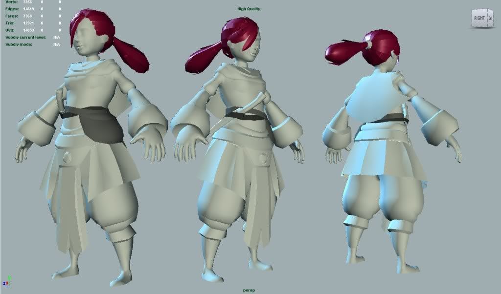
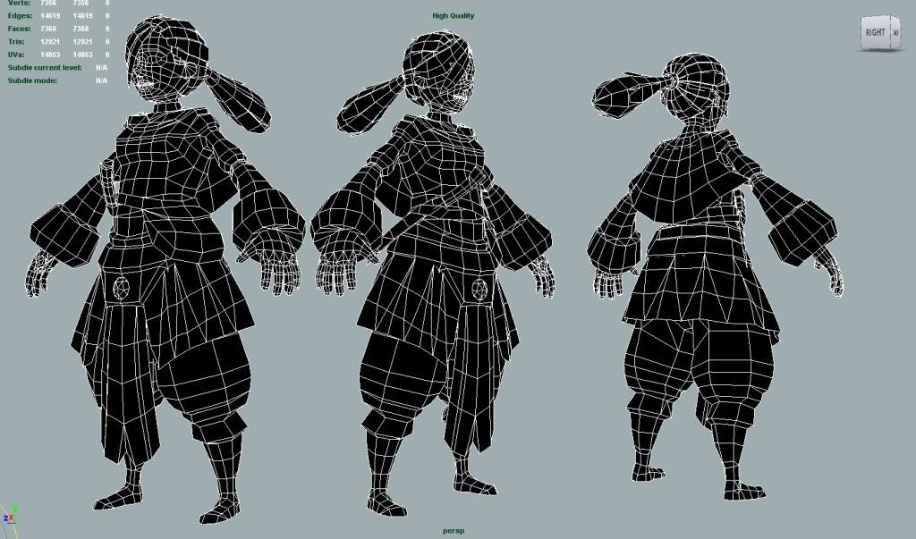
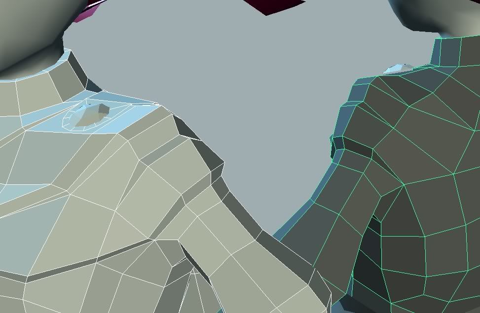
As you might notice the shoulder isn't really ready to be rigged and animated, but I have no idea how to keep the layer effect and still make it riggable.
So if any of you guys have any idea on how to solve this, I'd love some tips.
Please comment and crit as much as you like.
And thanks!
[WALL_OF_TEXT]
I've been a long time lurker and this is my first post
I started this model with just the idea of the baggy pirate-ish pants in mind, and the rest was just made up along the way. The idea was to make a young girl that uses magic to defend herself.
I gave her a staff but decided to delete it since, I find it funny how most games have mages wearing a staff but they never use them for spells, they only use them to bash a monster in the face if they get to close. So she uses her bare hands to perform magic and has a dagger to slit throats when monsters get to close.
Anyway, her name is Jane (yes as in Jane Doe) simply because I couldn't think of a name
[/WALL_OF_TEXT]


As you might notice the shoulder isn't really ready to be rigged and animated, but I have no idea how to keep the layer effect and still make it riggable.
So if any of you guys have any idea on how to solve this, I'd love some tips.
Please comment and crit as much as you like.
And thanks!
Replies
I'm no expert on rigging/skinning, but I reckon you just need to take car with the weighting on the bauble thing on her shoulder. The whole thing sits on one quad, so it shouldn't be too much work to match the weights up.
One thing, is the almost-13k figure correct? or is that the tri-count for 3 instances of the model?
Good point, perhaps I should just throw in a simple rig to see how the weighting works. I have some experience with rigging highpoly meshes, but never really tried a lowpoly mesh.
Hehe yes, the 13k is for the 3 figures. so the model itself should be 4307 triangles, but the model I have here at work is under 4200 triangles. So when I get home I'll check the actual triangle count and post it
Thank you for your post
@ Gallows: Thanks. Yes the hand does seem to be a bit thin, but I think that's the PoV being a pain. The hands used to be really fragile and girly, but it looked a bit odd when I zoomed out. So I decided to give her gloves and thus to make her fingers a bit thicker. I don't think I'll make the hands any bigger, otherwise I'm afraid they'll get to huge and chunky for a girl.
I just did a simple shoulder weighting test and I was pretty happy with the result. But I might still give your idea a try, see how that works.
Again, thanks for the replies!
This is my (or hers rather..) UV map. Before I start texturing I wanna be sure the unwrap work properly. I'm not really a texture or unwrapping guru, so I'd love the opinion of you guys.
The floating bit beside her head are her teeth. I'll put them in there once I get to the rigging stage. (< I wanna open her mouth before I put them in there.)
Oh and the chunk of polygons removed from her head are under her hair anyway, so I figured I'd might aswell give those less UV space.
Crits and Comments are more than welcome!
Thanks
What sort of colour scheme / design are you thinking?
Um the reason I made 1 of the 2 hand parts smaller in space is because this is the inside part of the hand, and Since you won't be seeing that alot. Do you think I should scale it up a to match the other part of the hand?
And you said to pack the hand uvs? Do you mean making them smaller?
Thank you
@ brandoom, Thanks!, I'm not sure yet. But I was thinking of using the red/pinkish color for the hair (as seen in the first image). So tomorrow I'll do some color tryouts to see what fits with the color of the hair.
@ Jojones, Thanks dude! I'm pretty new to texturing, so I'm really hoping I don't mess those up
I'm pretty new to texturing, especially handpainting them. So please give me your comments and critics.
Feel free to post harsh comments, aslong as you can give me reasons why
Tips and tricks are always welcome!
Lookin' forward to the updates.
Also the colours are already quite nice.
But you definitely can put more colour variations in there as LoTekK mentioned.
cheers
Anyway, here is the updated model, please give me your opinions and thoughts!
The model is 4152 triangles and uses a 512x512 texture. (painted at 2048 ).
It was rendered without anti-aliasing and with 2 simple lights.
Thanks!
from a technical standpoint i would have given more space between the UV tiles for bleed. When this is mipped the islands will bleed into each other
I'll also give the hair another go, I've been scared of the hair since the start. But I won't learn by not doing it
And thank you for the uv space tip, I'll use this in next projects!
Also, if you haven't seen this tutorial before, I recommend checking it out. I found that it's really helpful as reference while you're learning to hand-paint textures:
http://www.itchstudios.com/psg/art_tut.htm
Keep going! I'll be watching this thread! ^_^
Yes I gave the hair another try, but I really have no idea what I'm doing yet so I always end up deleting it. I also tried giving blue a go but it made the overall feeling way to blue so I switched back to red again. Might shift the hue around when I got some decent hair painted in tho.
And good point Metta, I should go around adding some damage and details on the character. Thanks for the website too, I remember seeing it in the past but maybe I should read it through carefully sometime.
@ djm6007, sorry I didn't thank you before, but I think the website was waiting for an admin to check your first post so I didn't see your message till later.
Update, added some details and redid the hair.
I also gave the bag sort of a polycount like face.
I think I'm almost at the point where I'm calling it done. I know it can still be tweaked and improved and I will do real obvious fixes and I will still listen to comments. But I have to stop at some point and move on.
I think you could have pushed it a little further, so I made a paintover:
A lot of that is just personal preference, but at the least I would have made the transition between the face and the hair more subtle, and I think the ears would have looked more natural if they were a tad redder than the rest of the face.
Oh, and it's completely inexcusable that you have a lock of hair going over half of the head, but not the unique UV space to draw the shadow. Shame.
I like the bag
Edit: I also made the mouth a little higher, I think that's a bit more natural, but again, preferences.
And I agree that I fail for not unwrapping the other half of her face.. I never thought about the hair dropping a shadow when I was unwrapping. I might just fake it on this model and make a HUGE mental note to think about stuff like this before unwrapping next time.
Thanks for the feed back!
Another updates, just small tweaks really. I gave the face more color, I went for a version inbetween mine and zwebbie's. I also added a hairline, which was a big old pain in the bottom. Made the shadow under her breast less black and more saturated and gave the gloves a bit more color.
Thanks shotgun, I still have to read through the itch studios page, but I'll be sure to pay extra attention there. (I already did a quick scan through earlier today). I don't think I'll be going back and redoing the whole character tho, just because I've spend to much time on her already. But I'll make sure I'll try and use your tip on my next model.
I'm still open for minor fixes while I'm rigging and posing her tho.