The BRAWL² Tournament Challenge has been announced!
It starts May 12, and ends Oct 17. Let's see what you got!
https://polycount.com/discussion/237047/the-brawl²-tournament
It starts May 12, and ends Oct 17. Let's see what you got!
https://polycount.com/discussion/237047/the-brawl²-tournament
Subway Hub (source engine)
Alright, been working on this long enough and its time for some crits
This is the first time i've used the source engine, all i wanted to accomplish was a nice looking mini scene for my portfolio,
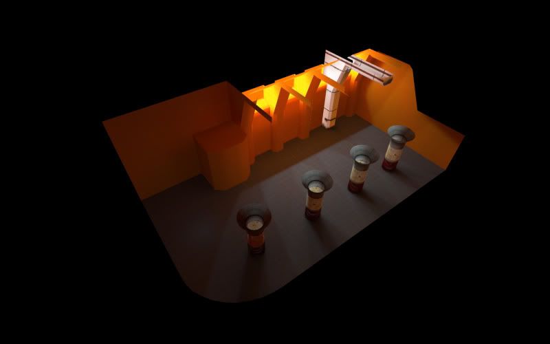
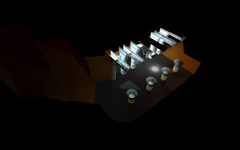
here's the work in progress on the basic layout:
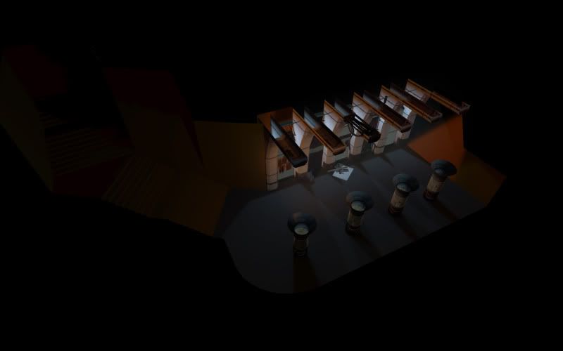
And here are the latest shots from where i left off tonight:
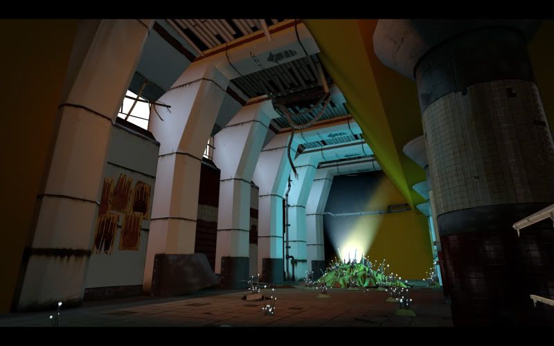
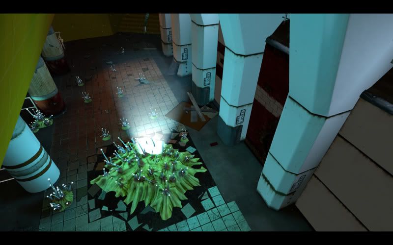
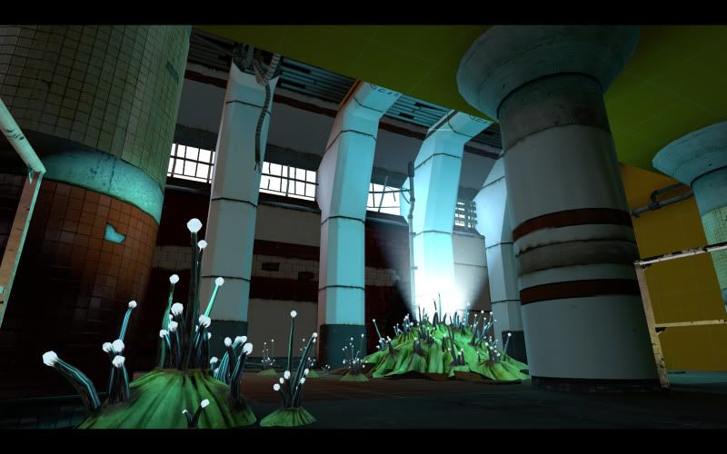
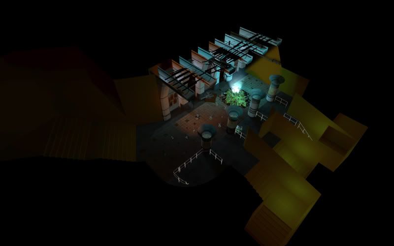
And just for fun i started messing with some ground fog on the last compile:
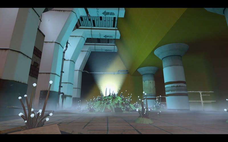
100% custom content save a couple hl2 railings that will be replaced this week.
C&C much apreciated!
This is the first time i've used the source engine, all i wanted to accomplish was a nice looking mini scene for my portfolio,
here's the work in progress on the basic layout:


And here are the latest shots from where i left off tonight:


And just for fun i started messing with some ground fog on the last compile:

100% custom content save a couple hl2 railings that will be replaced this week.
C&C much apreciated!
Replies
Just wondering. Why not?
Other than that, cool idea; although I don't know if those shrooms fit this kind of environment.
The light coming out of the giant fungus thing in the middle looks strange. I'd suggest playing with "fungus smoke" haha. Some yellowish fog similar to how Bungie did it in their swamp levels in Halo 2.
I'd look into adding some floating dark particles in there too for a little bit of fun :P
Right now the piece as a whole looks too clean, as if this fungus in here was just dropped in, rather than growing there. Add some grimy stuff in there around the bases of those plants to try to ground them more in the world.
Other than that... why are you using Source for a portfolio asset? As mentioned before the UDK would serve better for portfolio purposes in terms of desirability and you could make your stuff look tons better in UDK than in Source.
At any rate, carry on sir.
SasoChicken: Should have added more background around the concept. Old subway partially renovated, abandoned mid construction, alien growth takes over
LlamaJuice: Good stuff here thanks. I'l try and get a better sense of material on the white, I was going for a plastic pannel look, maybe yellowing with age would help? Unfortunately most of the detail will have to come through in the diffuse, source doesnt really do specular highlights easily, its more or less working around cube maps
And as for doing it in source as apposed to udk, I had started this prior to its release and i figured some ingame work spanning across a few different generations of engines would be a good thing to show in a portfolio since not all studios are using the latest and greatest. (or am i horribly off here and should i scrap it for udk?)
That being said though, do you have any other assets for your portfolio that are in engines other than the Source engine? Or is this the beginning of your portfolio? At any rate any future projects I'd hop into a more popular/recent engine to showcase your skills. It's all about making your stuff look great, use whatever you can to do it.
Any better?
It looks like you have too many different material types so it's too busy for the eye and also too saturated. The lighting is strange, orange and blue looks cool but think about where the light is coming from, those windows are the key
edit: jesus, you posted exactly the same time i did lol