UDK - Skatepark
Well, instead of spamming the "what are you working on" thread...decided to start my own to show my progress on my skatepark...
I would like to actually make it playable later on...but that's a really long time from now since my experience with UTE3/UDK...or any game engine for that matter, started when UDK came out just a few months ago...got me lots to learn!
Anyways...I started blocking out the level in UDK but it's still pretty crappy to show anyone...so I wanted to show what I have so far....
*Update*
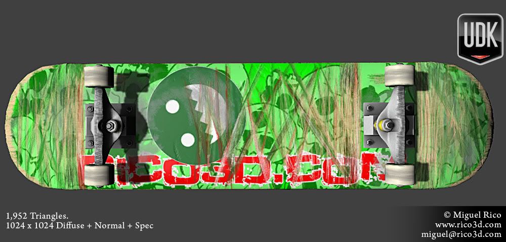
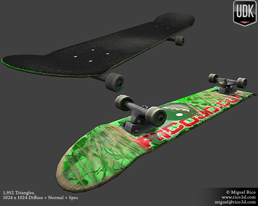
*END*
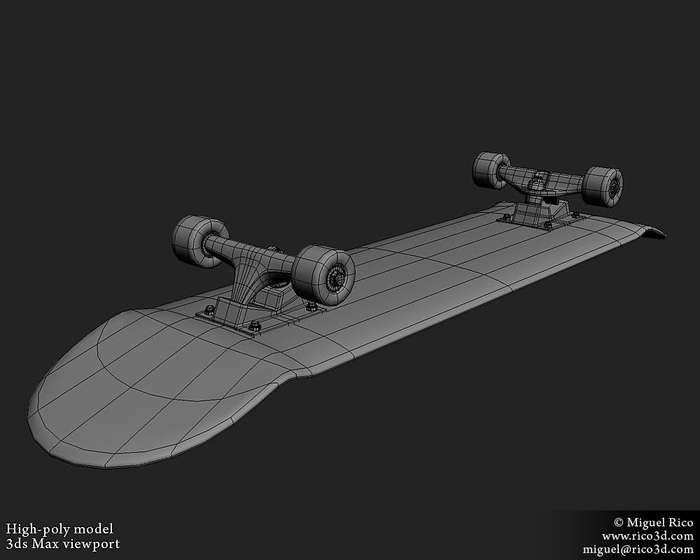
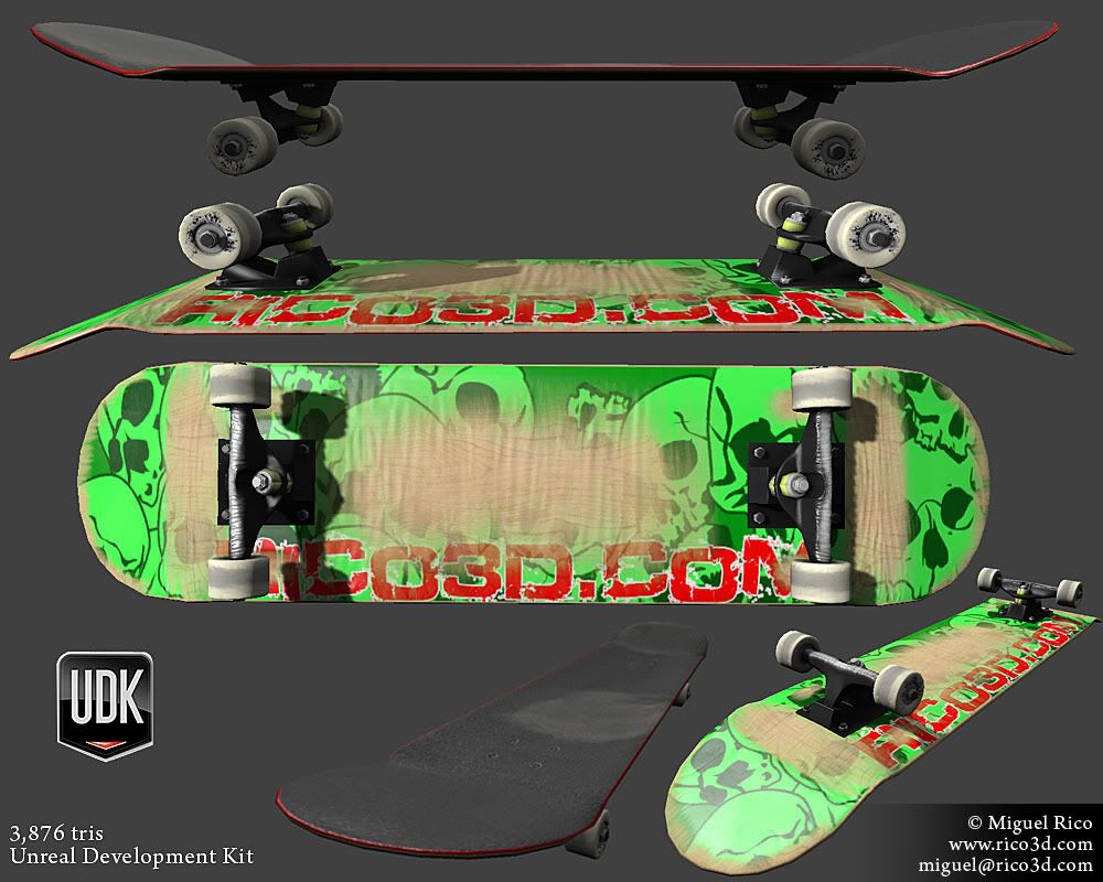
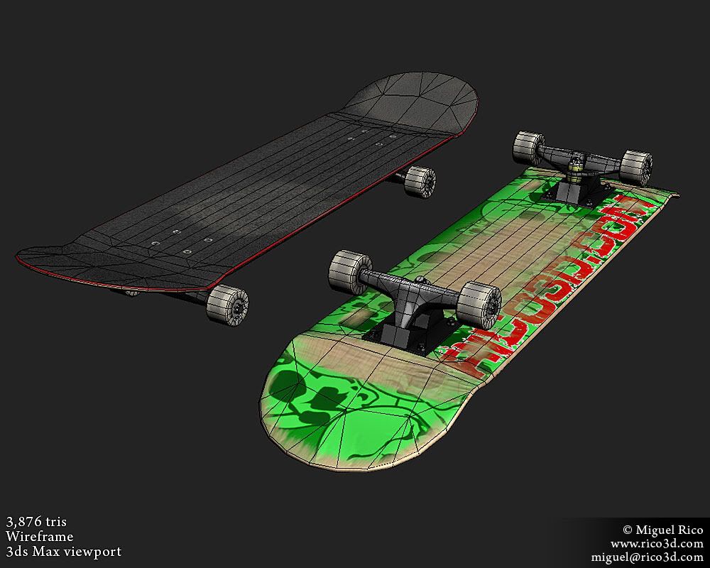
....there's actually an updated model with less triangles under 2.5k I think and a different texture...just can't find the fucking image. :poly127:
Started on some random assets...
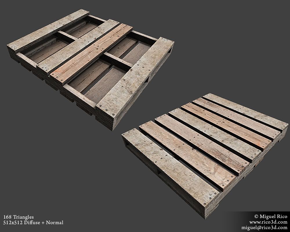
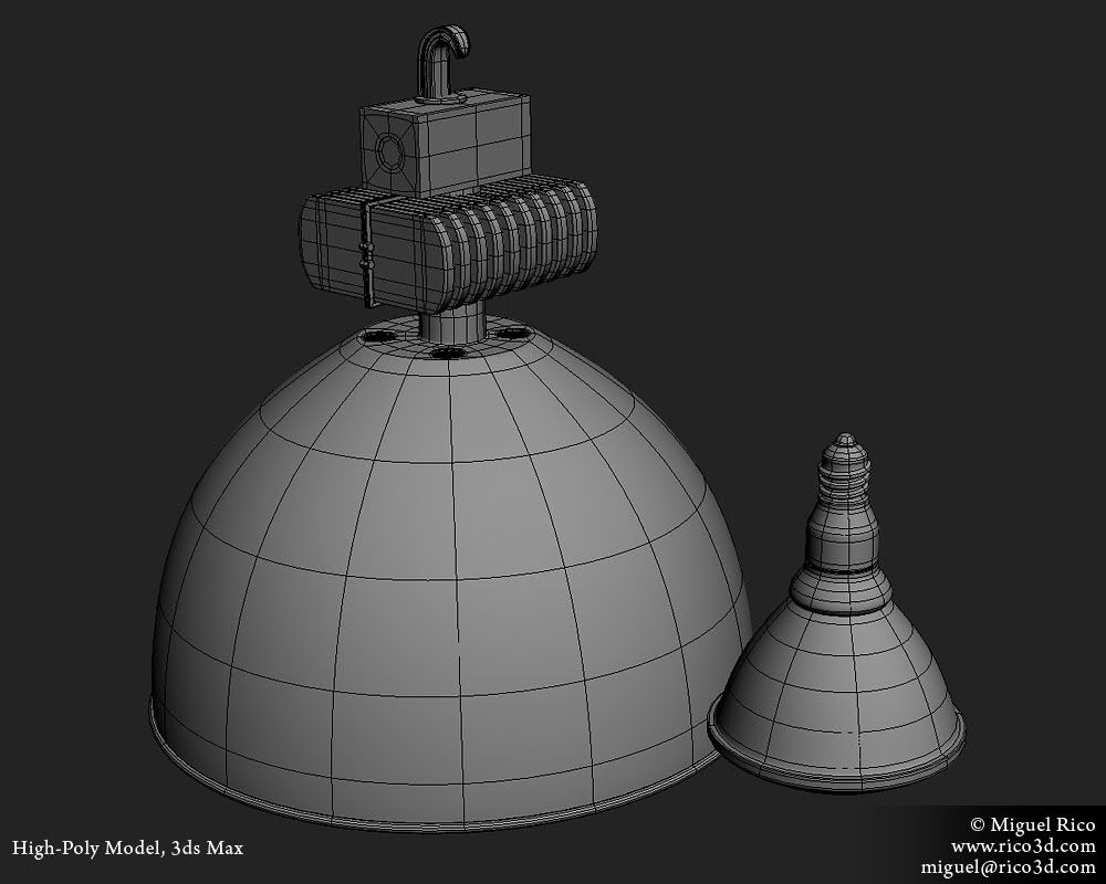
Hoping to get the low poly + maps done by sunday night.
Anyways, any crits or comments are appreciated!
I would like to actually make it playable later on...but that's a really long time from now since my experience with UTE3/UDK...or any game engine for that matter, started when UDK came out just a few months ago...got me lots to learn!
Anyways...I started blocking out the level in UDK but it's still pretty crappy to show anyone...so I wanted to show what I have so far....
*Update*


*END*


....there's actually an updated model with less triangles under 2.5k I think and a different texture...just can't find the fucking image. :poly127:
Started on some random assets...


Hoping to get the low poly + maps done by sunday night.
Anyways, any crits or comments are appreciated!

Replies
ZacD is correct.
The wear on the skateboard should have a sharper transition between the wood and paint, right now it looks a bit too soft blended. You might want to add a few deeper gouges with your normal map as well.
The wood palette could easily use a 512 no problem, or find a way to tile/stack UVs with a 256. A non-square texture might make a better fit as well. I'm not certain but you might be able to get away with letting Unreal handle the AO so you don't need to worry about getting it all nice and layered on your diffuse. Just have some good 2nd channel lightmap UVs to bake to.
Swizzle - Thanks man, I have an updated skateboard just couldn't find it. I'll post it up and let me know what you think. I hit most of your points with it. I'll go ahead and make those adjustments to the pallet.
Nitewalkr - I'll see if I can hit those changes.
Ben Apuna - I'll post a pic of the update skateboard later today...if I can find the model itself. Let me know what you think of the paint. I'm going to add a few deeper gouges like you said though.
The pallet is currently stacked up on the 256, I only unwrapped 3 of the planks and one side plank and duplicated them and rotated them to not see the mirror uv.
I think the pallets look good when you're actually playing the level...but I think most of you guys want a bigger texture size?
I'll post an image of it in game with the 256 and 512 to see the difference.
Anyways, thanks a lot for the help guys!
One thing you want to watch out for as you continue forward with your level is keeping the pixel density consistent on all of your textures.
Man...still a whole bunch of stuff I need to model!
On that note the scratches on the tail should be a bit longer and more noisy on the tail as people tend to do more manuals than nose-manuals and tend to drag the board a bit when they lean back as seen here.
Also the dirt on the griptape looks kinda blury. If it's a seperate layer I think you could easily fix it by bringing down the opacity.
MattQ lol
Reefer Yeah, I thought the nose/tail were looking too clean. But you're right, they should be more worn out and thanks dude!
Good luck.
images:
http://www.flickr.com/photos/85965115@N00/2539177399/
I wish I still skated =\
Also, forgot the scratch marks from wheel bite.
What do you guys think?
Random truck image...
Ok, well here's another model I started...
I have a question about the Fire Hydrant...will the normals come out ok if the pieces are intersecting like that? Or should it be modeled as one piece?
Anyways, crits and comments appreciated!
You can also bake pieces separately, too.
About the fire hydrant, intersecting in this case will get you most of the details and is much faster to do. It'll probably work better if you also plan to intersect the low poly model as well. Like ZacD mentioned it'll help if you are baking separate parts.
However you will miss getting that nice smooth intersecting edge that happens between metal cylinders that get welded together. It can be a pita sometimes to merge cylinders of differing sizes.
It really just comes down to where you want to spend your time. If it was a "hero" prop I'd say don't intersect.
http://suburbanrails.com/cgi-bin/WebObjects/PWDA.woa/wa/loadPage?pageId=1675
Also on a personal note, being a Houston skater this is my favorite skatepark in the world.
http://www.southsideskatepark.com/dnn/Skatepark/ParkPhotos/tabid/65/Default.aspx
Maybe some reference can give you some idea mojo. But digging the progress!
ralusek Thanks a lot dude!
Ben Thanks man! Yeah...I ended up joining the pieces together...I was looking at some references and yeah...I like that smooth transition, don't want to get an ugly sharp edge on the normals.
Ashley Thanks dud...er...chick? I've been wrong in the past calling dudes with the name Ashley, chicks before...sorry!
Gallows Freaking awesome, thanks a lot for those links man. They'll definitely come in handy!
Skateboard looks good.
Here's an update on the Fire Hydrant...I think I'm done with the high poly, I ended up connecting the pieces together...
I'm a guy. Don't worry, it's not the first time I've been called a chick :icon15:
Ash Ok, cool...lol, I'm sorry about that.
Well....here's an update from me.
I think I might have gone a bit overboard with the wear and tear...I dunno, what do you guys think?