Spaceworker
Hello everyone!
Wanted to try and improve my mechanical sub-D skills, so decided to have a go at this concept (its actually the other way around, the concept attracted me so much that i just had to do it, and the sub-D thing was a great added bonus).
Concept:
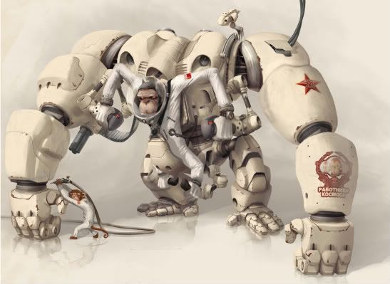
Heres a link to the deviantart profile page of the artist. This concept is actually based around a "fighting club" where different people make different characters in fighting poses and stuff. Go check out the other concepts by the artist (Kai-S) and be amazed! Im actually going to be doing 2 more characters from the fight club concept .
.
Ive asked for permission from kaiS but still have yet to be responded to. But im sure that wont be a big problem as ive heard that a shitload of people ask him and he says its totally cool (he's awesome ).
).
Finished high poly in max
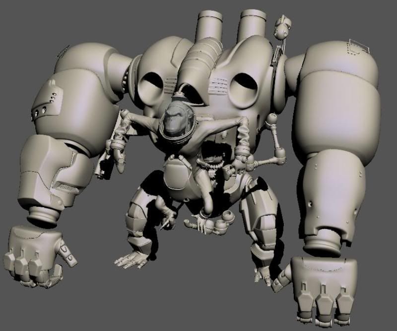
The back:
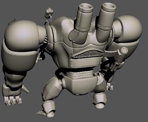
Them wires:
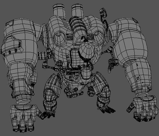
Still have to finish up the hands and feet. Not really worried TOO much about some major smoothing errors as i plan on just smudging them away off the nmap.
C and C welcome!!
Wanted to try and improve my mechanical sub-D skills, so decided to have a go at this concept (its actually the other way around, the concept attracted me so much that i just had to do it, and the sub-D thing was a great added bonus).
Concept:

Heres a link to the deviantart profile page of the artist. This concept is actually based around a "fighting club" where different people make different characters in fighting poses and stuff. Go check out the other concepts by the artist (Kai-S) and be amazed! Im actually going to be doing 2 more characters from the fight club concept
Ive asked for permission from kaiS but still have yet to be responded to. But im sure that wont be a big problem as ive heard that a shitload of people ask him and he says its totally cool (he's awesome
Finished high poly in max

The back:

Them wires:

Still have to finish up the hands and feet. Not really worried TOO much about some major smoothing errors as i plan on just smudging them away off the nmap.
C and C welcome!!
Replies
As for the model, it's a great start, but the proportions of some parts seem a little off. The arms seem much chunkier than the reference image, where the arms are obviously more powerful and ape-like than the legs, but still look slender with an organic feel. Likewise the feet on the model are very small compared to the image, and I'm wondering if such small feet could balance such a top-heavy machine.
Can't wait to see how this progresses - good work!
Crits:
- Fingers and feet on everything seem thin.
- Notice the Chimps left foot isn't floating but gripping the control arm, it actually has a pretty meaty foot. The shadowing on the toes might have thrown you off but there's a lot of bulk there.
- The fingers on the mech need to be chunkier, right now if it was to make a fist it looks like the fingers wouldn't be able to complete the silhouette.
- The wrinkles on the chimps arm look like there isn't an arm inside the sleeves.
- I think the arms might be too short, you might be posing them straight to make modeling easier, but don't forget to account for the added length of the bend. Or it could be like danshewan suggested and the arms are too thick, thinning then down could make them look longer...
- As for the balance, it would more than likely walk on all 4 limbs like gorilla?
Great start, I love the concept so I'm very interested in your progress!
Agreed with some of the crits here, overall the reference seems smoother than your model, some shapes are bolder like the upper arm reinforcement. Also the arms need some attention where they join from shoulder to torso, the concept is alot thicker in this area and almost matches in size.
Thank you very much for the help guys. It was real stupid of me not to post this earlier.
Danshewan:
Thanks alot for the critique.
Yeah i definitely agree that the proportions were sucky as hell. The machine was really bulky and in-organicy. I tried to work on everything you said crit by crit.
Thanks again
Vig:
Thanks for the support Vig
I went from crit to crit and adressed all the issues you mentioned. Still havent worked on the wrinkles per say, more on the machine and the overall proportions of everything (for example, lenghtening out the arms as you mentioned).
And yes, i believe this guy would walk like a gorilla. Or atleast it seems like it from the concept eh? kind weird though, it should have been more like a chimpanzee. huh. lol
Shiraz:
Thanks man
Snipergen:
Thanks for keeping an eye out
I actually saw that picture when i was halfway to where i am now. I didnt use that as reference though (only admired it) as i wanted to see what kind of work i could pull off with the same piece of concept. His is definitely better hands down, but im still working on it
GCMP:
Yeah the concept was great. Too much work though! XD heh
Worked on that arm transition, tried to make it look smoother,etc as you mentioned.
Thank you very much
Nitewalkr:
Hehe thanks man. Hope u like the update!
__________________
Update!!
So worked on crits and tried to follow as much as i could. Hope its better now?
Thanks alot
In yours he's kinda just sitting there like "whatever"
In the original he's like "Im gonna fuck some shit up"
Also the big bot needs to be supporting his weight a lot more on those arms.
I remember the concept from a while back; had it as my desktop for a time.
awsome take on the concept man, monkey-bot is looking great (maybe a little squahsing vertically so he's a bit shorter, lower profile and all that).
As has been said, monkey could use a little exaggerating, slouching him down a little so his head is coming out lower down would help out heaps imo.
anyways, awsome work. texturing looks like it'll be heaps fun on that suckah =D