WIP - Fireman - Megaman Robot Master Remake
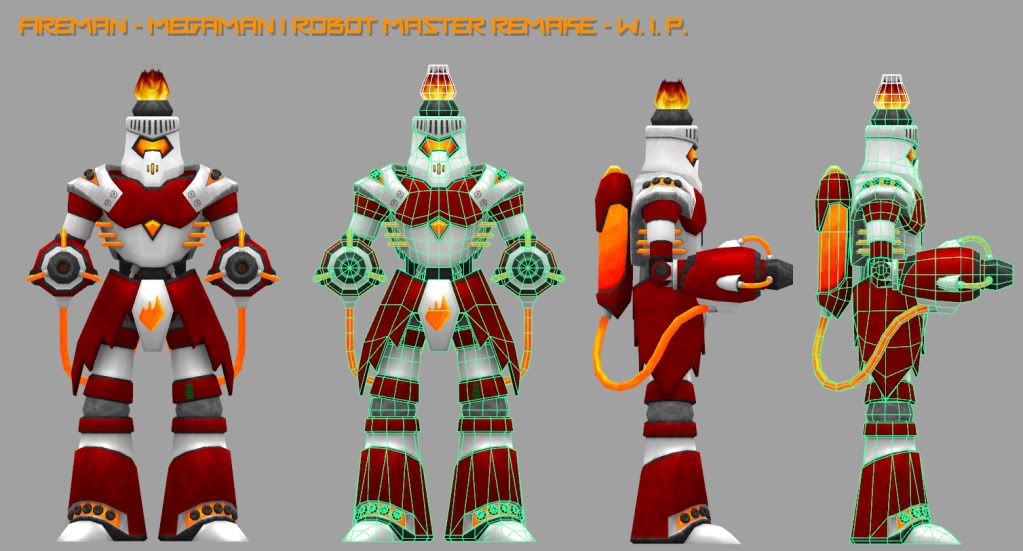
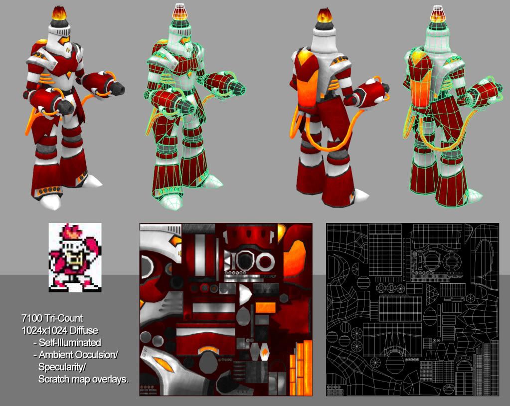
So I'm working on a remake of Fireman from the original Megaman/Rockman game. Its not quite done yet. Still adding dents and scratches into him as well as refining the specularity pass a bit more. Only using a self-lit diffuse map at the moment. These screenshots are from within maya with no lighting. I also tried to do his head flame using alphas but I can't say I'm happy with the result so if someone has a suggestion for a better method to do an in-game method of doing flames on his head and shoulders, I'm all ears. So let me know what you think and I hope you like the direction I took with this design.
Oh, and I'm intentionally trying to keep him color saturated and semi-animated looking to keep true to the spirit of the Megaman robot masters look.


Oh, and I'm intentionally trying to keep him color saturated and semi-animated looking to keep true to the spirit of the Megaman robot masters look.


Replies
Many questions for your model will appear such as:
- Will this be for a game?
- Is this animated?
- Is this for a portfolio?
- Is this for fun?
- etc.
But again having to do a model that is already made for a game from professionals will only give you too much disappointment in your model.Your competition for this Model is this from the Megaman Powered Up.
And it is fully animated and rigged with textures and so on. Are you sure you want to start from this character and not something original? You could learn much more if you did not have this much competition or regret with something fresh.
this piece is being made partially for a contest and mostly for my portfolio. I've had a fun time making this character so I have no regrets taking it on. For the portfolio part, I aim for something that shows strong modeling and texture work. For the contest I will be rigging the character to be game ready. So the suggestion to toss the character into Unreal is helpful so I can making sure he is animating properly as well.
As for the competition with the Megaman Powered Up model, I can't say I feel like I'm putting mine against the chibi one that was created since the styles are so different. As for it already being fully animated and rigged already, I consider that to be something for inspired by when I get around to rigging my remake not something I should be in fear of. So I appreciate the concern but I'm stubborn and intend to finish this regardless of any flakk I might get
btw, for those interested in checking out the contest. Its on Gamestepper.com. Currently being used by students and alumni from the Academy of Art and Art Institutes in San Francisco,CA to help us showcase things we're learning or doing for our portfolios and to help each other out.
goldensly:
I like it. if you are going to go for the more realistic touch, I think a few small details in the texture would help alot, the dirt overlays are kinda even and uniform, there should be a reason behind each dirt buildup. there should be some clean and (almost) perfect red and grey areas,
I think the guns should be mostly clean with a buildup around the nozzels, and maybe a bit extra running down from excess liquid spilling out.
all red armor is the same amount of dirty, even stuff in not-so exposed places. I think a bit of clean and an obvious amount of dirt and grim coming from joints, a leaking backpack and such will really help.
some good specular work will help with all of this as well.
or, if you want to stay true to the cartoon styling, then tone the dirt overlay down a bit, so its more of a subtle thing, rather than being so noticeable.
I personally like the flames alpha, they are very cartoony and still kinda realistic, like the rest of your model. most emitters in game will have a solution for you, but they wont give you anything near that look. I suggest to keep working with different types of alphas and plane setups, take a look at dominance war entries to see how much they can do with simple planes.
and no regrets!
As for the fire I'd do it in unreal. For two reasons. One it looks badass, and two you can make the fire go out and have him in a defeated state
In the unreal tutorial videos, they have a 4 videos dedicated to making fire. I believe it's under particles/emitters, or something like that. (they are labeled fire so it should be easy to find)
Here is a link to the unreal 3 tutorials if you don't already have them.
http://www.fileplanet.com/195417/190000/fileinfo/Unreal-Tournament-3---3D-Buzz-Video-Tutorial-Pack
Gallows: Thanks for the compliment. Once I have him rigged I'll be creating an action pose with him, this is just the pose I've been working in since I felt like it was his base pose.
Wisebrownmonkey: Going for a semi-battle worn but not run down look to him. I'll try adding a few random chipped paint patches. I have some chipped paint on some of the edges but its currently very subtle so I'll ramp those up a bit to see how it looks.
Going to put him into Unreal after the holidays and run some tests to see what I can come up with. Thanks for the link but I'm covered