3D to the Maximus!!
Hey guys and gals my name is Clint and i've been a long time viewer (and member) of Polycount and just never brought myself to post. I am a recient graduate from the Art Institute of Phoenix and i am currently working as an Intern at a company called VirTra making 3D characters for military and police combat simulators.
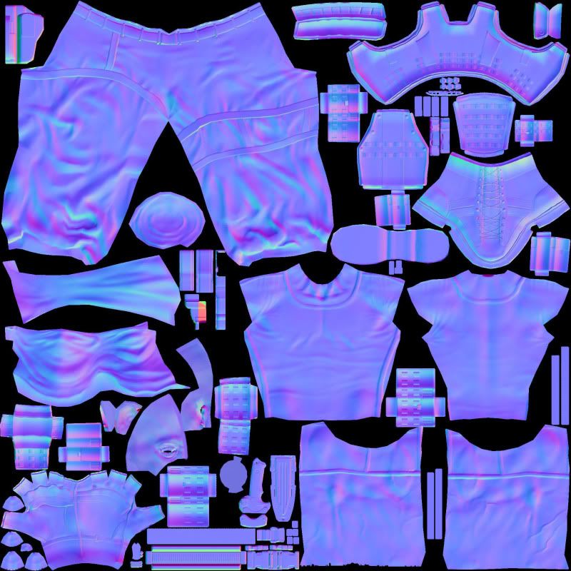
So, that's me in a nut shell! Anyway! Here's my latest terrorist. Rip me apart, i need to get better! Thanks!
Tri Count: 9,471
Texture Size: 2048 x 2048


So, that's me in a nut shell! Anyway! Here's my latest terrorist. Rip me apart, i need to get better! Thanks!
Tri Count: 9,471
Texture Size: 2048 x 2048


Replies
Textures look great though, is most of this all hand painted?
As for the poly count that's just shy of 5,000 polys. Alot of that is in the vest and gloves. The knife on the side of his leg is a little too high poly for its purpose and it's mirrored, so i can see where there is some waste there.
Tri Count: 9,471?
For actually using in a game, that's pretty high for the amount of detail that you have on the model.
The texture would benefit from a lot more detail being painted into it (fold highlights/shadows, dirt/grime/oil, etc.) You said there's a 2k, but it doesn't look like more than a 512 or 1k.
on the cloth parts, break up the obvious repeating pattern. I can see where the texture was tiled. Try using some more color variation on all of the texture. Think about the gradients in colors, even on simple cloth. Where can you put some subtle contrasting colors to draw the viewer's eyes to where you want?
As for the animation deformation comment, i don't have much experience there either. What would you suggest changing so that it was more animation friendly?
Texture Update!