Gears Inspired Hospital Map (DM)
I've been playing Gears WAY too much lately (even reading the books, get them if you don't have them). Anyway, I've been throwing around the idea of doing some level design so I figured I'd throw together an old school hospital that would fit into the Gears Universe. This is just a simple DM level, as it is my first time really doing a map start to finish.
Updates will probably be pretty lengthy, since I have a fulltime job and only get to work on this for an hour or so a day I plan on sharing all the assets once it's finished.
Enough text - Pics or it didn't happen:
Main Floor:

Second Floor (Will be open design, so you can jump to first):

Basement (This is going to look like something shady was going down):

I have already moved away from this design, I dropped it down to 1 staircase and added two elevator shafts at each hallway end...
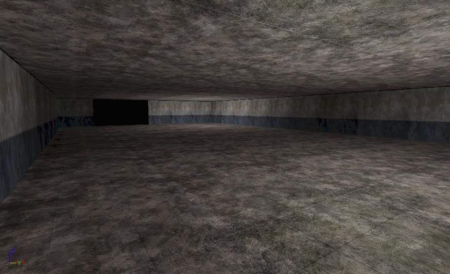
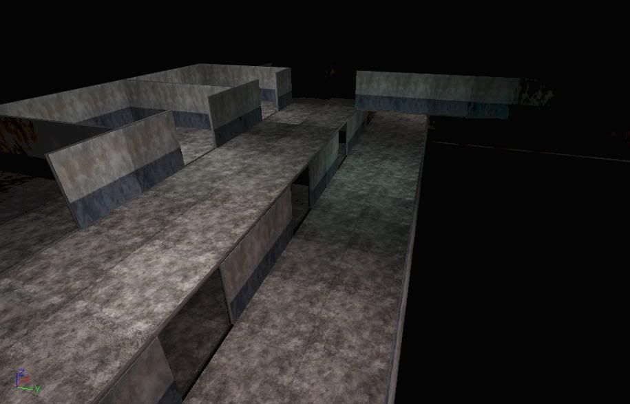
UDK screen shots:
These are just base static meshes I threw together to replace the BSP. It's only floors and walls ATM so I know it looks like hell. Also, I don't have an SM 3.0 card here so I have to bake my lightmass at home (I'll mess with the lighting once the level is complete).
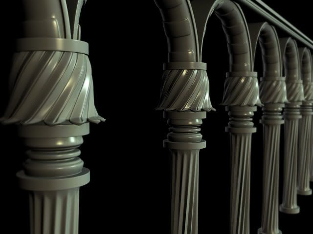
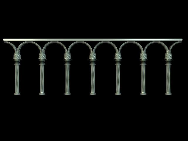
And finally, the very first Hi Poly piece of the map, the handrails (w00t):
More to come!
Updates will probably be pretty lengthy, since I have a fulltime job and only get to work on this for an hour or so a day
Enough text - Pics or it didn't happen:
Main Floor:

Second Floor (Will be open design, so you can jump to first):

Basement (This is going to look like something shady was going down):

I have already moved away from this design, I dropped it down to 1 staircase and added two elevator shafts at each hallway end...
UDK screen shots:
These are just base static meshes I threw together to replace the BSP. It's only floors and walls ATM so I know it looks like hell. Also, I don't have an SM 3.0 card here so I have to bake my lightmass at home (I'll mess with the lighting once the level is complete).


And finally, the very first Hi Poly piece of the map, the handrails (w00t):


More to come!
Replies
Usually level design, especially for DM maps with fast paced gameplay, should be built considering game flow in the first place.
U already have most of rooms as rectangles. Moreover u got dead ends everywhere.
Same height of celling everywhere does not contribute eitgher.
First of all i think u should do untextured BSP geo wiht basic lights, set up bot spawns, pickups, paths and all other gameplay elements. Then u run the map and play it. Also u might wanna run it only with bots and spectate. See how bots play without your help.
Dunno if GoW has bots for MP, but I did that for UT3.
U can also upload it to GoW modding community sites and let ppl play it and give u feedback.
Only after u can think of applying texture, adding props etc. because high chances u'll need to fix level design after that.
Otherwise it can be a nice looking hospital replication but not a fun map to play
U might want to check this out: http://www.hourences.com/book/bookgameplay.htm
Otherwise, I'm nearly done with the handrails low poly, should be updated and textured tomorrow
Thanks for the input guys!
I recently got Gears of War as well, great game!
-Buddikaman
I've had 1 and 2 for sometime, the books made me start playing the games again ha ha
Got to texture the top piece that goes with these. Hope to have this in level soon...
-Buddikaman
psycho, Hopefully it goes somewhere nice
I'm going to pop out a few more props, then I'll draw out my new map so everyone can see what I've added...
Right now I sort of get the feeling you might be starting too detailed too quickly. knocking out some highpoly action is never a bad thing (especially for learning and folio purposes) but you might want to save some of that moxie for the larger forms who's surfaces will catch a ton of light -vs- not much at all like these railings.
I feel like banging out sweet environment art, has a great deal to do with your foundations. make sure you give your self solid grounding, from which to refine further- try to think, big to small -what assets can you make that will flesh out a majority of the look/feel that you can then use to drive the look/feel of other supporting assets.
agreed the fun part is the small noodly bits, pipes, wires, decals, garbage/muck, blood, etc etc- but if you don't have a solid grounding from which to build on, you`ll find yourself spinnin your wheels.
BTW, I don't know why, but when I open your sketchbook, it takes forever for the images to load and then I get a blue screen of death when I start scrolling HAHA You're killing my pc!
The yellow square on the right side is another spot where you can move between floors. The second floor is going to be busted out (you know the whole cave in, but magically the floor is now steps
-"If I get shot here would I be able to escape/dodge"
-"Is there enough interesting height distance between level parts?"
-"Can I run fluently trough the map without dead ends?"
Or you can just get some friends and test the level before you detail it.
As far as the rooms go, where are some ones that only have 1 entrance? The only one I see is the one on the second floor that has the broken floor on it.
Also, I'm going to add some catwalks out from the second floor into that huge open area. After setting up the paths and playing with bots, there is WAAY to much open space out front.
Floor Overlays
Second Floor
First Floor
Pillar is going to be made from different metals for the top and bottom (like the railings) and then the middle shaft will be concrete...
Edit: I just noticed some blurring around the edges, that is a max error in the viewport, the map is ok
Adding it to the map now
Yeah, I will. I just threw in about 100 point lights to get everything lit. I'll light after everything is in place.
This map is gears inspired, but has nothing to do with the games, COG or Locust. Think Pendulum Wars
Sorry for the crappy lighting, working on the SM 2.0 carded machine
That was my next task :P
- The map generally leads to this central chamber, but this area has little ambition add balcony's, height differences and really think about how you want the combat to be in this area, also think about what this big room is, is it a large reception, an entrance, a plaza, a morgue ect..
- Try and avoid really long corridors without interruption, this is just REALLY boring.
- Always give the player as much choice as possible to what they do giving them 2-3 different routes at most positions is usually a good idea, because otherwise the players will become very predictable in their movements.
- Its all about the Z.. or the Y.. whatever.. add some height to your map! Different levels, layers, even if just small elevations this will really help.
Thanks for the comments man. I'll look at adding some depth the main area. That fallen down pillar really helped. The bots jump off the steps and use it as cover/height. I'll mess around with some BSP and see how it works out. Those hallways aren't very long so I think I'm ok there (they look longer in the top view than they actually are.
That's going to go between the wall pieces (like a support, dunno what to call them?).
And if you haven't guessed yet, this is going to be a Union of Independent Republics Hospital during the early years of the Pendulum Wars. :P
It's a big task man, doing a design and complete art pass. good luck! thee stuff you've done so far is shaping up nicely
Question: I saw a logo on gearspedia of the IUR and it was a lightning bolt. Does anyone know if that's correct or just some made up logo? I know they aren't mentioned or seen much but maybe its in the comics.. that's about the only gears related item I don't have yet :P
Sorry for the ugly renders, I'm too busy to sit around and wait for a decent render. I'll show you the moneyshots when the piece is complete
Sorry, when you only get like 30 minutes a night to work on this, any progress is good. You do learn how to do things very fast though.... At this rate, this map will be done in 10 years!