The BRAWL² Tournament Challenge has been announced!
It starts May 12, and ends Oct 17. Let's see what you got!
https://polycount.com/discussion/237047/the-brawl²-tournament
It starts May 12, and ends Oct 17. Let's see what you got!
https://polycount.com/discussion/237047/the-brawl²-tournament
Free Epic Lewtz! Six swords
Hey everyone,
This was a personal project I took on to expand my portfolio. I was informed entry level positions at bigger companies typically aren't filled by artists that have a lot of fully fleshed out characters and amazing castles or dragons in every project and that I needed to do something more basic.
So, I decided to concept up 6 swords that belong in the same set (or race) varying from level 1 to level 6, increase in rarity and badass-ness with each level.
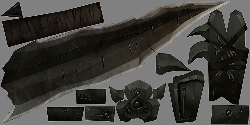
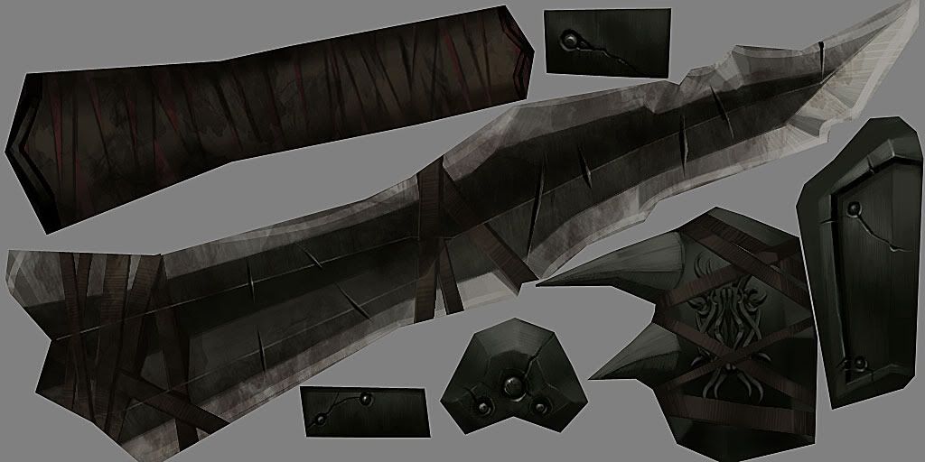
I was aiming at keeping the tri-count at a moderate level, below 1k for the level 6 sword and below 250 for the level 1 sword. They consist of a 1024x512 rectangular diffuse and spec map each.
Here is what I have thus far. They're all at what I would consider a finished stage, but I would love to receive any feedback because there is a strong possibility I will be going back and editing these next month.
I was thinking about buying Torchlight so I could bring some of these in and see how'd they'd look in-game and with particle effects
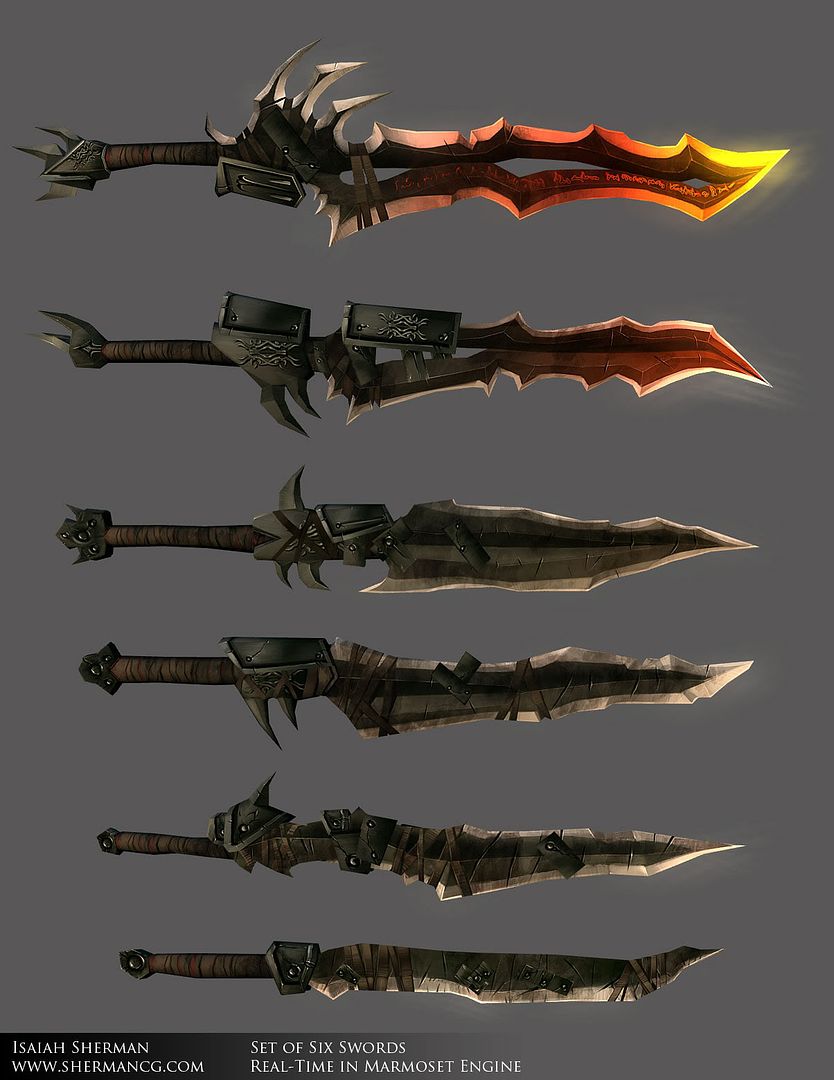
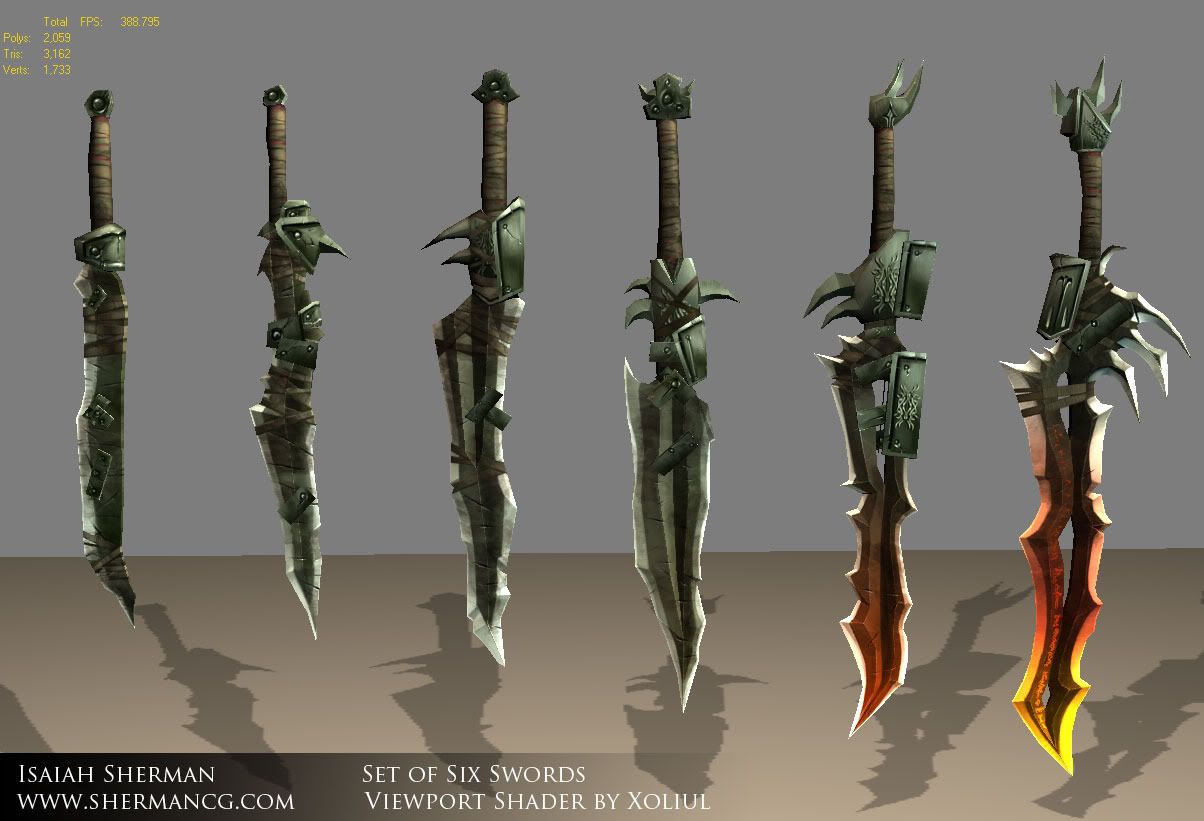
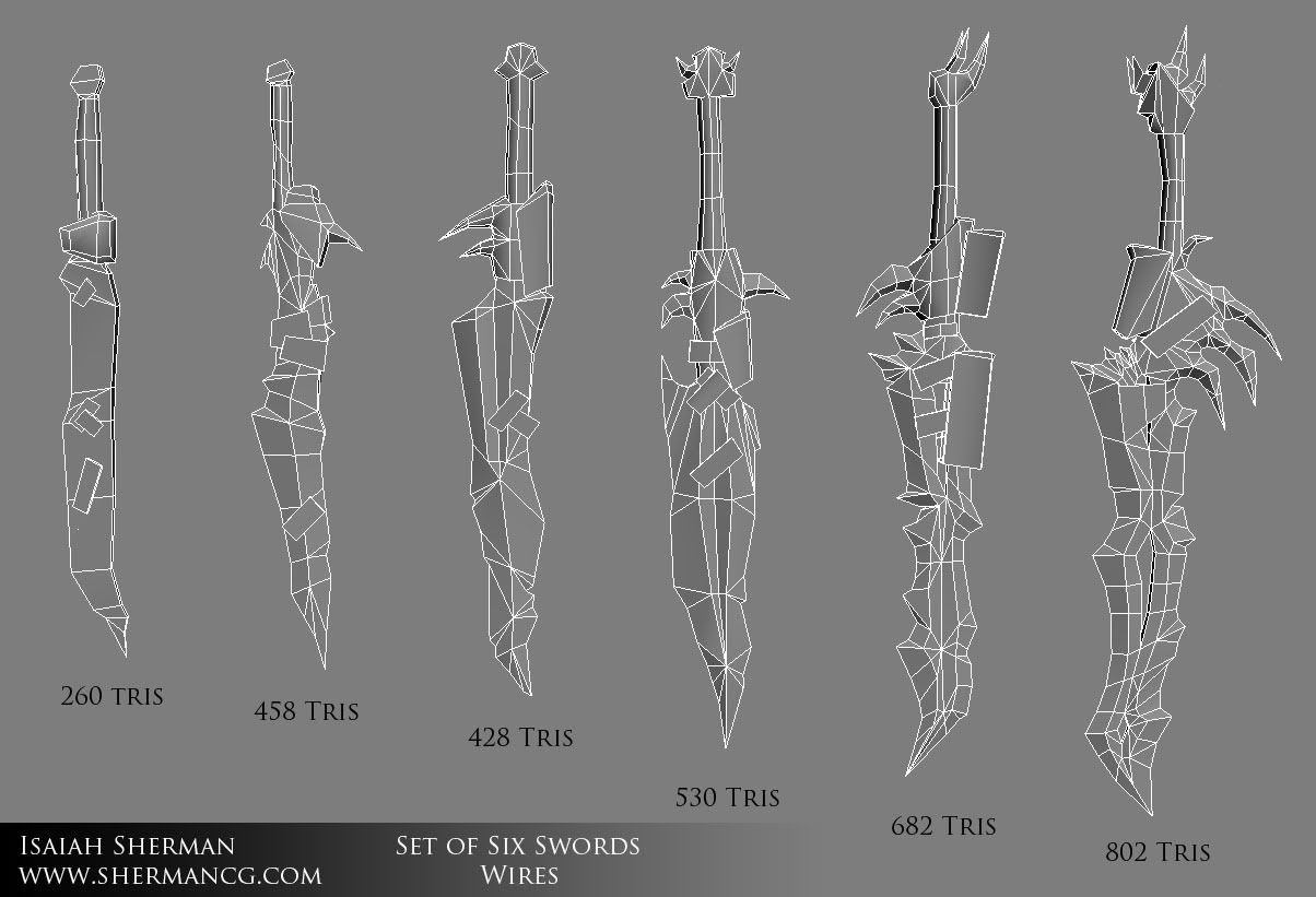
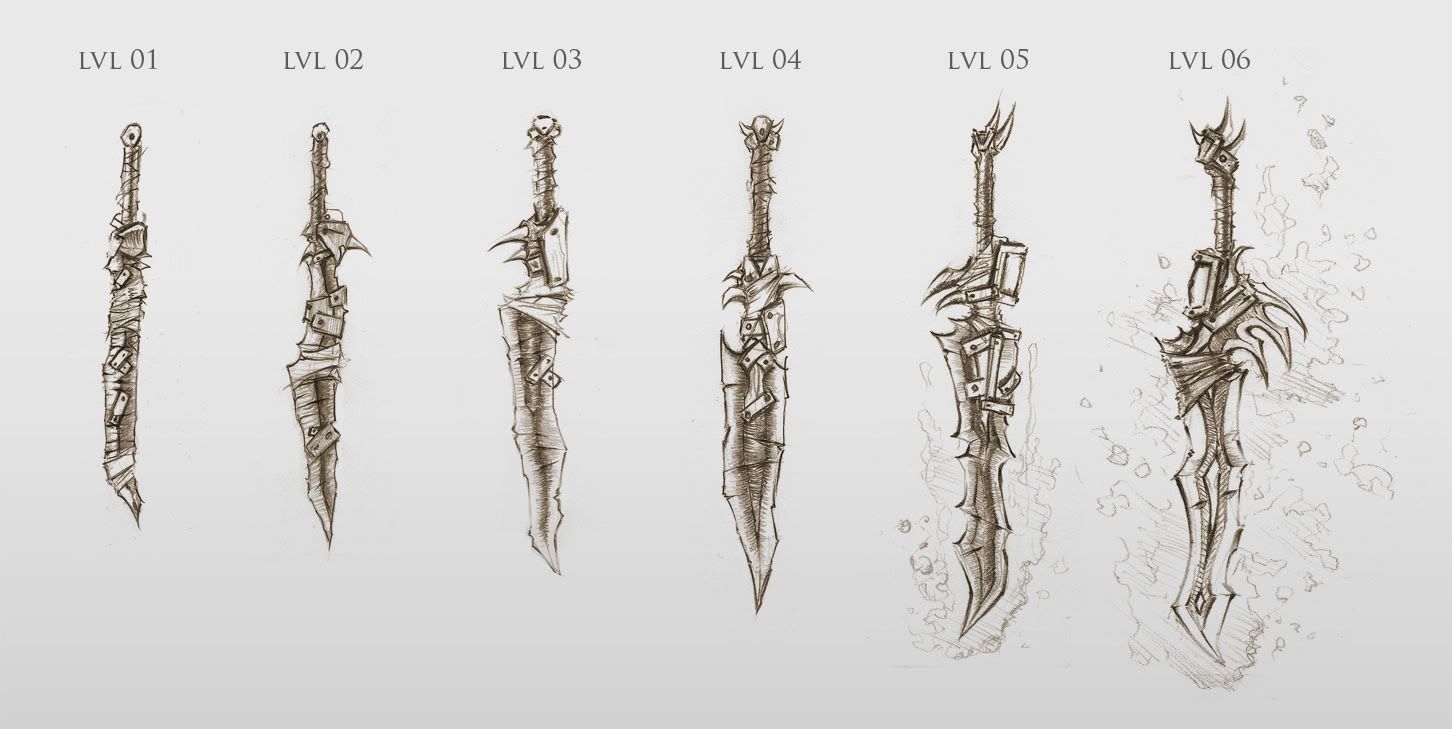
Level 4 Sword diffuse map
Level 3 Sword diffuse map
This was a personal project I took on to expand my portfolio. I was informed entry level positions at bigger companies typically aren't filled by artists that have a lot of fully fleshed out characters and amazing castles or dragons in every project and that I needed to do something more basic.
So, I decided to concept up 6 swords that belong in the same set (or race) varying from level 1 to level 6, increase in rarity and badass-ness with each level.
I was aiming at keeping the tri-count at a moderate level, below 1k for the level 6 sword and below 250 for the level 1 sword. They consist of a 1024x512 rectangular diffuse and spec map each.
Here is what I have thus far. They're all at what I would consider a finished stage, but I would love to receive any feedback because there is a strong possibility I will be going back and editing these next month.
I was thinking about buying Torchlight so I could bring some of these in and see how'd they'd look in-game and with particle effects


Level 4 Sword diffuse map

Level 3 Sword diffuse map


Replies
Oh and buy Torchlight. Ones of the best games of this year. You can't argue with $20.
As for them being reminiscent of WoW weapons, one extra thing I tried to take a stab at was their stylization as Blizz internship apps are going on right now.
Thanks everyone
really looks like I'd want to upgrade that sword
Vrav: I have had a few others say they really like the level 3 sword as well, I think it's because that's when it's getting away from being a low-level sucky sword but hasn't quite yet hit the high fantasy stage.
Sampson: Any suggestions on what you would have liked to see with the dirt?
then give me the files so I can equip them
- they look great, but some reason the high-res'ness of them freak me out and diminish the quality
- along with this, could go for some "dapled" stuff on the metal in spots to give it a more used feel.
- the cross straps seem too similar in value to the blade. Why is something wrapped around it? Make them cool & interesting! Give it some pop with some highlight edges (even if its a labert style surface), maybe a lil shadow
- as a whole it is very dark, think you could lighten the textures up about 50%
- the hilt wrappings could be a bit larger, so they're easier to read
- would be cool to have some fancy special gems on them
- the embossed stuff/etched stuff is nice, wish there was more!!
cool stuff!
Another comment, which kind of applies, but wouldn't adhere much to it on these: It wouldnt hurt to be a little more modular with your textures and models. In the age of normal maps, everything *must* have a unique texture, but in the case of these oldschool weapons and junk, you can reuse a lot of stuff and get similar results. An example being, you could use one texture for pretty much all but the final two stages of that sword, with some creative UV mapping and modular texturing.
I wouldnt redo anything here, but it is something to consider in the future.
Getting them into torchlight is super easy as well, I have been mucking around with it as well and have a project going of about 80-100 unique weapons! fun times!
As for lightening the textures, I could lighten them up a bit but on the 3 different monitors I have they seem to be consistent enough. I was going for an evil warrior black metal kind of look. If you feel they're very dark I can possibly revisit their overally lightness. Part of it may be from the post I did on the Marmoset "renders."
As for gems I think I will stay away from that. They are supposed to be kind of a dark warrior race's weapons. I could do some thick metal protrusions that emulate a gem's general shape, though.
I think I may do a bit more of the etched details on sword #5, at least a tiny bit of it to help tie in a progression of rarity.
When I bring them into Torchlight I think I will bump this thread up and post the files if you kids wanna run around and kill shit with them
Thanks!
Proxzee: I don't recall what the exact time was, but I would say overall the whole thing was probably about 40 hours or so. That's a really rough estimate. This was the first project I've used 3DS Max with so a lot of it was a learning experience.
I would have to agree with most of the crits here. they look really well done, but a few of them are very very similar. The differences might not cary over that well ingame. Definatly like 5 and 6 the most but that's to be expected since those are the ones with the most flair and color veriety.
I'd definitely bet on a bit more variations though, maybe an Axe, War Hammer, dagger..
keep up the good work!
engelik: For this project, no. For another one, definitely.This project was focused around doing a single type of weapon that varies in rarity, a challenge within itself, as I stated in my original post
:thumbup::thumbup:
I had shamefully never heard of Torchlight but I just checked it out after seeing this and it's awesome! If you could get these in and play with the particle effects that would be cool.
I had a look at the tutorials for getting weapons in to TorchED and it seems they missed off some rather important info on how to do it... it's like 'build weapon... export weapon... make icon... and..... erm.... nothing'.!
I'd remove that extra little blade on the handle that goes down towards the users hand. It isn't long enough to do any extra damage, and with the handle being shorter than the "lvl 4" type of thing, it really seems like it might pose a danger to the user.
Other than that little thing being gone, I think they look great.
Disco Stu: Oh let me tell you, everything about these swords would be troublesome in real life :P! Hell, practically any high fantasy weapon in RPGs would be troublesome
Two Listen: I agree, I will remove that small blade part.