Home 3D Art Showcase & Critiques

sci fi hangar bay

polycounter lvl 13
Offline / Send Message
wester polycounter lvl 13
This is a pretty big project i'm going to have in my portfolio. It's going to be a sci fi military hangar bay.

I'm using a concept from the Halo 3 artbook pretty closely. I'm going to try to have it done by new years, and ready for GDC next year.

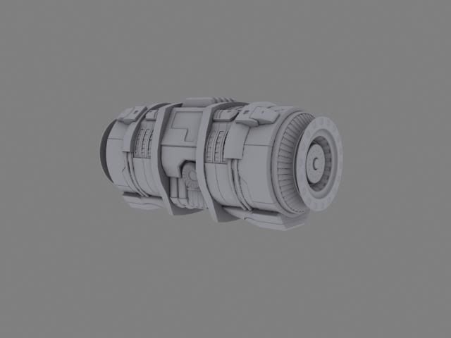
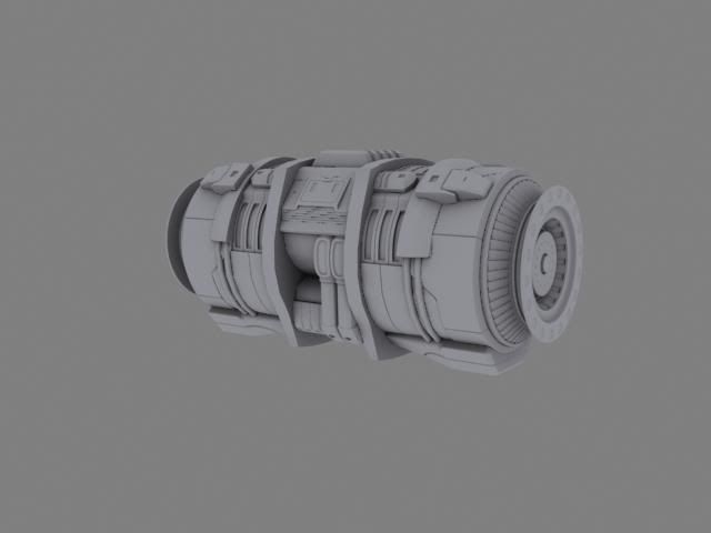
I'll be posting the WIP of the whole thing here starting with this generator.

Still WIP, i have a few design problems to work out.
generatorWIP.jpg

generatorWIP2.jpg

Replies

  • iWeReZ
    Well theres not much to say, good canister looking thingy, Maybe post the art that your following so we can get an idea of how close you are:D ?
  • [HP]
    Offline / Send Message
    [HP] polycounter lvl 17
  • wester
    Offline / Send Message
    wester polycounter lvl 13
    well yeah, the highpoly isnt done. I'll do some nice renders when it's finished.
  • Zack Fowler
    Offline / Send Message
    Zack Fowler polycounter lvl 11
    It's harder to crit if we can't make out the detail as well. AO-only renders like this obscure subtle changes in outer surfaces. Setting up better renders than this isn't difficult or time-consuming once you learn how to do it, so put in a little bit more effort and you will get much better feedback. Also, zoom in on the model a bit more -- that too will make it easier for us to give feedback on the details.

    The generator seems to be coming along well so far.
  • wester
    Offline / Send Message
    wester polycounter lvl 13
    Here are better renders.

    generatorWIP-1.jpg

    generatorWIP2-1.jpg
  • Dippndots
    looks great, doesn't feel very halo-y, which is a good thing (i.e. you can take reference images and not just rehash them using the original art style, props!).

    can't wait to see where this is going, can you tease us with any concept pics or drawings?
  • wester
    Offline / Send Message
    wester polycounter lvl 13
    Here's a quick concept i sketched up at work today.

    It's pretty vague...but the idea is there. Modular walls with sci fi pillars. The hangar bay is built into a mountain, so i want it to look like there is still rock under and behind the concrete they used to build the hangar. I just think that's a cool aesthetic.


    modular_wall2copy.jpg
  • wester
    Offline / Send Message
    wester polycounter lvl 13
    Here's one of the modular walls for the hangar bay. I did a quick blockout of the scene i'll post up tomorrow, for tonight im just goign to try to bust out the lowpoly and unwrap. it's going to be a late night.

    wall.jpg

    The negative space between those beams is going to be rock, as the hangar bay is built into a mountain.
  • DrunkShaman
    Offline / Send Message
    DrunkShaman polycounter lvl 14
  • wester
    Offline / Send Message
    wester polycounter lvl 13
    Here's an update on the hanger bay.

    Finished the highpoly on the modular walls, also decided to add some fans, they wont be everywhere but they'll be there to break up the red supports.

    textured the modular wall and did a quick lighting test, im putting everything in UDK as i make it....so i'll post up a screenshot of that so far as well.

    lastly the landing pad. It's made for smaller ships to bring the marines supplies and what not. It's the highpoly with a quick lighting test as well.

    wall-1.jpg

    wall_textured.jpg
  • wester
  • Tavor
    Offline / Send Message
    Tavor polycounter lvl 8
    I'm really liking both hi-poly renders of the landing pad and the modular wall; these came out really well. Are you using concept art as a guide? The texture is has a lot of green; I'd break it up with some dirt here and there so it doesn't all look the same.
  • Cojax
    Offline / Send Message
    Cojax polycounter lvl 10
    Some good stuff here man, nice work.
  • wester
    Offline / Send Message
    wester polycounter lvl 13
    the only concept im using is one out of the art of halo art book. It's a painting of a hangar bay that seems to have been burrowed out of a mountain side. The details are pretty implied and vague, but the composition and ideas are the same.

    as far as the tech goes, im kind of making it up as i go. :D
  • roosterMAP
    Offline / Send Message
    roosterMAP polycounter lvl 14
    the models are great, awesome, amazing... but the colors you went with... YUCK!

    still, good work on the models.
  • uneditablepoly
    I agree, the colors on that textured one give it the wrong feel, in my opinion. The modeling's all really solid though.
  • vcortis
    Offline / Send Message
    vcortis polycounter lvl 9
    Modeling is really fantastic any chance I can see some wires?
  • wester
    Offline / Send Message
    wester polycounter lvl 13
    Thanks for the input guys. I'm going to desaturate the green alittle bit.
  • crazyfingers
    Offline / Send Message
    crazyfingers polycounter lvl 10
    Nice work wes, quick crit on the fans though. They look a little flat, the part of the blade that's furthest back you might want to darken up in its ambient to add a bit of depth, they look more like speakers than fans right now.

    I know this isn't finished, but right now everythings a little too modular. Hope you have a really killer hero prop on the way that'll be a focal point. Anyway, this is coming along quick! keep it up dude.
  • LlamaJuice
    Offline / Send Message
    LlamaJuice polycounter lvl 11
    It's lookin pretty nice :P

    The only suggestion I have at this point has already been said (the colors in that texture are blah... especially the green) but overall I'm excited to see how this pans out :P
  • Mark Dygert
    Looking pretty awesome!

    Not every edge needs to be scratched exposed metal. You can highlight and pronounce edges in other ways. A slightly lighter diffuse edge with slightly brighter spec works great. When you have ever edge damaged not only does it stop making sense, but it starts to become noisy.

    A good way to do damage is to first lay down your diffuse in full color no damage.
    - Then while looking at it ask yourself:
    "If I was going to drag a pallet of XYZ into this door what would I hit the most and how would it effect it?"
    - Sub-d your model a few times, apply vertex paint and block in the areas that will be most effected. Bake this out to a flat texture and use it as a guide for your damage. (unless your unwrap is really simple you can probably skip this step)
    - This takes a lot of the guess work out of "where do I put the damage" when you stare at a jumble of UV pieces.

    Really great modeling, good textures!
  • wester
    Offline / Send Message
    wester polycounter lvl 13
    Here's the startings of the UDK scene. So far i have the modular walls and hte starting of some lighting with some geometry blockouts so i can find a good composition.


    The focus is going to be a small one manned drop ship in the middle (if i have time). There's a landing pad with pillars that line the opening of the mountain.

    As far as props go im going to have crates, and those two cylindrical pieces to the right are going to be generators. I'll think of more props as i need to. I'm going to also add foliage to the opening of the mountain at the top. I'm goign to have some vines hanging down with trees and bushes at the top to imply a jungle.

    It looks abit pink because the default blue and gray tetures in UDk, hopefulyl it wont look like that when i fill it in.

    UDK.jpg
  • crazyfingers
    Offline / Send Message
    crazyfingers polycounter lvl 10
    Hmm, i think you should drop the middle of the room down a bit, kinda have a slope that goes to the center area so you can see the effort you put into it, be able to look down on it just a tad.
  • wester
    Offline / Send Message
    wester polycounter lvl 13
    Here's some small progress on my senior project. Did a UDK screen grab and did a super quick paintover. my tablet pen pressure was being stupid so i didnt spend too much time on it. just to get the idea across.

    I'm going to start on the lighting asap. I need to atleast have a lighting blockout by the end of the week.

    Next on the list.

    1. crates
    2. generator
    3. various rocks
    4. misc wires/pipes
    5. sci fi forklift (or some type of tech that helps feed the idea that this is a loading and unloading bay)
    6. FOLIAGE!!!

    Render2-2.jpg
    Paintover.jpg
    render1-4.jpg
  • A.Kincade
    Offline / Send Message
    A.Kincade polycounter lvl 9
    This is all coming together very nicely Wes. I think when you have it all finished it will be a legit piece to add to your already awesome portfolio. Keep up the the good work. Can't wait to see more.
  • Amadreaus
    I like the pillar, pretty nice color scheme as well. For your main scene, just don't forget about the AO!
  • DrunkShaman
    Offline / Send Message
    DrunkShaman polycounter lvl 14
    Awsome work!! Thanks for sharing.
  • natetheartist
    Offline / Send Message
    natetheartist polycounter lvl 9
    The colors are feeling very halo-y.
    If that's what you're going for, awesome, if not, you may want to desaturate things quite a bit for a more "serious buisness" kinda style.
  • wester
    Offline / Send Message
    wester polycounter lvl 13
    Here's a paintover i did today in school for the environment. Just wanted to get a final thought on what i want it to look like.

    Page7.jpg
  • ajr2764
    Offline / Send Message
    ajr2764 polycounter lvl 10
    This is looking good, but Im not sure about the lighting setup in that scene. Overall my eyes are just seeing alot of yellow and with the light from the sun it seems your scene would be a bit washed out...?
  • reiro
    Offline / Send Message
    reiro polycounter lvl 10
    Really nice stuff. You using archvis shader in max for high poly renders? Or is this maya?

    The color scheme is a bit too colorful for my taste a slight bit warmer yellow would look nicer
  • Autocon
    Offline / Send Message
    Autocon polycounter lvl 15
    Hey Wes I'm liking a lot of the changes you are making to the scene. The landing platform is not getting nearly as lost as before and you dont have the ridiculous amount of dead empty space on the right as you did before.

    As I said before I think you should make the rock walls different chunks and very the heights a lot more. Give it some dramatic elevation differences. Also I still dont like those big honking yellow things on the tops of pillars. I think the idea that they would "help lead a aircraft down" is still kinda goofy and would have never got that unless you told me.

    I think you can give off that impression with lights, they could be yellow but they just look like yellow blobs right now.


    As for lighting it seems a little strange and too yellow with all this yellow light down in a cave, sure it might be from lights turned out but I think if you had a setting sun with light spilling over the tops of the cliff walls into hanger area with some nice cool blue atmospher down in the "darker dank" cave will make this a must stronger piece.
  • wester
    Offline / Send Message
    wester polycounter lvl 13
    Ok I need help.

    the shadows from the foliage seem to be affecting the wrong side of the geometry of the rocks...so it's creating this weird dark spot. UDK isnt treating the rock as two sided...even though it is.

    I'm not sure how to fix this. So help would be sooo appreciated.

    What's left:
    Crates
    god ray or rays
    atmospherics

    Then i'm calling her done. Time to learn and move on.

    Render-1.jpg
  • brandoom
    Offline / Send Message
    brandoom polycounter lvl 15
    Just a suggestion for the rocks. Have you tried making a 2nd UV channel for them? That may or may not solve the weird shadows.
  • PredatorGSR
    Offline / Send Message
    PredatorGSR polycounter lvl 14
    Scene looks great so far.
  • crazyfingers
    Offline / Send Message
    crazyfingers polycounter lvl 10
    odd, have you tried putting a quick shell modifier on them? Might fix the normals and at least block the light coming through from the other side.
  • build.
    Offline / Send Message
    build. polycounter lvl 11
    i love where this is going, keep it up.
  • Rhinokey
    Offline / Send Message
    Rhinokey polycounter lvl 18
    i still think you are gettin a bit nuts on the scratches on things, the tall green pillars have scratches all the way up it, what would be tall enough to be constantly bumping into them things to wear the corners up that high.

    the other day in target i confused my girlfriend by taking her shopping cart and trying to replicate the way the stores suport pillars had gotten their dings and scrapes (not hitting the pillar, but just checking the height of the cart and the location of the dings) most all the dings lined right up with the upper lip of the cart at expected, tho there was some i could not figgure out, maybe from some larger handcarts the stock ppl use or something.
  • A.Kincade
    Offline / Send Message
    A.Kincade polycounter lvl 9
    I like what you've added Wes. The foliage is turning out pretty sweet. Not sure about the rock thing. Hope you figure it out.
  • Matroskin
    Offline / Send Message
    Matroskin polycounter lvl 11
    Vegetation needs some fake subsurface skattering ;)

    Shadows on leaves r too dark. U can fix that by adding a little bit of self-illumination to leaves' shader. U can plug the diffuse into the Emissive channel, but first u could Multiply it with a low-value constant in order to control the "subtleness" of self-illumination.
  • DennisGlowacki
  • wester
    Offline / Send Message
    wester polycounter lvl 13
    Thanks for the help guys.

    Matroskin: that's a genius idea. I'm going to do that for the SSS

    This has been my first real environment...unfortunately im not happy with it. I'm going to finish ti for the class of course. I've learned alot from this assignment and am ready to move on and learn from it.
Sign In or Register to comment.