The BRAWL² Tournament Challenge has been announced!
It starts May 12, and ends Oct 17. Let's see what you got!
https://polycount.com/discussion/237047/the-brawl²-tournament
It starts May 12, and ends Oct 17. Let's see what you got!
https://polycount.com/discussion/237047/the-brawl²-tournament
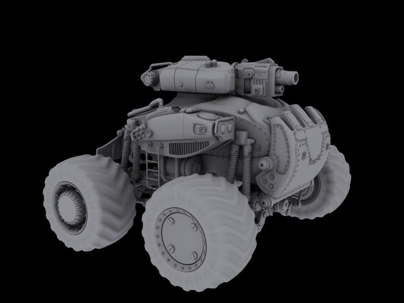
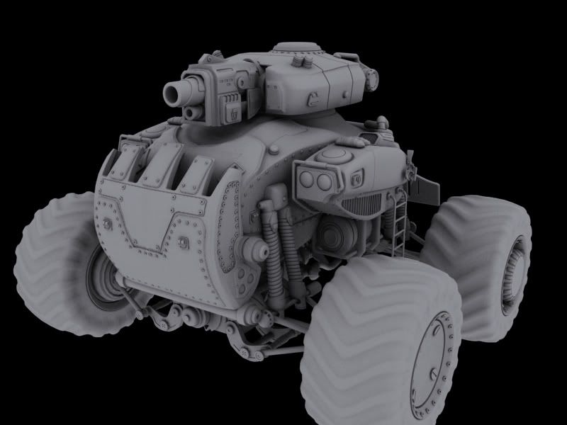
Gears_Rhino_tank_WIP
I start this tank awhile back and now decided to finish it off! The basic idea is that the tank is a modified version of the centaur. The Rhino is meant for high impact low range combat... kind of like you every day shot gun but with explosive rounds. Tell me what ya think.
Also I know some of you have seen this tank on one of my previous posts, and that's fine. I am just going to keep posting updates on this thread, going from high res to game res.


Also I know some of you have seen this tank on one of my previous posts, and that's fine. I am just going to keep posting updates on this thread, going from high res to game res.


Replies
the overall design though really looks like something that belongs in the Metal Slug
universe more than Gears.
can never go overboard on bolts!!!
The scoopy front makes it feel a little imbalanced, like its top heavy. Rest of the bits inspired by the centaur are really closely matched! good job
Also - can we see your wires?
yea get some work in on making a badass tread on those tires and this will be lookin pretty damn good
ps like the scoop gives tons of personality
-Woog
You do have bolts that are too close together on the one side panel, I mean they're almost touching, might as well make them smaller and more like rivets if you want that many.
Your shapes also look puffy, the object looks like it's made out of molded plastic rather than metal. You need sharper edges and some more defined curves with tighter bevels. It would also help if you show'd your model with some lighting and specular, it'll help the shapes read better.
Here's some images from the net that I found that might help
Would look cool with the scoop down too, hopefully thats possible!
but yea, that scoop kind of goofs it up a bit. It resembles the exaggerated underbite of a bulldog and the side-mounted lights immediately become eyes and the whole form starts to look like a caricature just a tad bit. To be fair, the effect is lessened with the tires on it, but it might be worth refining the overall shape a bit to get away from that.