First ever character- Egyptian Guard
Hey! This is my first time posting a new thread here!
So I have been working on my first character lately. This one was done in about a day or so. I tried keeping this thing pretty low poly. I didn't want to exaggerate anything by putting too many edges everywhere.
This was done only in 3dsMax, and I'm not texturing it for now. So a high poly bake in mudbox/Zbrush won't be necessary.
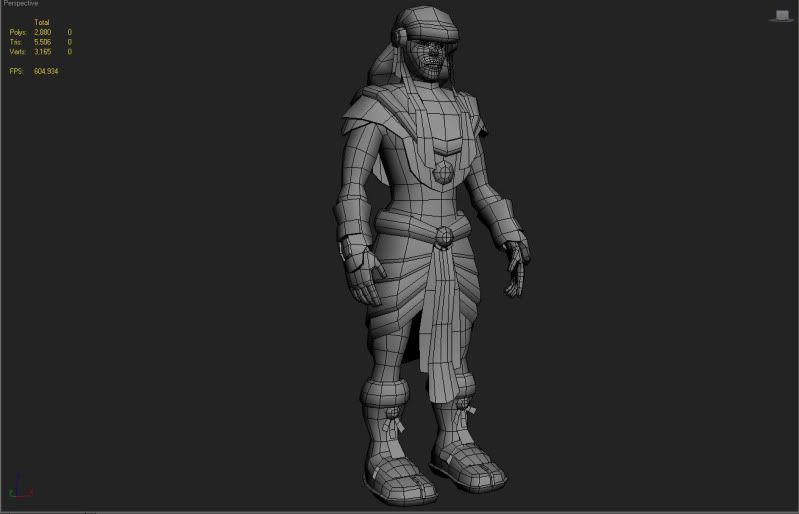
The polycount of the actual character is 4392 tri's (I have other objects in the scene.)
I want your crits!
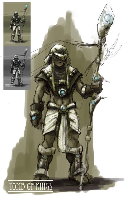
Here is the original concept that I based my character on:
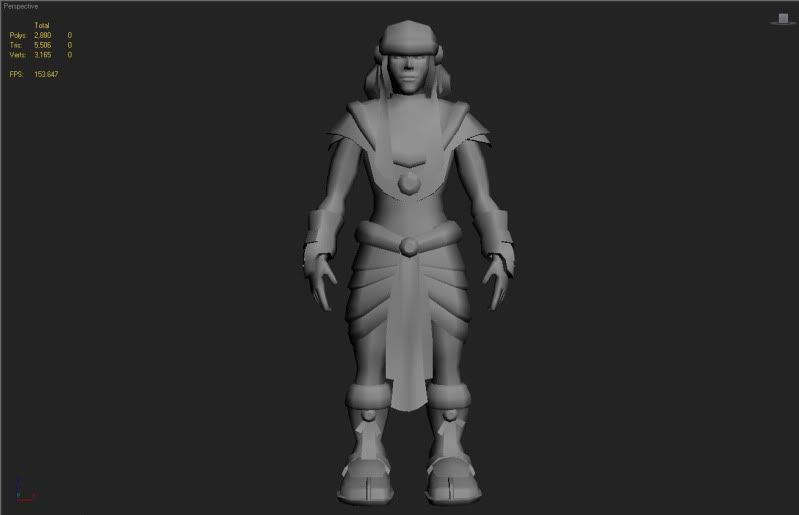
And here is the character itself!
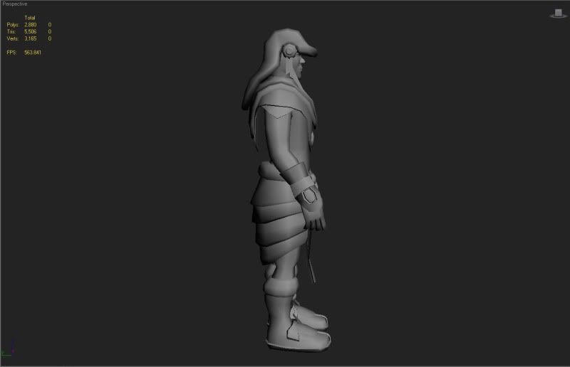
And here is the wireframe:
Thanks!
So I have been working on my first character lately. This one was done in about a day or so. I tried keeping this thing pretty low poly. I didn't want to exaggerate anything by putting too many edges everywhere.
This was done only in 3dsMax, and I'm not texturing it for now. So a high poly bake in mudbox/Zbrush won't be necessary.
The polycount of the actual character is 4392 tri's (I have other objects in the scene.)
I want your crits!
Here is the original concept that I based my character on:

And here is the character itself!


And here is the wireframe:

Thanks!
Replies
Thanks again!
More crits welcome!
Here are my crits:
The face looks too long and thin
Hands look too small
Arms could be more muscular
Hips should be wider and much higher up (look at the spacing between the clothing he is wearing in the stomach area, there is hardly any)
The side could use some work also:
I would probably accentuate the spine more.
Stomach area thinner, and bring the shoulders back.
The arms appear to be straight from the front, but they are bent in the side. It's okay to model this way, but you have to compensate for this because if you made them straight now, they would actually be way too long.
Boots and legs bigger
Legs shorter in general
The hat looks like an eagle head or something, so there should be a point more on the bill (edges should be pretty much perfectly straight, coming to a point)
Like I said the concept has a sort of cartoony vibe going, almost like the person is a child there.
In this sort of style you typically have bigger forearms and hands, and bigger calves, and feet/boots, and a very round face.
I think it's important that you over exaggerate these features if anything, because you are just doing the model and the textures will not be there to help sell it.
So yeah, I can see how using real life proportions would make it really hard to get things looking correct, because the concept is by no means portraying real life proportions.
Anyways, for a first character model you did a really nice job. Don't call this done yet though, keep working on those proportions!
I'll keep working on the proportions though. Thanks again!