Early WW2 French Tank - Char B1 bis
Hi everyone,
Here's first wip post of my current thing i'm working on.
French B1 bis:
[ame] http://www.youtube.com/watch?v=I_vBH3-He_Q[/ame]
[ame] http://www.youtube.com/watch?v=2JJqDIQOuJE[/ame]
I love its design that visually represents a transition between retro WW1 and WW2 machinery.
For now I've finished low-poly model and did "clean-no-mud" Normal map for it.
Actual Diffuse is some basic baked AO and gray-white colors for now.
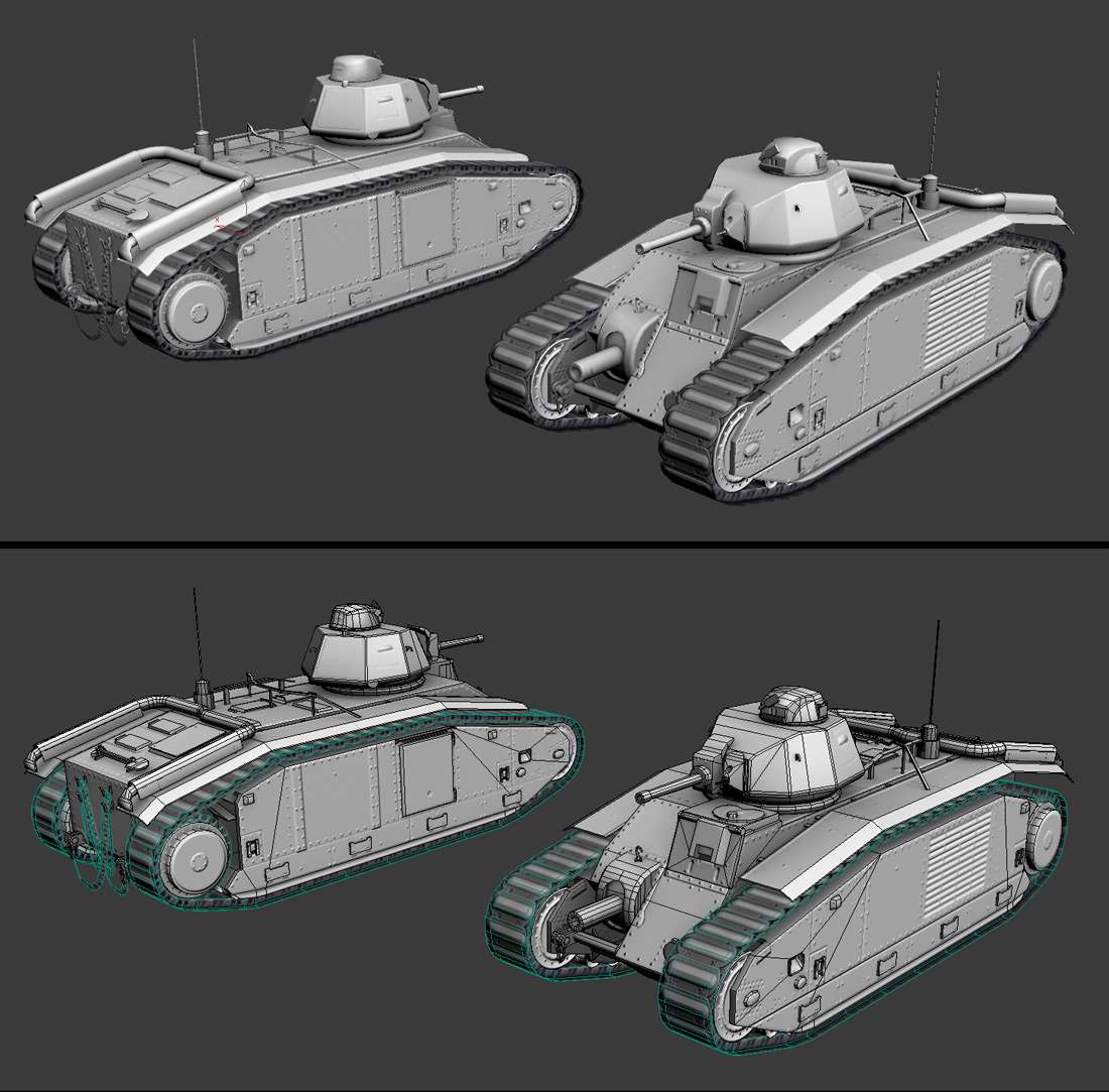
Here's first wip post of my current thing i'm working on.
French B1 bis:
[ame]
 http://www.youtube.com/watch?v=I_vBH3-He_Q[/ame]
[ame]
 http://www.youtube.com/watch?v=2JJqDIQOuJE[/ame]
I love its design that visually represents a transition between retro WW1 and WW2 machinery.
For now I've finished low-poly model and did "clean-no-mud" Normal map for it.
Actual Diffuse is some basic baked AO and gray-white colors for now.

Replies
Uncle Theodore will be proud of it.
never heard of him as Theodore :P
@ Joe Lemonade - I did partially by baking and partially by paining them in PS, since the size of many details is fairly small.
The whole texture is 2048 so some stuff is literary 1-2 pixels wide which makes it faster to just paint manually.
As for the "real" hi-res elements used for baking they r all done as "floating" geometry. They all baked one by one and then combined in PS. For example, seams layer, rivets layer, grids layer etc.
This allows to obtain Normal map faster compared to making real full hi-res tank :P
Ill post some wips of thosewhen i finish finish.
Just working on Diffuse texture now.
Still need to add paint scratches, marks, refine details (tools, tracks, chain etc.).
Displayed as fullbright with vertex color:
Render, God obliterates New Orleans.
It's on you bro..
maybe it would look more interesting if you changed the hue on the different parts. like if the treads were slighly different hue, or maybe just more desaturated than the body. it seems liek the whole thing has a uniform yellow coloring on all of it.
also noticed in that video that there were flames coming out of the exhaust once in a while and theres a lot of burn marks at the tip.
preferably in marmoset hehe
My words.
Also, I think it's Max you use; don't you get wildly uncontrollable camera movements when you work orthographic? I used to lose focus of my object every 10 minutes before I stopped using Ortho...
00Zero - yep, i worked more on tracks. Also in the vid exhaust was kinda cut. And i actually added some burned tips and also some black smoked areas on mud protectors under exhausts' tips.
butt_sahib - well, as to me, if doing environments it is important to use orto in order to have correct proportions and shapes. It is also easier to navigate and faster. Perspective can be useful just to see the scene as "in-game" view once in a while to make sure it is ok.
If doing characters maybe Persp is better also to model, dunno, haven't worked with characters.
I hope it answered your question, though I don't get well what do u mean "old school software".
Xoliul, 00Zero - no problem if u use "rotate around selected" mode. This way u always can comfortably rotate with no problem should u have multiple selection, one object or sub-object selected.
I feel actually easier with user viewport navigation than with perspective :P
Anyways, here is some update.
For now i am mostly done with Diffuse, except for maybe minor tweaks here and there :P
all texture sheets r of their original size, but main texture is originally 2048 (here it is 1024):
Maybe ill downsize this one at the end, feels uselessly hi-res compared to the average texel density of other textures:
the normal map seems completely lost in the diffuse texture, or did you disable it to work on the diffuse?
Around 11 K tris.
Textures 2048x2048, 512x256 and 128x128
Renders from Unreal Engine 3 :
Soon I gonna post some more breakdowns and maybe will add my first ever mini tutorial on my website :P
bad example but you'll get my point.
By the way, my name is Theodore. And I'm pretty proud. But I'm not your Uncle.
Cheers!
@ ZacD - because of shading issues (2 perpendicular faces = they have different shading) plus twice more polys for that. In this case u see them mostly from one viewing plane so chain like that gives better result as to me.
Also when I c chains like that in game i like em more, so i decided to try myself as well
@ BUSYROBOT - well, it is finished, i'm done with it :P Dents and scratches r there btw. Plus it has dust and mud in some areas. that is why scratches r more visible on top parts than on bottom.
thats a good dirt colour if you're driving around in australia, but european dirt tends to be lighter and slightly more yellowish.
if you added in some heavy mudcaking on the tracks and lower parts of the trackwalls, in a very dark somewhat saturated brown to simulate wet mud, and a lighter yellowish brown dirt for the middle parts that have dried, you'll get some nice contrast in the lower parts of the tank.
here's a pic from WW2, and your tank side by side for a comparison between contrast:
which shows the heavy contrast between the light and dark dirt in the photo, and the almost uniform dark grey in your model. well, its partially the light as well.
But first i had to consider that such vehincles don't get a shiny paint on them.
Second, it has lots of dirt and dust on it. Therefore i had to get a balance between visible spec AND dust/dirt. The lower part has less strong spec but upper part, especially turret has got stronger spec.
My quality ref for such things is usually World at War (dedicated CoD fan:) :
http://pc.ign.com/dor/objects/14222042/call-of-duty-world-at-war/images/call-of-duty-world-at-war-20081007050103387.html?page=mediaFull
http://www.lowpings.net/gamingnews/wp-content/uploads/2009/01/tank-beats-infantry.jpg
But anyways, my point was to get it realisticly spec-ed and not "next-get" shiny :P
Well, maybe there could be slightly more spec though
@ dejawolf - i understand what u mean, though on the photo that u showed the contrast is achieved mostly with light and shadows :P
To obtain such image by desaturating a color image u need to have white colored tracks for eample
@ conte - thanks man.
the white tracks is because its a dry day, and the tracks are covered in dried mud, which gets this very light faintly brown colour.
you can see the light mud on the side of this CV90 on this pic:
the bright mud shows up light gray in this pic as well, while the heavy mud caking gets a medium gray colour. you can see the sides of the hull in the WW2 photo has this very bright tone, which means they're covered in dried mud, while the turret has a much darker tone.
yeh, the light adds a lot to the image as well.