The BRAWL² Tournament Challenge has been announced!
It starts May 12, and ends Oct 17. Let's see what you got!
https://polycount.com/discussion/237047/the-brawl²-tournament
It starts May 12, and ends Oct 17. Let's see what you got!
https://polycount.com/discussion/237047/the-brawl²-tournament
Character Redesign
Hey guys, i havent posted any of my own stuff for quite a while now, been really busy at work lately. However I've finally decided i need to start doing something before i end up losing my artistyness to the world of no skill required box moving and unpacking.
So I decided I'd start working on a next/current gen remake of a character and possibly whole game series that i've been involved with a bit over the years.
The game series is called Knightman, created by Kingdiz, a pretty good friend of mine. In Knightman III: the Demon Within, i actually did the painting of the character in the main menu.
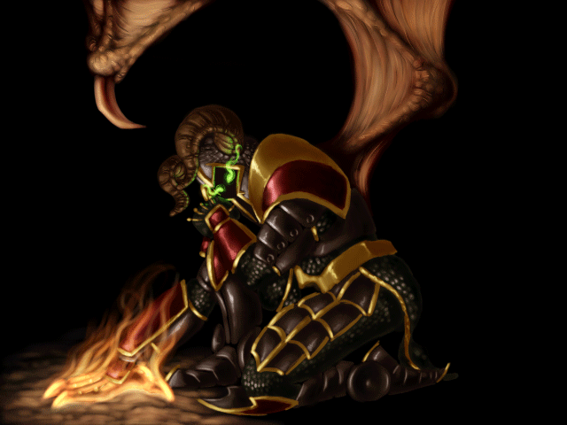
That is of course a really old picture and every time i look at it i count the flaws, as is the same with much of the work i've done.
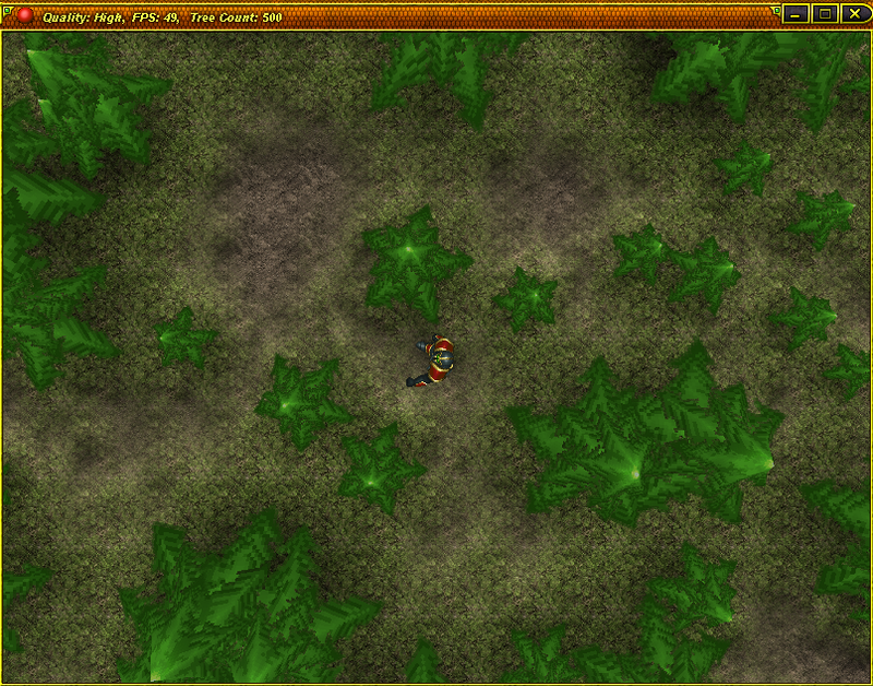
I've done a few iterations of this character, a top down pixel art version:
and most recently (though still a year or so ago) i decided to create a warcraft style 3d version of the character:
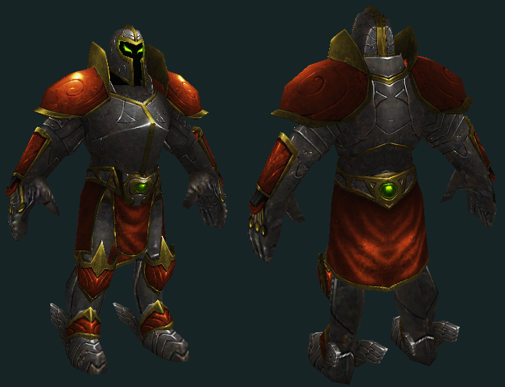
Looking back at even that version there, i see there are problems in the mesh itself, and how i've unwrapped it, and then the shading appears to be flat and even rather muddy in places. I've decided that it's time for a remake and redesign of the character, pending approval from the original creator (who has stopped working on the series). If i get approval i plan to create a proper sequel to the original game with high quality visuals, shaders, high polycount characters and gameplay that marries diablo with classic zelda.
Before i get started on the concepts i'm curious what you guys would like to see in a revamped version of this character? I'd like to keep the colors and general style of the armor intact as it is really what defines the character, but i'm open to suggestions and crits, what you think would improve the character to make him seem more bad ass i guess is the best way to put it, and if you have any reference that you think would help then show away!
So I decided I'd start working on a next/current gen remake of a character and possibly whole game series that i've been involved with a bit over the years.
The game series is called Knightman, created by Kingdiz, a pretty good friend of mine. In Knightman III: the Demon Within, i actually did the painting of the character in the main menu.

That is of course a really old picture and every time i look at it i count the flaws, as is the same with much of the work i've done.
I've done a few iterations of this character, a top down pixel art version:

and most recently (though still a year or so ago) i decided to create a warcraft style 3d version of the character:

Looking back at even that version there, i see there are problems in the mesh itself, and how i've unwrapped it, and then the shading appears to be flat and even rather muddy in places. I've decided that it's time for a remake and redesign of the character, pending approval from the original creator (who has stopped working on the series). If i get approval i plan to create a proper sequel to the original game with high quality visuals, shaders, high polycount characters and gameplay that marries diablo with classic zelda.
Before i get started on the concepts i'm curious what you guys would like to see in a revamped version of this character? I'd like to keep the colors and general style of the armor intact as it is really what defines the character, but i'm open to suggestions and crits, what you think would improve the character to make him seem more bad ass i guess is the best way to put it, and if you have any reference that you think would help then show away!

Replies
However, I don't think the wings on his boots fit very well with the rest of the look.
I also think it'd be cool if he had some sort of green smoke coming out of his helmet where his yes are, sort of like in the drawing you did, but more spread out and going upwards instead of out towards the sides.
That's just what came to mind from looking at the last design!
I agree with dv8ix, the in-game shot looks pretty bad. It really needs to be at an angle instead of directly overhead. It is in 3d right?
Also, the wings on the boots do look pretty odd, but the painting in general looks really nice to me.
But my main crit with the character is the proportions. They simply don't work well imo and he looks sort of like a little person, instead of a big tough guy (which I'm guessing he is supposed to be).
Anyways, I hope this doesn't come off as too harsh but since you said you are thinking of re-doing it all, I figured I would give you some crits to think about.
Good luck man, and as long as you are painting as good as you used to, I'm sure this will turn out great!
QUestion:
why do you keep revisiting this character? just curious!
My reason behind revisiting is because I enjoy the original game a great deal and I think he has a lot of potential if taken in the right artistic direction.
thanks for the comments guys. Lost my net access at home and my tablet drivers aren't working so no pressure sensitivity, which is gonna slow my progress tremendously