The BRAWL² Tournament Challenge has been announced!
It starts May 12, and ends Oct 17. Let's see what you got!
https://polycount.com/discussion/237047/the-brawl²-tournament
It starts May 12, and ends Oct 17. Let's see what you got!
https://polycount.com/discussion/237047/the-brawl²-tournament
ASQ, Awesome Space Quest
Hello fellow polycounters!
I'm a student from Sweden that studies at The Game Assembly. This is my seconds year at this school and we have just started producing 3D games. Last year we made four 2D games (posted Wings Of Steel last year as well).
Anyways, this friday we finished our first 3D game. This year we were assigned one group of 5 artist and 5 coders. We had 10 weeks to finish this game, the graphics engine was built by our coders and is built from scratch with the directx sdk. We used collada as mesh format. All code and all graphics is built from scratch using Visual studio (for code) and maya+photoshop for art.
During these 10 weeks we had lessons and assignments as usual.
As you probably understand i'm not a coder but a artist (so if anyone has any code questions i can't answer them but i can forward them to our coders).
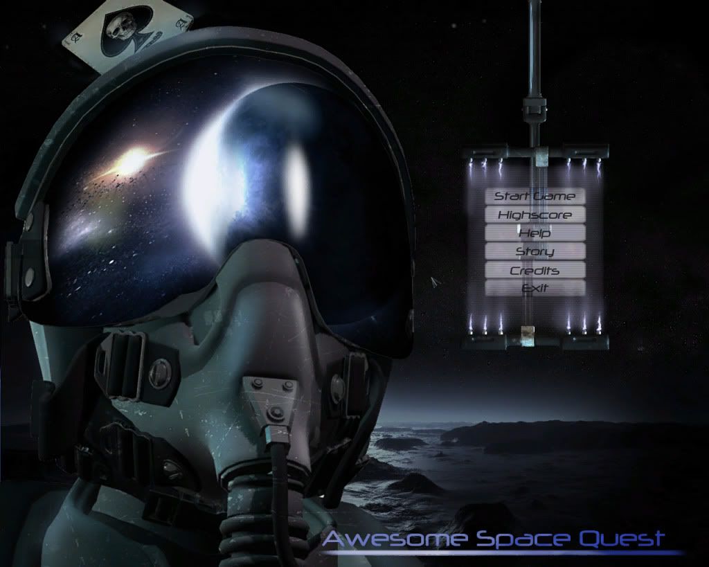
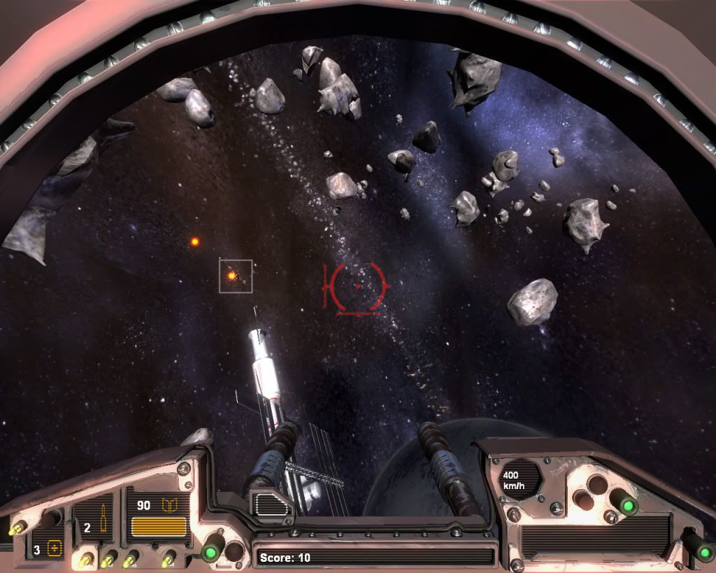
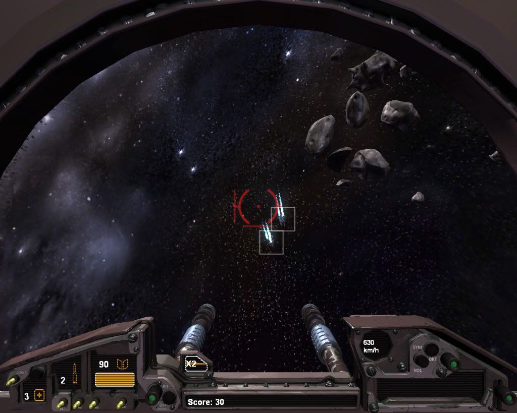
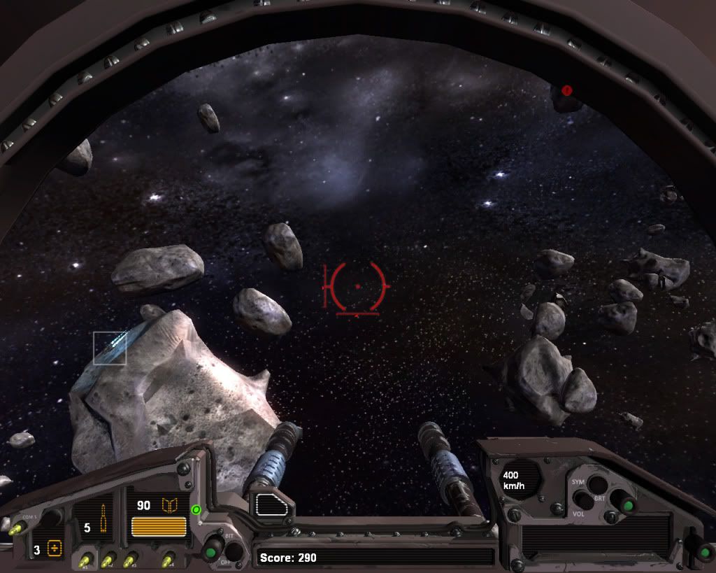
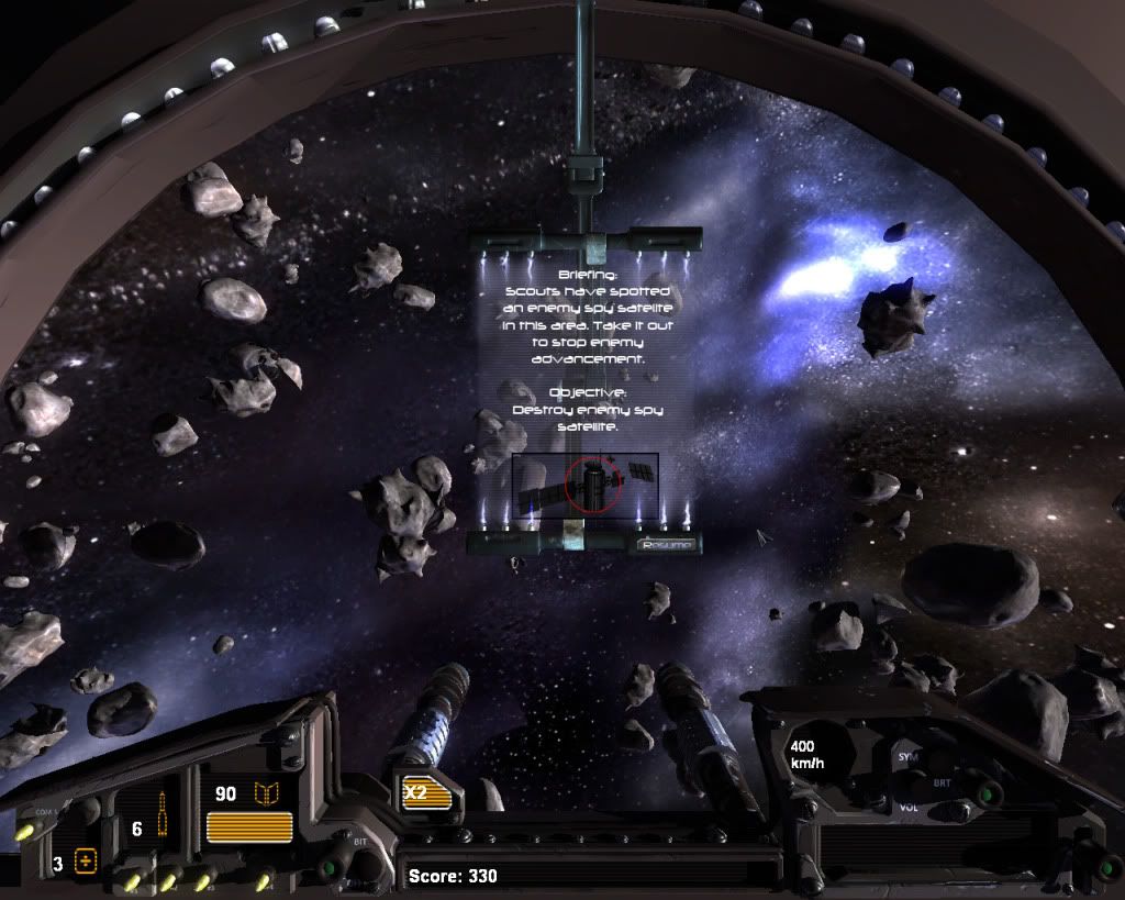
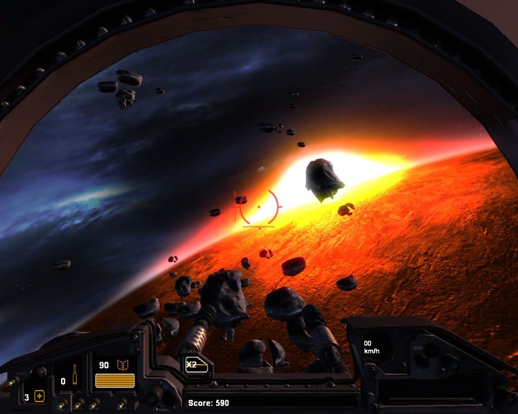
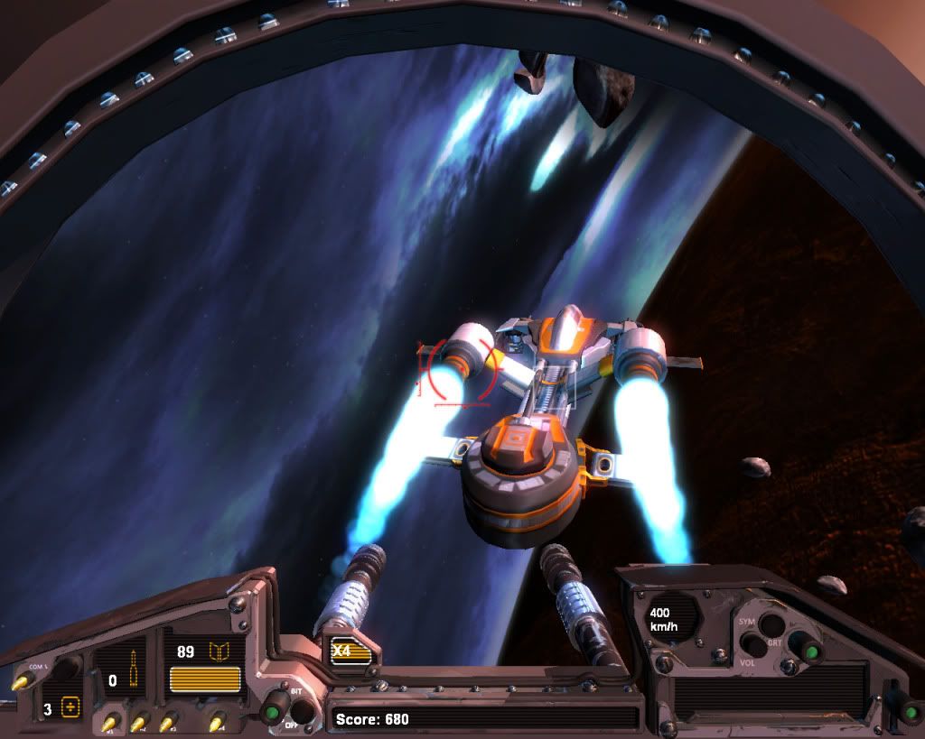
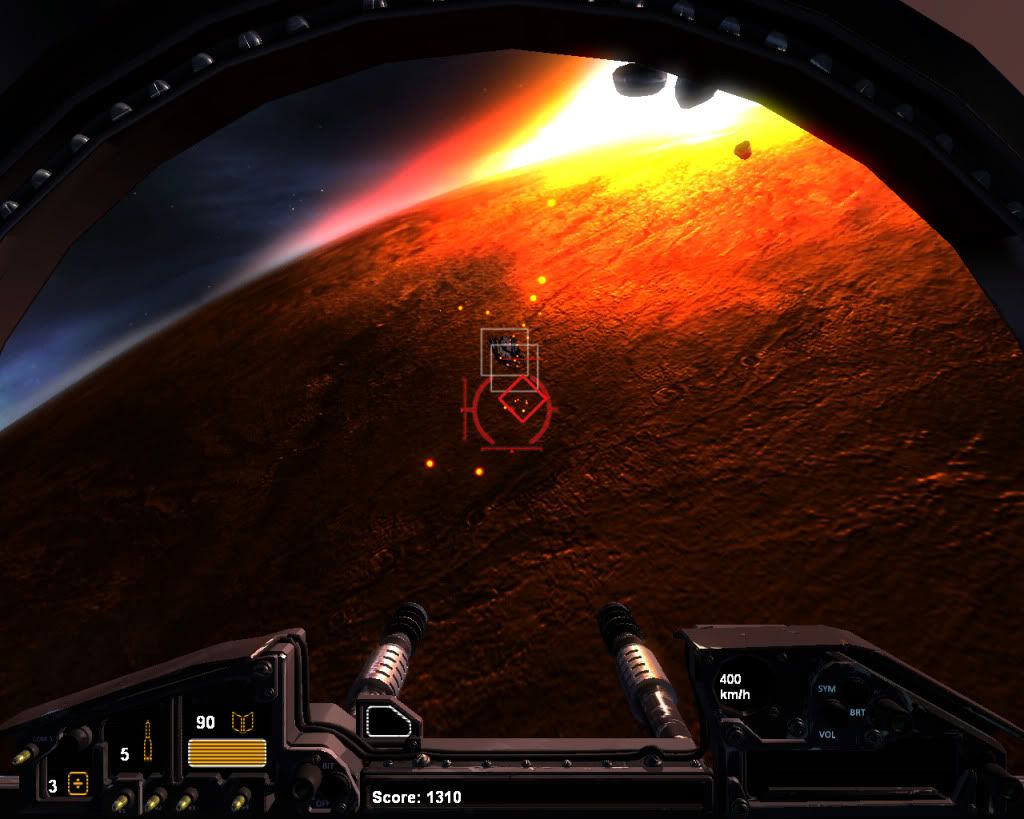
Here is a few screenshots from the game and a link if you want to download and test it. There will be a trailer posted on youtube later on for the ones that can't play it (it is quite performance heavy and not that optimized).
And the game for those who want to try it out.
Awesome Space Quest
This game is not in anyway intended as a final product or sale product. Only as a educational project. Property of The Game Assembly.

I'm a student from Sweden that studies at The Game Assembly. This is my seconds year at this school and we have just started producing 3D games. Last year we made four 2D games (posted Wings Of Steel last year as well).
Anyways, this friday we finished our first 3D game. This year we were assigned one group of 5 artist and 5 coders. We had 10 weeks to finish this game, the graphics engine was built by our coders and is built from scratch with the directx sdk. We used collada as mesh format. All code and all graphics is built from scratch using Visual studio (for code) and maya+photoshop for art.
During these 10 weeks we had lessons and assignments as usual.
As you probably understand i'm not a coder but a artist (so if anyone has any code questions i can't answer them but i can forward them to our coders).
Here is a few screenshots from the game and a link if you want to download and test it. There will be a trailer posted on youtube later on for the ones that can't play it (it is quite performance heavy and not that optimized).


And the game for those who want to try it out.
Awesome Space Quest
This game is not in anyway intended as a final product or sale product. Only as a educational project. Property of The Game Assembly.

Replies
Now play our game!!!
a) The HUD atm is rather dull, you have a lot of wasted blank space in the top left/right sides.
b) These screens are not widescreen, which means a HUGE percentage of people are either going to see a different effect or have stretching. In fact, if you used a widescreen res but moved the HUD up (so that the bottom of these screens is the bottom of the viewing area, with the top cut off) then it makes much more sense. But how do you plan on supporting different aspect ratios? I would likely model the top of the HUD seperately and then simply align them to the top/bottom where needed, but that may create an un even playing field for different players...
Either way, food for thought. I think it looks great so far, so keep up the fantastic work.
a, yeah.. the hud got rather rushed.
b, the game is programmed after our school screens, 1280x1024. Since time wasn't anything we had alot of we didn't have time for resolution settings. So yes, it looks strecthed on a widescreen. Hopefully we will add widescreen option later on.
Thanks for the crits.. hope you try the game as well :poly121:
Congrats on your finished project.!
some toughts..
something the pops for me, is the general lighting. I see like a general directional light over everything. In a game like this you can make full use of different lightings and separate planes with it, like ship interior(darker, constant light)/outer space, and you can even make more contrasted areas for showing dinamic light like flares or explosions.
Guess you didn't had the time for fancy stuff, but it adds much depth overally.
Ships looks very nice too.
Downloading..
The game has dynamic lights for ship engines and bullets. These will light up ships and props. Doesn't show in the screenshots though.
We didn't have that much time to polish static level lighting but there are three kinds of light. A directional light, a shadowcasting pointlight and an ambient light connected to a ambient color cube map.
The next game will have dynamic lights spawned with explosions as well (we just forgot it and then it was to late to add it).
Unfortunately, i agree 100% with ZacD.. and it's hard to even say what happened here.. but I think that what it LOOKS like you guys are missing is a high level art direction.
the pieces themselves look fine, but they don't fit together. get your lead artist to study some composition theory and get some art style reference for the next project. it'll make it 10000000% better. not only will it look better, but the game will read better and it'll be easier to play..
haven't tried it yet. maybe i'll give it a shot right now..
Hopefully our next project will look better since this was our first 3d game.
Also, the guy in the main screen mostly looks like a MIG-pilot or something, not a space pilot.
Overall I'd say its good work in such short time