Home 3D Art Showcase & Critiques

Science Lab Assets

polycounter lvl 11
Offline / Send Message
Firecracker197 polycounter lvl 11
Hey there, I haven't pimped any of my stuff in awhile since I have been working like mad just to get it done in time for graduation, but now I think I need you guys! Hopefully I can start to be more active on here again now once school is done but if you can please give me some critique on my final project!

This is the concept by Adam Brockbank
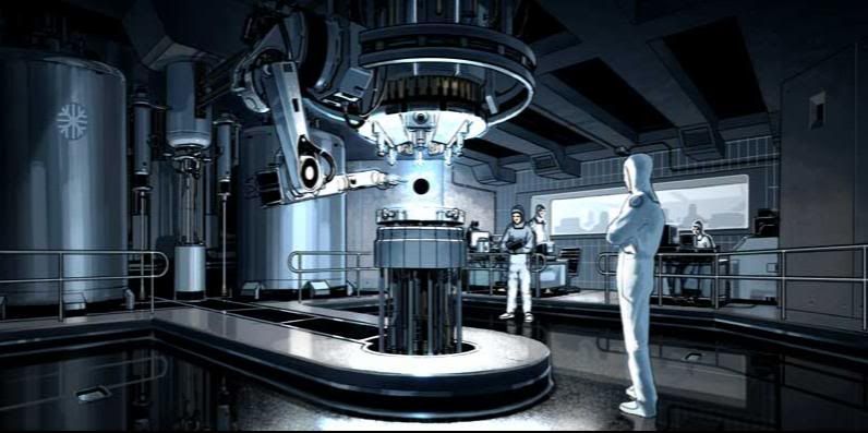
adambrockbank_environment_large.jpg

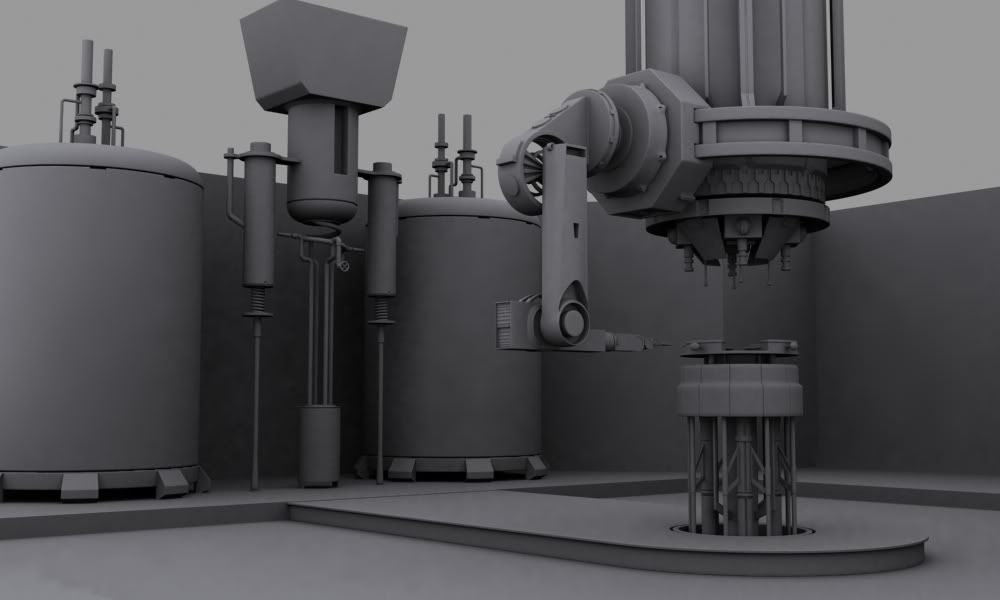
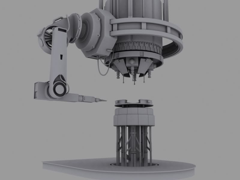
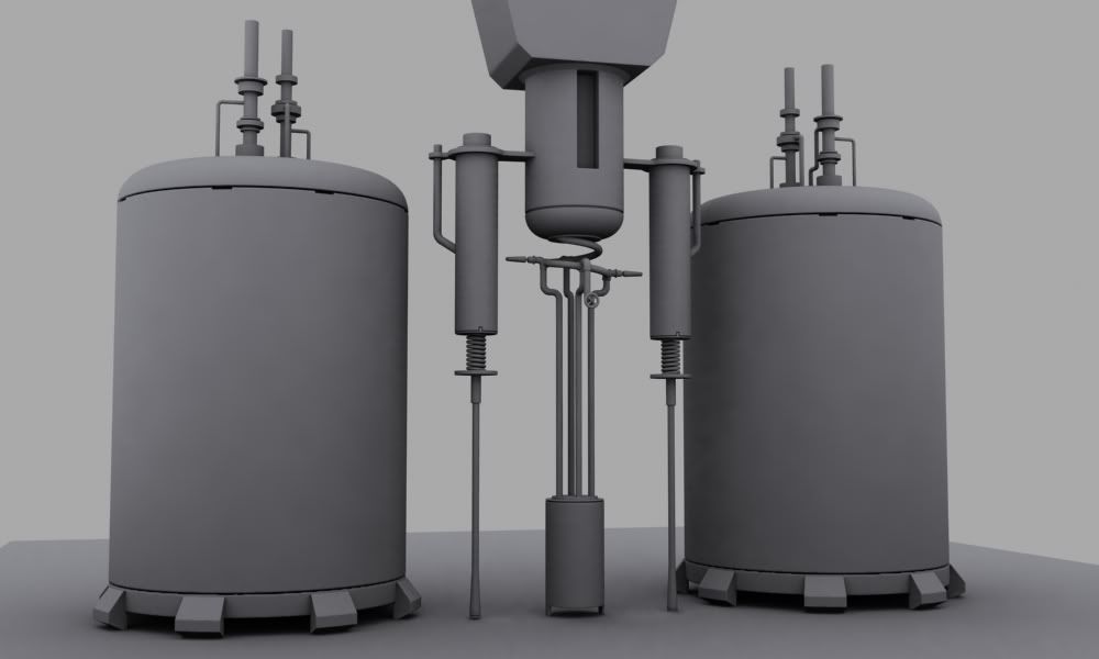
Here are the highpoly models:
scene11-04-09_01.jpg
centerpiece11-05-09_final.jpg
generator11-04-09_01.jpg

Some wires (i'll get better shots once I get on my main computer)
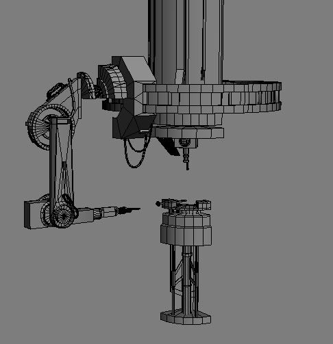
centerpiece_lowpoly.jpg
this is before I mirrored pieces to share UVS

Here are the bakes with normals:
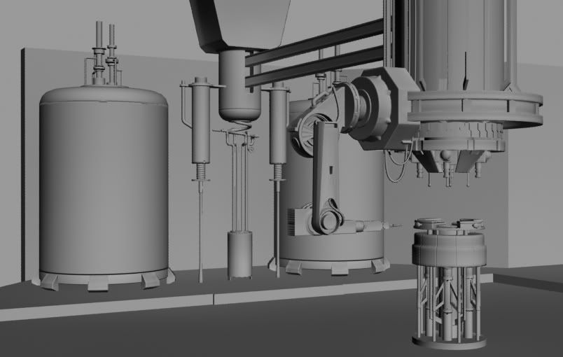
baked_scene.jpg

And here is where I need some help, the concept doesn't give me much to go by as far as color design, its mono-toned and I'm not sure I should go for that same design in my pieces. If anyone has any ideas of what direction I should go in that would really help.
Here is what I have going so far, its just base colors and simple spec.
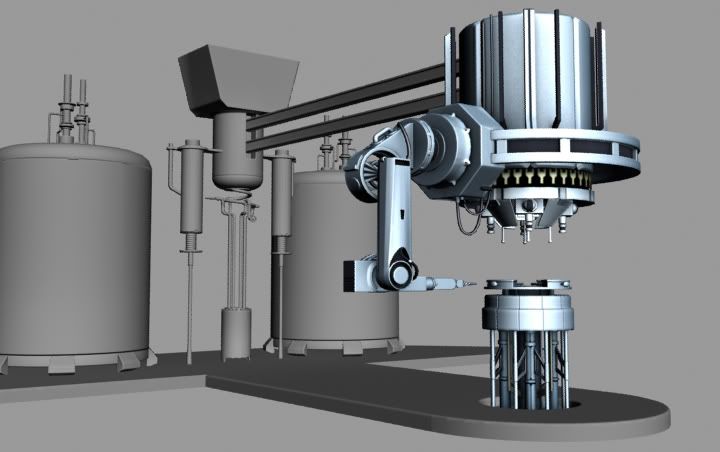
diffuse_test.jpg

Replies

  • Cojax
    Offline / Send Message
    Cojax polycounter lvl 10
    This might shape up to be a good modeling piece. I wouldn't worry about color and lighting at this stage, and focus on the modeling right now. You need to make those pipes and wires a lot thicker and more pronounced. Work on getting a wider array of bevels in your models, some of these bevels are way to sharp and sadly will not show up as well as say a nice double bevel. Heavy or big pieces of steel / metal require bold corners or 'bevels' to sell there massive weight and size. Try not to just intersect large pieces into one anther, but rather figure out how large machines like this are built, look at tons of reference, don't relay souly on the concept. The concept is there to give you direction and should not be 100% copied. Use your artist judgment. To be honest I think the concepts point of view is boring and if I were you I would come up with a better camera angle that showcases your center model a little more. Forgive me if some of this makes no sense it was quick and dirty heh.

    ST_Series_Robot.288192526_std.jpg
  • Dippndots
    this is looking good, try white, blue, purple and some yellow for a color pallet if your going for the whole clean room look
  • Shiraz
    You should use hard surface modeling for your high poly normals instead of polygon modeling. Unless im mistaking otherwise it looks very blocky.
  • Firecracker197
    Offline / Send Message
    Firecracker197 polycounter lvl 11
    Thanks for the modeling tips guys, unfortunately since I only have a week left to finish it I don't know how much they will take into effect on this model, but I will definitely keep those things in mind in the future. I will keep working on the textures and post up some progress later.
  • Firecracker197
    Offline / Send Message
    Firecracker197 polycounter lvl 11
    Here's what its looking like as of right now:

    nice_render.jpg

    generator_front.jpg

    centerpiece_front.jpg
  • imb3nt
    Offline / Send Message
    imb3nt polycounter lvl 14
    Cool idea. Those guys are doin some SCIENCE.
  • Rhinokey
    Offline / Send Message
    Rhinokey polycounter lvl 18
    Shiraz wrote: »
    You should use hard surface modeling for your high poly normals instead of polygon modeling. Unless im mistaking otherwise it looks very blocky.

    hard surface modeling over polygon modeling? what exactly do you mean? (its late an i'm really sleepy so sorry if i misread something here.
  • Shiraz
    Bah my bad probably a bad way of saying that, what i meant was Sub D modeling over standard polygon modeling.
  • Firecracker197
    Offline / Send Message
    Firecracker197 polycounter lvl 11
    Except I did use sub-d modeling, like I do with all my models. I don't know what about this made you think I didn't maybe I should work on that.
  • Rhinokey
    Offline / Send Message
    Rhinokey polycounter lvl 18
    well a lot of your shapes are very primitive looking, cylinders boxes which kinda gives it that low poly look. its not really your fault, the concept is mostly basic shapes also.

    i'm not saying its the case here but i've seen this happen when a concept artist who is not well versed in using 3d aps trys to go the route of blocking out a scene in 3d and then paint over it. it tends to look a bit basic. (not that this is a bad method far from it when done awesomly)

    but again adam may have been wanting a kinda primitive form style with that concept.
Sign In or Register to comment.