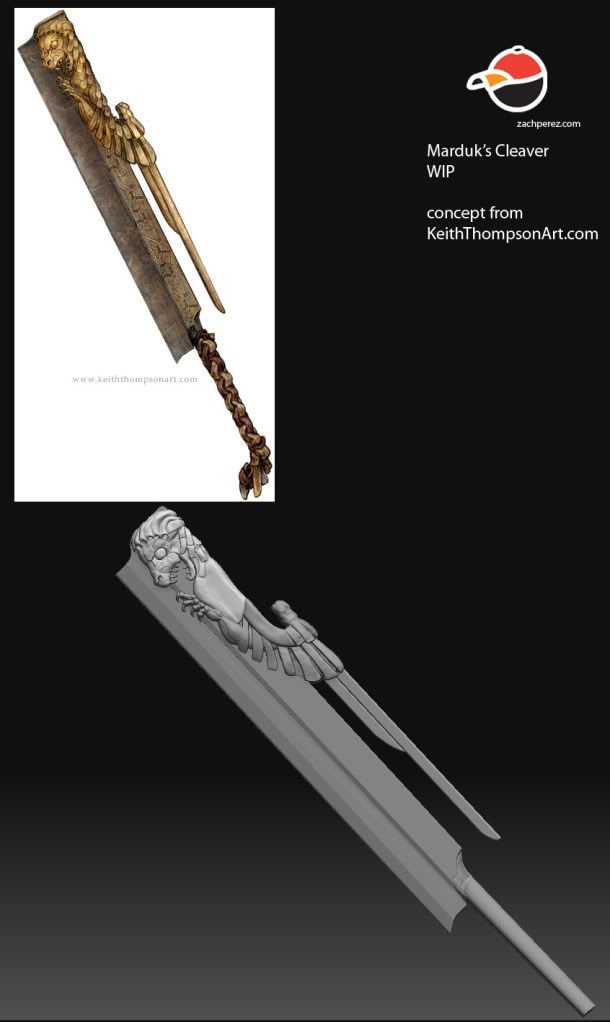
Found this piece of concept art by Keith Thompson awhile back and decided to start doing it. Still got a ways to go but hoping to get modeling done by sunday, will try to keep updates coming, im kind of bad at that though. c&c always welcome. Thanks
Alrighty like i had noted kind of bad at posting updates, but this time is was because i hadn't really touched it in awhile, unfortunately. Some problems getting a wacom, thanksgiving, and yada yada. Gonna try to finish up the sculpting tomorrow. would love some cc, handle still needs love i know, but would love some feedback on the rest. Thanks
Hey guys thanks for the comments, i've been working on this handle for a while now, and just dont seem to be getting anywhere. have tried some different looks, like this one the best. Gonna go to bed for a bit now, will get back to it in a few hours. But would love some input. maybe some ref of how this would look in RL. Thanks
look how braiding works, you could even try it on your own to understand ist, build that with splines and loft a shape around it
[ame]http://www.youtube.com/watch?v=DlhTICwoRjo&feature=related[/ame]
this is a 5 strand braid, from the concept i'd say its either a 3 strand braid, which would give it a bit more stability but it could also be a 2 stranded braid, which will make ti easier for you to recreate, search for rope braid in that case
I think the easiest way to go about it be to get some ribbon and a cylinder (spent paper towel roll?) and try out some different weaves.
from looking at the concept, I don't think that handle weave is even possible. I think it's supposed to look like it's been wrapped and woven around the handle.
unless im not seeing something, feel free to correct me
yeah the concept guy prob just did somehting he thought looked cool may not be based on any possible weave at all, or maybe it is,, give him a email an say "wtf"
hmm... is tricky! I don;t quite "get" the handle on the concept handle, alsorts of pain and problems for the user... am assuming its solid with leather wrapped round it.
Neox is onto something there could look good!
Firstly though .... Rotate the "handle" some 45 degrees.... so the edges are more aligned to concept.... see what i mean?
edit... does it look like the artist has done the humble "chain" not a weave on 2nd look?
neox - thanks for the video link and the ideas, i did a little bit more looking into the braid idea, and i think he drew it as a 4 strand but that would work, with the metal hilt that would be there, but from it i got some ideas.
dippndots - that is a great idea, i hadn't noted what you said till now, so if you all still think this one looks bad im gonna give that a go, and try to find a patteren i like.
rhinokey - yeah i think that is what he did, and it does look cool.
willburforce - not sure what a humble chain would be. sorry
i wound up going with a 2 strand rope braid, and added in a third strand in some places to break up the patteren, a little bit like it might have been repaired. still needs a bunch of work, gonna keep cracking at it now, but here's where im at
Hey all, thanks for the support. Thicken up the handle a bit and did some more work on it. Gonna call this hp done for now, though im sure when i look back at this is a few hours gonna see more to change as always, C&C always welcome. Thanks again. looking at it now i think im gonna need to change up the little pieces of leather hanging off the back, oh well, for tomorrow.
awesome work dude, the only thing i see, and its a tiny one is at the hilt on the underside of the blade as seen from the middle picture, are the 2 lines, not sure what's causing them but they are the only thing i can spot that seems off
Alright, started making my low poly a bit ago, and just finished up a once over, still to dense so gonna be cutting out more polys. any suggestions for density? I'm gonna be putting it into unreal for renders, so i guess whatever a game made using UE would have for a first person weapon, then what should i shoot for if 3rd person? current count is 8847 tris, i figure im gonna shoot for 4k, but was looking for peoples input on this. don't really need help with cutting kind of got that down, just what count i should try to hit. thanks
well a little update got it down to 5988, could probably go a little lower but will loose some silhouette so probably not gonna do it, and i looked to see what the tri counts were for the weapons at my old job and they seemed to be in the 6k range so i figuered i was fine.
now gonna uv and do some bake tests
alright just finished up my ao, had a ton of problems baking this one and did a ton of clean up, need to get better at baking 8( so this is ao and normal in the maya viewport. now time to start texturing
Started some texturing on saturday and have done a bit today, still got a ways to go but its a start. would love some c&c maya viewport screengrab. i know i got to work on those snake things a bit more. Also, does anyone know where i can get actor x for maya 2010 64bit? the link at unreals website just re-links to the page. thanks
thanks for the ideas zacd, and yes i am going for leather, here's a little update, gonna start workon the spec right now, would love some more c&c though, Lighted it up as suggested by zacd and changed one of the leather strap colors i think it works better. screengrab from maya viewport, now gonna bring into unreal for the spec and gonna owkr a bit more on the side decoration
Imo for gold materials like this (atleast the concept looks like gold to me) i think it looks much better with a brownish diffuse and a bright yellow spec!
hey everyone, im having some problems here with making the handle look like leather and i was hoping to get some thoughts on it, in how to make it look better. this is a screengrab from maya with flat lighting and only the diffuse. so any help/input is appreciated.
*edit* did a little bit of work, removed some of the purple of f the back piece, but not sure where to go with it still, so gonna call it a night.
well back at it from a little xmas break, this is where i had left off but now that killingpeople has left me with some ideas gonna need to go back and do a bit more work. Thanks for the tips killingpeople, hopfully i can create something that is half as good as your little demo there, thanks again
The lowpoly is pretty sloppy, i think everything here should have been modeled as one nice seamless chunk. I'm sure you had problems with all those intersecting areas when baking. You're also wasting a good amount of uv space by having these unneeded intersections, and adding a LOT more geometry to follow the silhouette of the intersection, when you could have simplified the mesh into one nice clean chunk, saved uv space, tris, and saved yourself some headaches with the bake. So think about how all these sort of things will affect you the next time you build a lowpoly.
The shapes on the wrapped area also seem to flow oddly, you have triangular shapes/points in the middle of the cloth pieces, where you would think it would be more flat. The end result is kind of confusing and abstract because of it.
hey thanks for the words guys,
EQ i didnt realize the lowpoly was so dirty, if you notice one was higher poly so the baking was that bad, and xnormal can work wonders. So i just had cut polys out of that one and i guess thats why its so bad? the handle i had a ton of geomety in the handle to make it look the same for the subtle silloutte but realized it was pointless so i removed the the extra edges but so now the cuts follow the flow they used to have. i guess i did get sloppy with it and didnt want to re UV.
rooster yeah ive been having alot of problems with the handle i was going for leather but i guess that still doesnt come across at all. I may just have to start their texture back over from scratch.
but thanks again guys for the advice wish you had been around a bit sooner EQ, cause i dont want to start this guy back over from that point hopfully on the next one ill get it right.
again thanks to everyone for their input, but i do believe im calling this done unless someone spots somethings that is pure and utter crap that i missed. so please leave whatever comments. And thanks again, i do believe ive learned a few things on this project, because of all of you, which is always my goal.
Replies
-Woog
[ame]http://www.youtube.com/watch?v=DlhTICwoRjo&feature=related[/ame]
this is a 5 strand braid, from the concept i'd say its either a 3 strand braid, which would give it a bit more stability but it could also be a 2 stranded braid, which will make ti easier for you to recreate, search for rope braid in that case
from looking at the concept, I don't think that handle weave is even possible. I think it's supposed to look like it's been wrapped and woven around the handle.
unless im not seeing something, feel free to correct me
Neox is onto something there could look good!
Firstly though .... Rotate the "handle" some 45 degrees.... so the edges are more aligned to concept.... see what i mean?
edit... does it look like the artist has done the humble "chain" not a weave on 2nd look?
neox - thanks for the video link and the ideas, i did a little bit more looking into the braid idea, and i think he drew it as a 4 strand but that would work, with the metal hilt that would be there, but from it i got some ideas.
dippndots - that is a great idea, i hadn't noted what you said till now, so if you all still think this one looks bad im gonna give that a go, and try to find a patteren i like.
rhinokey - yeah i think that is what he did, and it does look cool.
willburforce - not sure what a humble chain would be. sorry
i wound up going with a 2 strand rope braid, and added in a third strand in some places to break up the patteren, a little bit like it might have been repaired. still needs a bunch of work, gonna keep cracking at it now, but here's where im at
Other than that, simply beautiful!
now gonna uv and do some bake tests
*edit* did a little bit of work, removed some of the purple of f the back piece, but not sure where to go with it still, so gonna call it a night.
The shapes on the wrapped area also seem to flow oddly, you have triangular shapes/points in the middle of the cloth pieces, where you would think it would be more flat. The end result is kind of confusing and abstract because of it.
EQ i didnt realize the lowpoly was so dirty, if you notice one was higher poly so the baking was that bad, and xnormal can work wonders. So i just had cut polys out of that one and i guess thats why its so bad? the handle i had a ton of geomety in the handle to make it look the same for the subtle silloutte but realized it was pointless so i removed the the extra edges but so now the cuts follow the flow they used to have. i guess i did get sloppy with it and didnt want to re UV.
rooster yeah ive been having alot of problems with the handle i was going for leather but i guess that still doesnt come across at all. I may just have to start their texture back over from scratch.
but thanks again guys for the advice wish you had been around a bit sooner EQ, cause i dont want to start this guy back over from that point hopfully on the next one ill get it right.
[edit] alright correct stuff in there now