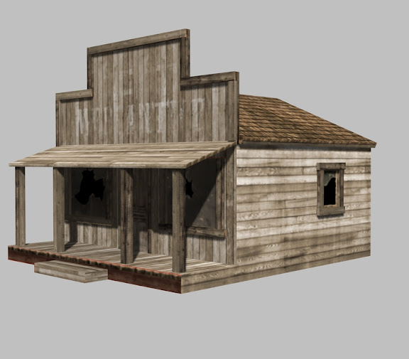
Ghost Town General Store
Something I've been working with just to do some quick scenery.

I feel that it is nearly complete. I see several trouble spots with the textures in this pic: the front step, the sides of the porch.
I am also working up a normal map to make the boards pop a bit.
All criticism appreciated.

I feel that it is nearly complete. I see several trouble spots with the textures in this pic: the front step, the sides of the porch.
I am also working up a normal map to make the boards pop a bit.
All criticism appreciated.

Replies
just a suggestion the bottom 2 boards on the side of the house are bothering me a bit. The porch and "walkway" would be added onto the store if building it IRL so i don't think those 2 boards would continue on all the way through. They would stop where the porch starts and 2 new boards would be nailed into place finishing it out. Make sence?
The seams on the stairs don't match up from one side to the next.
The front of the porch should wrap around to the sides. (Eltrex has a good point here).
I'd change the porch floor texture so it isn't identical to that of the rest of the building.
Maybe bump up the contrast of the letters that were once hung up as a sign. I had to look closely to see that there were faded letters there. You could even consider leaving a few of them on there.
Pop the door out a bit. Maybe give it some flaky old paint job with some color. It's hard to find it right now.
Cool stuff though, I like where this is going.
As mentioned above, I haven't posted wireframe and texture maps yet. Here's what is being used for the model above:
That texture you have on the roof has some obvious tiling going on. If you have unique space for the whole thing, why not go in and take care of that. OR, you could use a tiling map for the roof by dividing the roof into howmanyever you need
I think the texture could use a bit of extra detail, though. They look a bit too clean. Makes the whole thing look a little... bland, I guess.