Warhammer creature concept model- Ol'Skool
HAI
So yeah,Ive fallen in deep deep love with the WAR series. They have had the most awesome artists working for them as slaves.
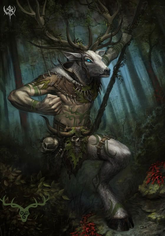
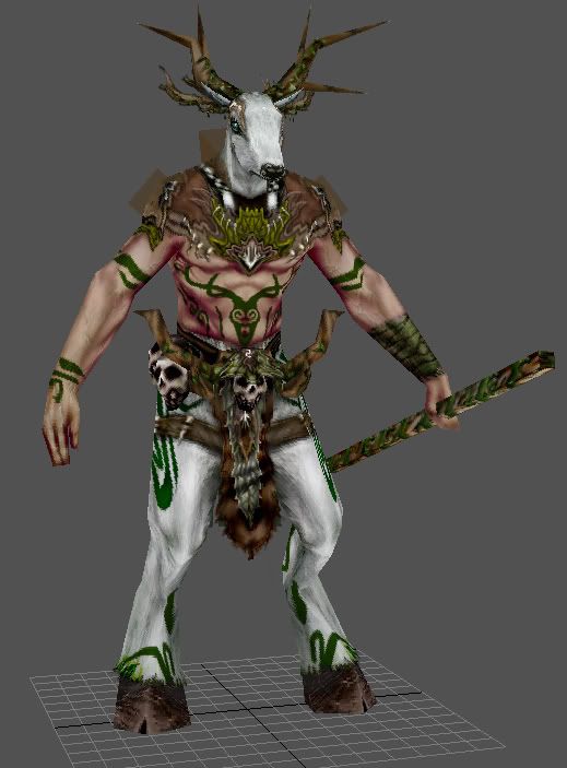
So i saw this concept and i thought that i should give it a go.I didnt want to post something very early. I think im 70% done with this model and im having the time of my lfe here.:) Im so jealous of the people who worked on these sexy games :P Im pretty sure ill be doing a few more of these concepts at these specs. HEAVEN!
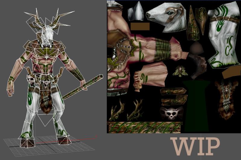
Tri count is 700 Tris i think (i forgot)
Concept:
Model:
Wires and textures:
___________________________________
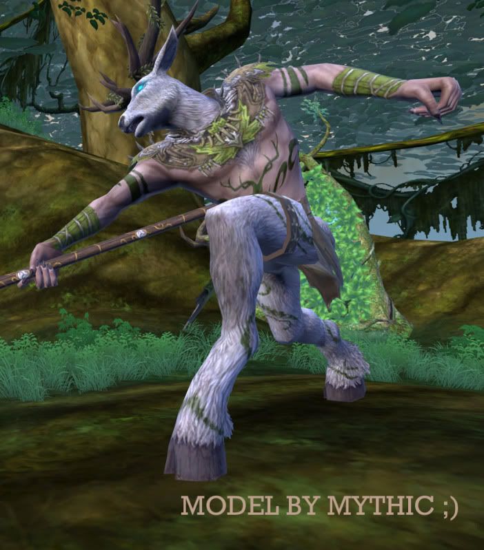
I just found a picture of this guy in the actual game (Which is awesome). Wish i had seen it earlier somewhat. I tried to follow the concept as much as possible
Comments and Crits are welcomed. Would like to get some pointers on the texturing please!!! This was the model i was thinking of SDK'ing but i dont think anyone would want this so fuck that
THANKZ
So yeah,Ive fallen in deep deep love with the WAR series. They have had the most awesome artists working for them as slaves.
So i saw this concept and i thought that i should give it a go.I didnt want to post something very early. I think im 70% done with this model and im having the time of my lfe here.:) Im so jealous of the people who worked on these sexy games :P Im pretty sure ill be doing a few more of these concepts at these specs. HEAVEN!
Tri count is 700 Tris i think (i forgot)
Concept:

Model:

Wires and textures:

___________________________________
I just found a picture of this guy in the actual game (Which is awesome). Wish i had seen it earlier somewhat. I tried to follow the concept as much as possible

Comments and Crits are welcomed. Would like to get some pointers on the texturing please!!! This was the model i was thinking of SDK'ing but i dont think anyone would want this so fuck that
THANKZ
Replies
lookin good. Only thing that stuck out to me at first was the fur bits were extra white and the shadows on the skin are really red/magenta. Making it all slightly desaturated, darker and kindof washed over with yellow/green might help tie it all together... either that or kill it :P
awsome stuff dude (i wish i had low poly painting skills ;_;)
edit: almost forgot... MORE ANTLERS MEANS MORE POWER!!! :P
http://www.creaturespot.com/main/2009/8/11/wild-hunt.html
Thanks mate
Nizza:
Thankiezz
I tired really hard to get them shadows looking like that, but yeah i dont think they fit in either. Worked on them crits aswell!
Also, bigass antlers FTW!
Doc Rob:
FUUUCCCCK.... man i hate you for not letting me know earlier
dv8ix:
Thanks
________________________
Hai guyz!
So yeah im done!! I think this is my best low poly piece yet. Will work on another one like this hopefuly soon enough!
Wires/Textures/Polycount etc:
Hope you like it!
agree'd on it looking aws (and woo, antlers!)
hope you get onto some more soon man
(making me wanna try low poly stuff now :P)
The end result is looking great! I think you could have handled the UV's a bit better though!
I see a lot of empty space, and some items which could have benefit from being mirrored- namely thinking on that antler texture in the bottom left. There isn't a ton of difference between the two textures.
In regards to UV space, I find it helps to lay out all the BIG chunks first, and then squeeze the smaller, less important chunks in wherever you can find space.
Anyhow - the model looks really nice! I agree, I want to see more
Just to throw something in, a tip that's worked for me before regarding uvs with low poly models like this is to make the texture in photoshop first and then map out the uvs. As weird as that sounds.
I'm also not sure if this applies, but when I made models for the DS I could move my uv coordinates wherever I wanted, so uvs on top of uvs and what not. It really helps reusing as much as you can and mirroring whenever possible as well (like Jon said). I also agree with his advice regarding the chunks.