Deadman - character for class
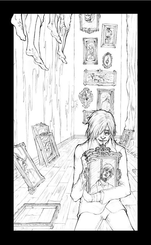
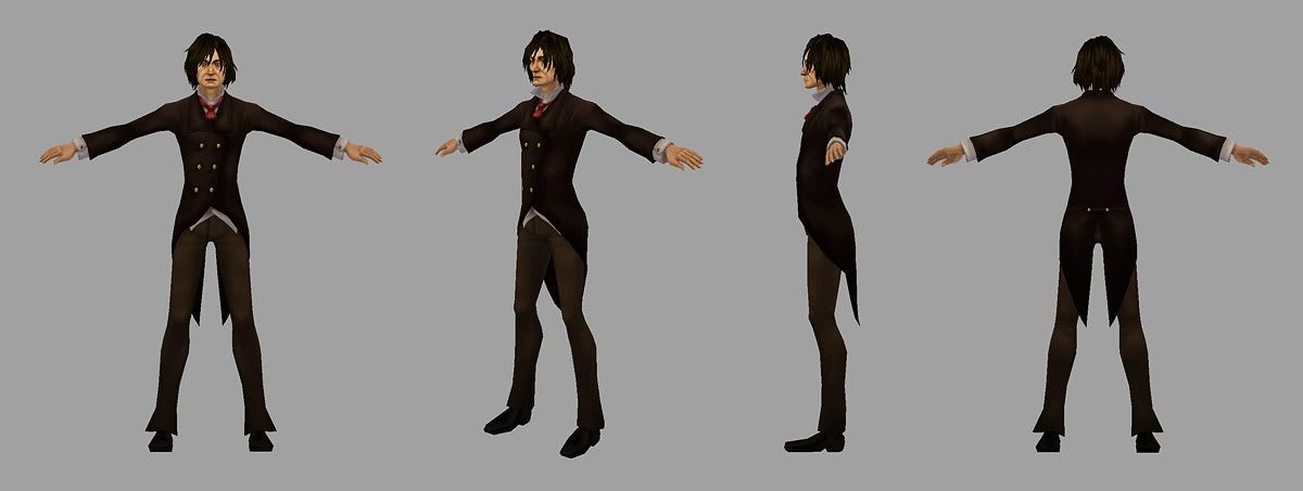
Hey everyone. I'm currently working on a character for class and my instructor advised me to post this up here. While I'm pretty much done working on him for class, crits will be appreciated as I'll continue refining what I need to for portfolio purposes. I'm just using diffuse and alpha maps for this.
My concept piece for the character "Deadman"

The 3d model w/texture

My concept piece for the character "Deadman"

The 3d model w/texture

Replies
The concept piece could use some color scheme attempts. And the model (altought it looks polished at this point)...it might be interesting to see him with slightly exaggerated proportions. Make him even more lanky, maybe shorten his torso and add some length to his limbs? Just a thought. The model doesn't really convey the same creepy feeling as the character concept.
But all and all i like it!
Hands look a little stubby, his thumb especially looks fat at its base. Could probably lengthen all of the fingers for the creepy look in the concept.
The concept is that Deadman is an immortal who enjoys the sensation of dying. He fritters away most of his time killing himself in a myriad of ways. The concept drawing is more of an illustrative depiction of his masochistic tendencies. In a sense it's much like his "hall of fame", a library of methods he's employed so far.
I'll give it a shot with the proportion and facial structure changes. It definitely bugs me how normal looking he came out when translated to a 3d model and it's probably me attempting to keep to an ordinary human proportions.
An additional shot of close up for the face
DKK:
Here are my wires and flats
Digging the hair style though, nice disheveled look. Wicked concept work by the way
Rings! Where are his rings? The rings totally complete the look along with those creepy bony fingers of his. Any plans on adding his rings?
anyways, yeah first thing that stuck out to me was his chin and jaw was no way near as long and pointy as in the concept which i thought looked really cool.
Also a little more colour variation in the skin or some more contrasty cool and warm colours overall could help the textures pop a bit more mebbe?
cool work tho, turned out great thus far
I think that his face is like, ALMOST there, in my opinion, and if you pushed it a bit, i think it would be much more awesome.
i think you need to make it a lot more guant. those creases (I forget what they're called) running out from the nose for example.. the way they bow up like that, makes him seem to have a more fleshy, found, healthy face. I'd be tempted to make him a gaunt, pale motherfucker with a lot of texture.. that's what i get from your concept, anyway.