Home 3D Art Showcase & Critiques

Thunder God

I'm taking it as no one is digging my gator soldier as it seems everyone is ignoring it so here's something else

Character: Shango - the thunder and lightning god

Story: In a fututre where all humanity has lost itself to corruption and evil Shango descends from his seat in the realm of gods to save us from ourselves.

Powers: can control and manipulate thunder and lightning *shrug*
Unfortunately his human form needs to adjust in order for him to have full access to his powers.
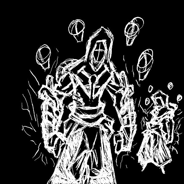
RAI_concept-1-1.jpg

plz comment good or bad it helps

thanks in advance

Replies

  • Nizza_waaarg
    Offline / Send Message
    Nizza_waaarg polycounter lvl 15
    not much to say yet man. Could be really really awsome or really really crap :P
    any plans to refine the concept more (work out details and stuff), or planning to jump right into teh 3d?

    Anyway, keep working on it and post what you get :)
  • raiskul
    Thanks for the quick comment, hopefully this comes out really really awesome :)

    here is a refined concept I'm thinking I'll have it so the helmet opens up to the face underneath, or would it be better to just have the face or just the helmet, hmmm?

    There will be six of those skulls when he is fully powered. He'll start off with one and as his body adjusts he gains more. Might change the look of the skulls I feel like they don't really go with the whole theme.
    RAI_concept2.jpgRAI_concept2_masked.jpg
  • Dippndots
    I like where this is going, I would go with the helm and the slits for his eyes should glow blue or something. What material would his armor be made out of? My vote is for mainly stone with metal accents (with cloth or w/e where necessary).

    hope this works out for you looks sick.
  • Baj Singh
    Offline / Send Message
    Baj Singh polycounter lvl 9
    The skull's don't seem to make much sense to me. What is the main reason for them to be there? Personally I would just scrap the multiple forms altogether and go with a single form.
  • raiskul
    Here's an update for today got the color scheme finished still got to work on the skull design.

    @Dippndots - the armor is made of gold or silver because they are two of the best natural materials for conducting electricity also they show signs of dignitry.

    @Baj Singh - the skulls represent the drums that surround the shinto lightning god raijin (whom I am basing this design off of) They will also serve to show his level of power any given moment (1 skull = hp grade = human form adaption to god powers). So I can't completely scrap them but i need to change their look to better suit this style.

    Im going to have it so when he is in battle mode his mask is on and his energy is revved up and when in travel mode his mask is away and power is idle. (This way i'll get some more practice with ipo actions and such)

    Thanks for the comments plz keep them coming every bit helps :)

    PowerOff ............................................................................................PowerOn
    RAI_concept_PowersOFF.jpgRAI_concept_PowersON.jpg
    RAI_concept_PowersOFF_silver.jpgRAI_concept_PowersON_silver.jpg
  • Dippndots
    looks good man, gold should be sick didnt realize you were going for a modernish looking armor. The arms are looking sweet, I would add some of that gold armor to his waist to make his top 1/2 seem less busy
  • Nizza_waaarg
    Offline / Send Message
    Nizza_waaarg polycounter lvl 15
    cool. Like the first colour concept better but the second is getting more interesting contrast between the blues/greens and the brighter red waist bit :P

    hope you can get it into 3d soon :)
  • ralusek
    Offline / Send Message
    ralusek polycounter lvl 10
    looks sick. much better than that gator you were working on (no offense, i didn't mean to ignore it, just wasn't doing it for me). this guy looks badass though, especially with mask
  • raiskul
    @Dippndots - i'll have it so that in travel mode the skulls/drums are around his waist

    @Nizza_waaard - tried to play around with the colors below are the results. I'll be starting the modeling now that I have the forms finalized.

    @ralusek - it's no problem I figured that was why no one was commenting on it, guess it worked out in the end cause it gave birth to this guy :)

    here are the color schemes available with a fixed design for the skulls/drums:

    RAI_concept_belt_Col1-3.jpgRAI_concept_mask_Col1-2.jpg
    RAI_concept_belt_Col2-1.jpgRAI_concept_mask_Col1.jpg
    RAI_concept_belt_Col3-1.jpgRAI_concept_mask_Col3.jpg
    RAI_concept_belt_Col4.jpgRAI_concept_mask_Col4.jpg


    glow affect added to a couple of the schemes:

    RAI_concept_belt_Col3-2.jpgRAI_concept_mask_Col3-1.jpg
    RAI_concept_belt_Col2-2.jpgRAI_concept_mask_Col2-1.jpg
  • Dippndots
    nice color schemes I would go with either the 1st or the last, the colors work best with the whole lightning god theme
  • raiskul
    Sorry for the super long delay, had exams, a birthday party and a confirmation taking up my schedule but now I can put in some serious time to this.

    Here is what I have so far.

    He will still have the mask

    I reaize the neck is super long but I can't seem to picture it any other way plus it works with the hood.

    fixed the taper in the neck so it doesn't look so wierd in the hood
    ShangoHoodBack.jpgShangoHoodFront.jpgShangoHoodSide.jpg
    ShangoBack_wire.jpgShangoFront_wire.jpgShangoSide_wire.jpg
    ShangoHeaf_front.jpgShangoHead_side.jpg
  • Dippndots
    its obviously still a wip so ill just point out a couple of things, the hips should be slightly wider and the thighs should be a lot beefier, also his waist seems narrow.

    here's a great hood anatomy ref image

    956858_20090416_790screen001.jpg
  • raiskul
    Thnx for the comment
    I fixed the thighs, but I was aiming for a skinny waist

    Here is a small update:

    ShangoFront-1.jpgShangoSide-1.jpgShangoBack.jpg
  • raiskul
    Here are some wires:

    ShangoFront_wire-1.jpgShangoSide_wire-1.jpgShangoBack_wire-1.jpg
  • raiskul
    Here's another update:

    finshed blocking out the major pieces

    plz leave crits they are always welcome :)

    ShangoFront-2.jpgShangoSide-2.jpgShangoBack-1.jpg
  • raiskul
  • Nizza_waaarg
    Offline / Send Message
    Nizza_waaarg polycounter lvl 15
    cool update mayne. Can't remember if you said you were or not, but got some sculpting coming up soon? :) Full hp of this would look cool
  • Dippndots
    looking good man, I would make that bar that wraps around his elbow flat-sided instead of circular like it looks in the concepts
  • raiskul
    Nizza_waaarg - I've been thinking about doing a highpoly only prob is that I have not practiced much in the use of blender's sculpting tools so it'll take time for me to get aquainted, but I will give it a try and post what I come up with.

    Dippndots - thnx, I will give that a change

    The cloth colors are starting to bug me so I'm going to play around with them and if you guys have any ideas plz post

    thnx for all the comments so far plz keep them coming
  • raiskul
    Got some work done on the helmet

    Looking at it now the hood really isn't going to work with the helmet so I will either change it to be a longer shaul or just take it out entirely

    ShangoHelmet_Closed.jpgShangoHelmet_Open.jpgShangoHelmet_Open_persp.jpg
    ShangoHelmet_Closed_hood.jpgShangoHelmet_Open_hood.jpgShangoHelmet_Closed_persp.jpg
  • Dippndots
    the helmet seems to hug his face too much and too closely, I would experiment with dropping the jaw piece down. As rule with helmets I try to create something with enough space inside it that the character can open and close his mouth. Also, I'm not sure if this would work but maybe try including the side parts of his visor on his forehead with the main piece that slides down over his face.

    looking good though man
Sign In or Register to comment.