- DYRT - SOLDIER -
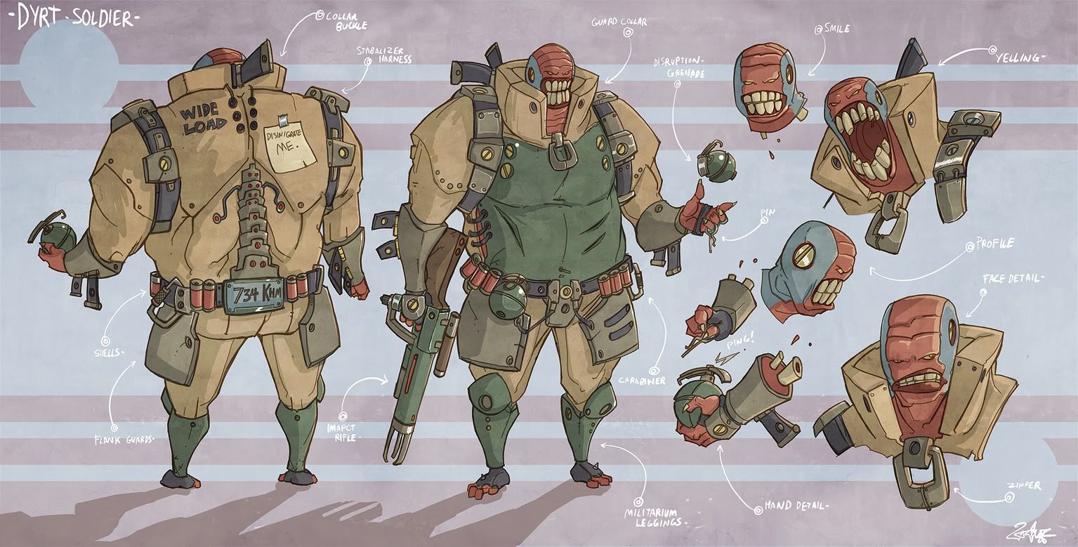
With the loving grace and permission of the awinspiring jouste, I'm working on his Dyrt Soldier concept.
so this will be a WIP
the kick ass concept:
Final Sculpt Images : 11/19/09 w/TURNTABLE RAR file


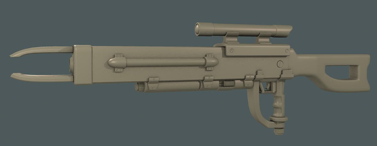
here's the gun:
and here's the body:
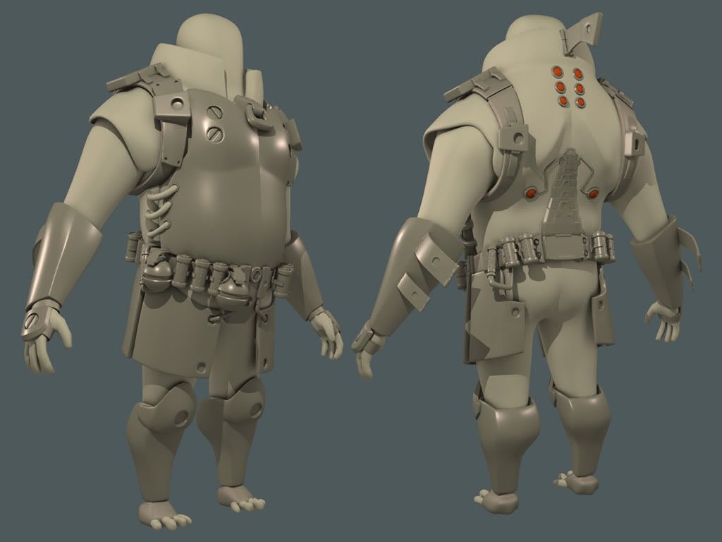
i need to widen this dude up fo sho... add in some more stuff... then slap him in zb...
i'll have a head sculpt up tomorrow night...
so this will be a WIP
the kick ass concept:

Final Sculpt Images : 11/19/09 w/TURNTABLE RAR file


here's the gun:

and here's the body:

i need to widen this dude up fo sho... add in some more stuff... then slap him in zb...
i'll have a head sculpt up tomorrow night...
Replies
Cool concept.
Yeah definitely broaden him up and maybe give him a hunched position. I also think you should bulk up and add more depth to teh backbone kinda thing on his back. Too flat IMO.
looks like a really fun concept to work on actually. Will be cool to see how you tackle it in zb.
And don't be afraid to push proportions more (can always pull back later)
cool stuff so far man
Just a note, in the concept the end of the gun is triangular with 3 prongs, yours is square and has 2 prongs
whats_true: thanks man!
butt_sahib: i dunno about the hunched position... i think if i go that route it will really take away from his gesture and flatten out the back a little too much... i do need to fatten it up along his lats and obliques though... you are TOTALLY RIGHT about the spine... i saw that yesterday and i messed with it some this morning (not very visible in this screen though)... nice catch
Nizza_waaarg: hey dude! thanks for stopping by! i hear ya on pushing it, tried doing that some this morning, so let me know what you think. you should really take a whack at that wolverine that you were going to do for the comicon... i'd love to see what you could do with that!
Muzz: thanks dude! there are actually 3 prongs, you just can't see it because of the angle, but i really should break that bevel down a little wider... it is too square atm for sure. that would also add some nice contours for the rail mount for the scope too... thanks for the crit!
Neox: seriously, when i woke up this morning, that was the FIRST thing i said to myself... "damn those lines are too straight..." no contours hardly at all... i worked with it a little bit, but i know there's more i can push on that end. i really appreciate the advice man. thanks
***************************************************************
here's just a quick screen of the proportion tweaks... haven't moved all the accessories yet, but that's not a big deal to tweak those into their spots. maybe push it even a little bit further? need to fatten up the lats and obliques :P
edit: oh you have 3 prongs, nm.
aesir: will do! thanks for pointing that out! that really will make a huge difference.
just a quick rough in sculpt before doing a retopo and clean up. i have my opinions about it, but i'll let you guys be the judge.
good basic form makin though
anyway, still a badass sculpt, hope you post more soon man, like seeing this progress
i made some small adjustments in maya with some scaling for the eyes and mouth and to check the proportion of the head to the body with the features roughed in.
i'll get everything tweaked and positioned tonight so i can get him in ZB.
ZacD: the toes are just stand in before the zbrush pass... so yeah, they're blobby atm
Swizzle: thanks for stopping by man! yeah, i agree... i shrunk it back some more...
first zbrush pass:
and it's lookin dope, the back shot especially...
only thing i can notice is mebbe a smaller head, killer update
I'd like to suggest comparing it to the concept a bit more though. Right now your 3d sculpt gives me the feeling that the dude fits inside the suit fine, while in the concept it looks a bit big for him. The sculpt also feels a little squat. I think you can see it best when you compare the concept to the sculpt side by side. Here's a quick comparison with some of the changes I would make.
OrganizedChaos: I see what you're saying about the suit needing to feel a little too big. I made some adjustments... let me know
made some quick tweaks to the size of the head as it is continually brought up before i go in and start to really finalize everything and pose him out
paintover as you please by all means.
Looking great Firebert!
BTW the arms are too long, i'm pretty sure the forearm is about the rite length but its total length is wrong. The forearm should be starting just under the height of the pecks. Look at the concept, the guy would have to hunch over to itch his junk, go with it!
I love how this guy is Earth Worm Jim and Cable smashed together.
Lookign great. Agree that the new head is alot better. Have you tried adding curvature to the leg?
Liking the new head, the lack of defined cheek bones should make it fit in better. And kinda agree on the arms, they look like they should be slightly shorter and taper in a bit more towards the elbow and wrist, tho could just be the angle (in two minds about it after a second look).
i agree with others, int he concept the head is barely larger than the knee pads, almost like the koopas from the classic mario movie but not quiet so extreme
I went back and made the head smaller and tweaked it out with more teeth showing. I also shortened up the arms. Not TOO much, but about where they looked functional. I probably could have made them shorter, but I am happy with them.
So this guy is done for the sculpt. I'm moving onto another sculpt before baking this guy down. I'm trying a new approach to keeping my personal work fresh. Since free time is extremely sparse, I don't want to fall into a rut of working on finishing one piece over the course of who knows how long when life suddenly and typically gets in the way (runonsentence :P) I'm just trying to keep everything fresh so I have a pile of high polys ready for low poly uv baking and after I finish each one, I have another one at the ready. So this will be risen from the dead once I finish my list of high polys.
Hope you guys like how he came out.
I had a really big issue with rendering these. Ready below and let me know if you have any suggestions. Thanks
I rendered these all out at a higher doc res in ZBrush. I export the doc, and open in photoshop and they end up being half the size of the ZBrush doc. Ummmmm, whhhhaaaaaa? Happens at random too. The two renders above are the only ones that rendered at full resolution. The rest ended up outputting at half, regardless of how many times I export, or render it. Anybody else had this issue? I've had it before, but just kinda dealt with it. Now it is just annoying. Using 3.1 still... 3.5 is too buggy for me to feel remotely comfortable using it.
not sure on the zbrush doc exporting thing tbh (i usually just prnt scrn and call it a day :P), could try resetting to default setting and such but that might just be a waste.
Anyways, turned out real cool man =D (especially the back,
It'd be cool if you ran straight through and got the low poly of this done, colour would rock. Tho it sounds like a cool plan to keep a bunch of projects up so things don't get stale.
I'm kind of curious, what's the list of things you're going to make?
It seems like a nice approach to working on things, keeps everything fresh and gives you a variety. And maybe when you come back to this you'll see a few more things you'd like to tweak.
I'm slowly working on my portfolio too (any chance I get outside of work), it's pretty tempting to try the same.
nizza: you're right. it wouldn't take long to bake this guy down, but i've made a game plan for a very specific reason and i'm sticking to it.
organized: ahhhhh, well i would tell you...but i'm sorry... no can do... you'll just have to keep an eye out
Remind me of Nemesis!
I reckon that spine hardware could be pushed out a bit, looks like a texture rather than actual mesh!
Keep it up man
ok first off this is some pretty awesome shit my friend. i was really suprised you got that much detail in his hardware, i LOVE the embellishments that you did on the grenade and the rifle, i actually assumed i created those in my concept but was happily suprised when i saw that it was all your interpretation and that i indeed am not as delusional and arrogant as i originally thought.
VERY super job on the damaged chest piece. and a very awesome job on the back. the back is the MOST IMPORTANT PART of a character as far as i'm concerned. cause when you are playing that bad boy for 6+ hours you better have something awesome to look at.
and i know i'm rambling on but you NAILED the flabs (flabby abs, an anatomy term i've invented where something can be both muscular and flabby at the same time).
i am aware you are all done this kinda thing but he needs some more movement in his pose, twist him up a bit, hunch him over, he shouldn't have the same amount of weight on each feet standing like some statue.
but that's getting picky. i've never really had something this close to my concept ever done up so it was an absolute honor. what usually happens is people jump down the modeler's neck about not hitting my concept on the nose and they stop doing what they're doing because they aren't masochists. you my friend are a glutton for punishment but it looks really great.
i know i need to get my shapes a little more clear but it was really awesome to see the interpretations you got from them, i am very very happy with your end result. you rock firebert. thanks so much.
Jouste: haha I'm one of the slackers