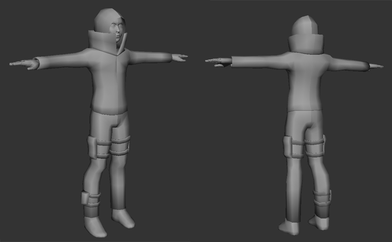
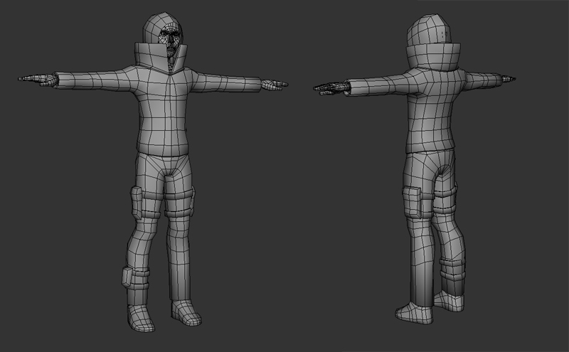
Free Runner Messenger
Greetings everyone. I'm a Polycount newborn, finally decided to take the plunge and start posting my works in the hope of improving my technique. I've been working on this character and getting back into character modeling. I'm really rusty and not really getting the right feeling about the overall form of the character. If anyone would care to give me some advice, I need some pointers into how to make this guy look more bad ass. Right now he just feels really bland. The model will be kept low poly and brought into Zbrush for some sculpting. Thanks in advance for the crits and advice!


Replies
i looks like you just jumped into max and whipped a character up.
im sure if you just doodle for a bit you can come up with something awesome on your own
I think some good reference to think about would the the Scout from Team Fortress 2 - instantly recognizable silhouette, and obviously designed to reflect the character's purpose. Right now, your character doesn't say anything to me about what they do, or their role in a game.
The T pose is hurting you a little bit, and the model will definitely look better after its rigged to a biped and put in a more natural stance, that being said, there are many things you can do at this stage to help too. There is a nice natural bend in the characters knee, but the arms and hands are straight as pipes. Consider putting a bend in the elbow... maybe 5-10 degrees just to imply its direction of movement. The fingers also could be curled a bit into a more natural position. These little bends make your character look better and make rigging easier.
Add a few edge loops to the arms and lower leg to even out the geometry. The bottom of the leg especially needs this as there is some weird smoothing group thing going on that's making it look dark. This will also help when you go to subdivide it in zbrush. You may want to eventually consider modeling some cloth folds into your low poly to make the silhouette look more like clothes and less like a form fitting garment. This could come at a later stage too, though and be done to match your zbrush work.
It took me a while to figure out if the character was male or female. From your description, I think its a guy. You may want to work the chest and shoulders a bit to make it look more male. The chest especially looks totally flat, and fairly narrow. I'm not suggesting major changes, just a bit more shape.
Its hard to see from these renders, but the face may be a bit pinched at the midline. The same thing happens to me a lot when i'm working with half the head then adding symmetry. Just do a quick check to see if there is one eye's width between the eyes. You might be ok as, like i said its hard to tell from full body shots.
Lastly, Whats up with the seam around the base of the collar. Is the collar coming through from some piece of clothing below the jacket? if so you might want to define where the jacket ends a bit more. If its part of the jacket, you might not need such a hard line.
That's kind of a brain dump of everything I noticed. You have a decent start, just work on making the body a bit more natural, and look for ways to make the piece tell a story.
Thanks for the input all! Will work on the proportions like Danshewan suggested. Shrew & Fiveways thanks for the suggestion on the concept, the paint over method seemed to help a bit. Need to add more detail to the accessories though. Thank you for the breakdown of what I need to work on Goatjustice. I plan to rig and pose the character when I'm through.