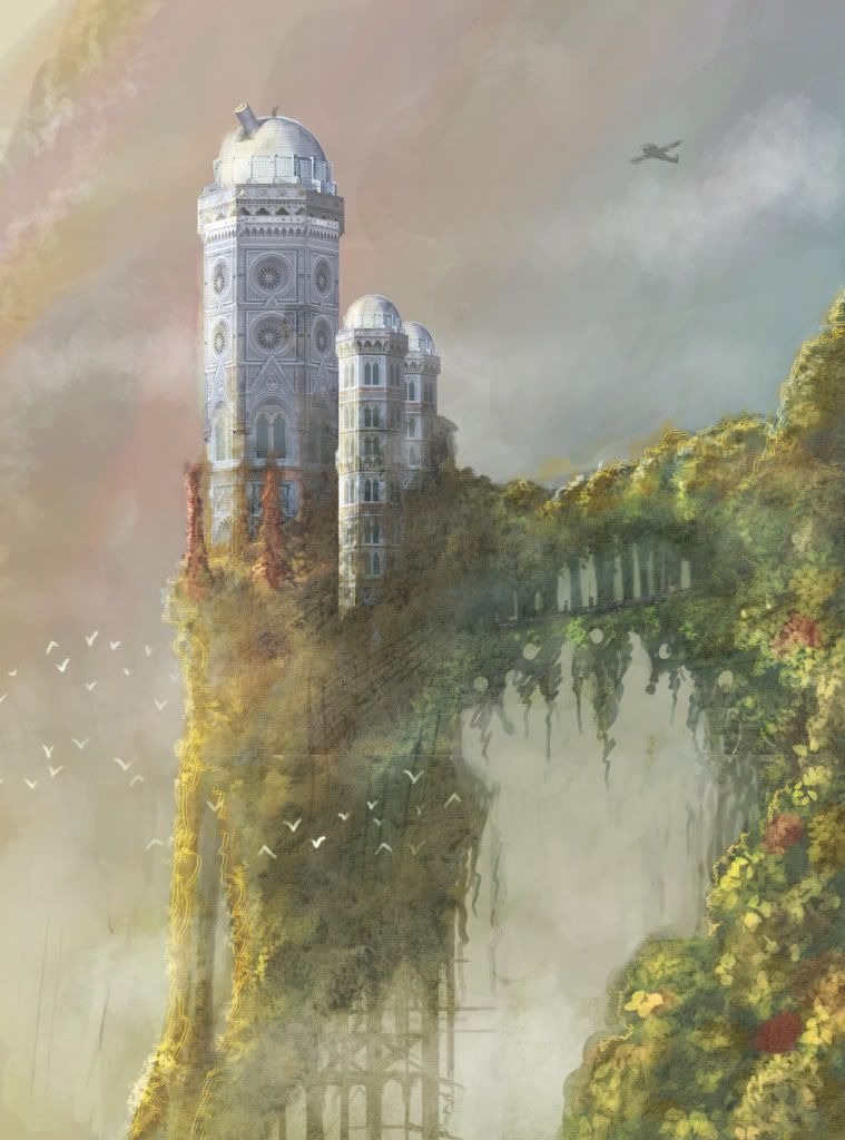
Observatory- Environment WIP thread
So i am working on an 3d environment. this is my second 3d environment ever created so I am still a pretty big noobie to this type of thing. Any critiques or advice would be greatly appreciated. My plan is to build the environment to be supported by a current gen game engine.
so moving right along. here is the latest build of my concept.

the building is an an overgrown observatory. the place is inhabited by a mad scientist who has converted the telescope into a crazy death ray. interior concept art will be coming soon. I have already gotten on to modeling the exterior buildings by first creating some modular chunks. will post those soon, but I just wanted to get this thread off the ground for now so aufwetersehen for now. :poly124:
so moving right along. here is the latest build of my concept.

the building is an an overgrown observatory. the place is inhabited by a mad scientist who has converted the telescope into a crazy death ray. interior concept art will be coming soon. I have already gotten on to modeling the exterior buildings by first creating some modular chunks. will post those soon, but I just wanted to get this thread off the ground for now so aufwetersehen for now. :poly124:
Replies
Although i would make it more apparent that the scientist living there was a bit loony and that the telescope was in fact a death-ray-of-doom, perhaps by adding a crazy attachment onto the end like some of these things.
Best of luck it will be interesting to see your progress.
I like the concept, especially the architecture of the observatory itself. It looks almost like the minarets of a mosque. Depending on what you do with the colors and composition, it could have a really gothic feel to the final piece.
Keep going - great start!
I imagine something like this:
The scientist was once a great man, furthering science for the betterment of the world. However, when his wife fell ill, he was unable to save her, actually worsening her condition through an experimental medication, and hastening her death.
Now he is racked with guilt and anguish, and remains alone, in his solitary observatory, and wants the world to share in his pain.
update on the modeling. I have the smaller buildings almost completed. changes to the concept have not been made yet but I can simply change out the lighting and swap diffuse maps to accommodate any changes. let me know what you all think!
jakelear. I love that idea. I think i will run with that. but what mood should the lighting give? I am wondering if I should make the season fall. add red and yellow leaves with a thick dingy mist. decay the buildings a bit more?
here is a chair prop that will go inside the observatory. will model table and tea set. the professor loves tea!
here are some references for the death ray / telescope and the interior.
from the shots of the tower and chair are they rendered or screen grabs?
I think you should add a little more contrast to you're leaves, they are merging in quite a lot to the stone, or consider making the stone more white like in the concept, because i think the two colours feel quite similar at the moment.
Oh and btw is that a guy stood on the top of the observatory on the concept ? :P
i actually imagined the framing to be old iron or steel but i guess it came through in the concept as being wood. Point taken though.
Myles,
I am changing the concept a little to make the observatory dome partially collapsed inward, this took some of the floor with it. I also feel like the leaves blend in too much. i am working on learning how to bake lightning maps into the building. I am hoping to bake in more blurred shadows to make the leaves pop more. and yes, that's the professor on top!
ok guys here is a very rough and early sketch of the interior space. will be fleshing this out more soon. the idea with this is that the professor had stared welding platforms where he needs them and kind of works around the advancing greenery that is growing around him. he also lives in this space so i will be adding a shrine for his fallen wife, and a bed with bookshelf as well as old blueprints and books strewn about.
a little update on the over paint. i added some more details and threw in a bit of color, the palette might change but i kind of like these colors. i want to keep the foliage more yellow or red to symbolize the decaying state of the professor's life
The only thing that looks a little off is where your telescope connect to the base, be sure that you have lots of axis'/ cogs to make it more apparent that it does rotate. Also remember the top part of the observatory usually rotates and possibly you should make it out of a different material to make that more obvious.
Cheers!
http://www.museum.state.sc.us/!UserFiles/observatory.jpg
I'm not sure about the colours in your rendered shots. I preferred the mood in your concepts. The colours were much colder and it seemed more dreamy. I hope will get this kind of mood once you finish.
Anyway, can't wait for the updates
OK so check it out, i have reworked the concept to make it fit the story a bit more. I have decided the feeling I really want to get across is mystery and intrigue. I changed the lighting to be far more yellow washed and added in atmospheric green lighting. The building and all of the machines withing are run on this glowing green power source. power cables are hung about the towers and bridge, most of which converge and plug into the laser gun.
I really need some feedback so dont be shy to give critiques or tell me what you think. the concept has really made a metamorphasis from the beginning but i think i like where its going now.
Thanks much everyone
take it easy
Paul H
I'd say this... How is the place being powered? I think you could make a high steam punk or sci fi generator for your scene to balance out the lack of tech with all of that Victorian feel of the observatory.
The building and all of the machines withing are run on this glowing green power source. power cables are hung about the towers and bridge, most of which converge and plug into the laser gun.
it pays to read once and a while
Ah, didn't see that part.
also (sorry if it was mentioned before) but those supporting things underneath the cliff looked more like stone or brick or somthing, similar material to the tower itself... as opposed to wood. So that could be one way to go potentially ^_^
cool stuff man
hey again guys, just posting a little flow chart I made with the help of my friend Nrek. the red line represents a theoretical path that a player would use to traverse the level.
the bridge may become more crumbled with chunks hanging in a web of vines. the player would hop from chunk to chunk.
suggestion: i'de like to see more power cables dangling over the place. if a mad scientist lives there i would imagine he would have tons of cables connecting gadgets and dodads everywhere you look.
also i feel as though the yellow doesnt give it much mystery. its still very warm and fuzzy, though the eerie green is a nice touch. perhaps usng a darker shade and/or add more of that green. IMO
keep up the great work!
so here is where i am at with the observatory exterior. almost done. I need to add the door and a few more details. the top dome part is still unfinished.
I really need some feedback again guys, so please leave me some input.
Thanks Much
Paul H
Paul H
The structural foundation doesn't make much sense. Why is a top-heavy observatory perched on stilts, with a bridge leading to a mountain peak that goes to nowhere? From an engineering standpoint it makes more sense to have the observatory built directly into a peak, with stilts spanning the gaps. I guess it depends on how abstracted the game universe is.
I like the green but it seems overkill, maybe use it to highlight game objectives like the window entrance and the ray gun.
CANDLE PACK V1.0
here are some candles the professor has set up to mourn his wife. He also constructed the stands.
hello again Polycount!
quick update: I modeled some machines that will be running throughout the environment. mostly inside the observatory. these machines store and convert the liquid fuel into electric energy.
Since there is some electicity involved could those machines have some wires as well?
Because right now the design suggests only liquid related function. If water is being transformed into electricity there could be also wires ind isolators:
http://images.google.ca/imgres?imgurl=http://www.elkraft.ntnu.no/eno/projects/generator.jpg&imgrefurl=http://www.elkraft.ntnu.no/eno/projects/pictures.html&usg=__mvJqznFrMzkKoGW9uOZGw-C85oE=&h=453&w=340&sz=65&hl=en&start=3&um=1&itbs=1&tbnid=iVQ6B3G6MdHyOM:&tbnh=127&tbnw=95&prev=/images%3Fq%3Dgenerator%26hl%3Den%26sa%3DN%26um%3D1
http://www.eswari.in/pdf/110kv%20isolator.jpg