UC 2009 'END GAME' | Mazvix | 3D
Hello Everyone,
I decided to join UC 09, it is kinda late but I will try as much as I can to get a small/focused scene with a powerful messege through the composition.
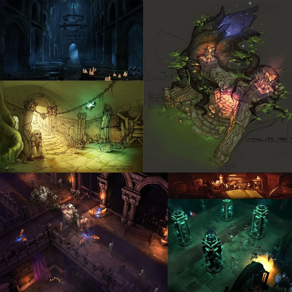
I have many, many ideas in my head that I have to start choppin down for me and for you guys. Here is my inspiration and the style I am going for- Diablo Hand painted
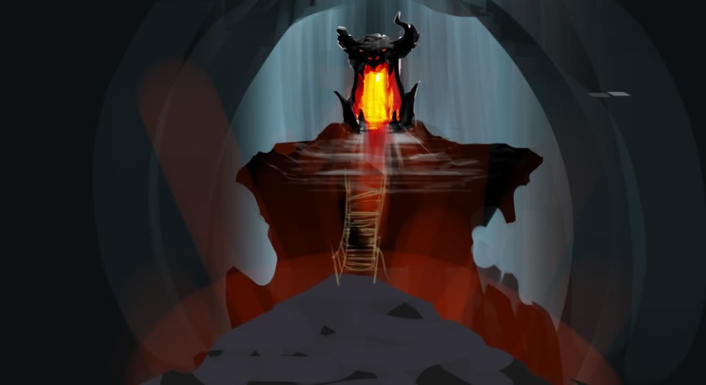
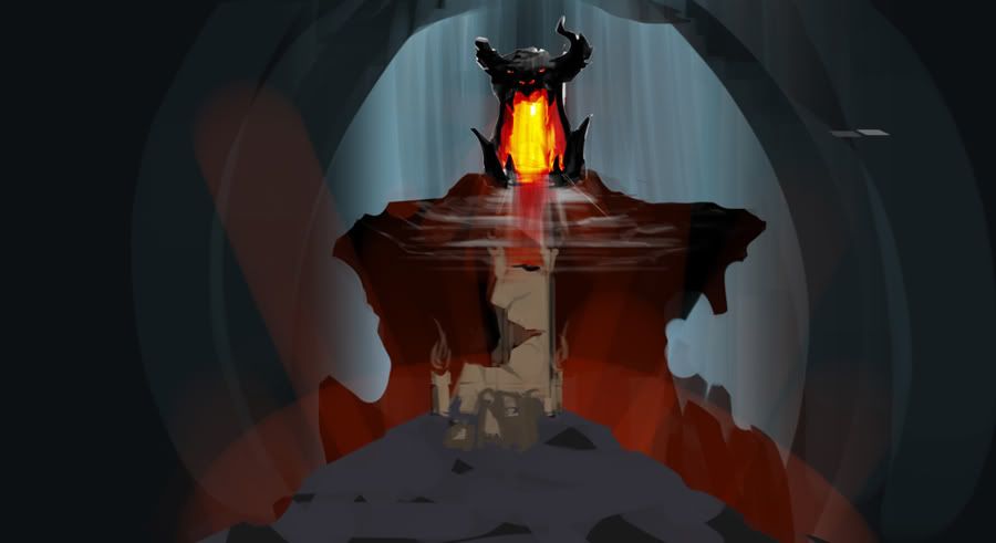
And quick idea.
I decided to join UC 09, it is kinda late but I will try as much as I can to get a small/focused scene with a powerful messege through the composition.
I have many, many ideas in my head that I have to start choppin down for me and for you guys. Here is my inspiration and the style I am going for- Diablo Hand painted

And quick idea.


Replies
neat concepts you've got there
LARGE PROPS-
Demon Entrance Head
Wooden Bridge
2 Floating islands
MEDIUM PROPS-
stairs(chipped off)
Barrels
candle stands
Braizers
Pillars/broken.
SMALL PROPS-
carpets
candles(big and small)with smoke planes.
jars/ Vase
skulls
Spider webs
Lava planes.
chains
blood spills
After I am happy with the final results I will have different versions of everything in terms of damage/broken parts and pieces.
Here are some silhouettes for the pillar as you see I beleive 1 fits the best. The rest are candle holder designs and blazers. I ended up making a new design for the candle holders and I am chosing number 2 for the blazers.
"EDIT" I aiming for diablo II - D3 style.
here is the rock formations that I will use, duplicate and such for the base. I will post the stuff I have been working on later today.
I am done with the modeling, rest is texture work this week and that doesn't usually takes time with me. I have to make sure the color pallete matches with everything, for the pillar design I was thinking Red, Gold and Blue with either white or beige for the pillar material.
Tiled floor
(btw the small plat forms for the bridge at the top of the base is where the flag is going to go)
For the sake of saving time I did not post everything I textured, but this should be enough to give you guys a sample. I am exporting everything into unreal now.
I will also post more detail shots later if the time allows it.
Enjoy.
rest looks good too
I got everything in unreal. At the moment I will only show 'unlit version' from UT3 so the scene is more readable for crits. Here are the 3 screenshots, I cannot think of anything else to put into the scene, so if anyone has ideas to add please do not hold back.
I thought of putting tilted vase with mound of gold coins on the floor, best I got for now. I also added barrels as you see, some are stacking and so on, not sure if I should really increase the amount.
Things to add:
fix floor texture and size + add tiles that stick out to give it more depth more, especially with the lighting.
Portal and floating rocks with a spirit ring floating around the island plus fx.
I could really use all the ideas that you guys got. Thanks
Looking cool so far. The two things that stuck out to me were the broken pillars and the rock that is with the portal.
The question that went through my head was how did those pillars break?
The other left pillar remains seemed to have disappeared as well. You should add the remains in like you did on the other side.
I would like to see more definition on the rocks that are with the portal as well. Try to match the topology that you chose on for the rocks.
Thanks for the crits. Pillar pieces/ debris are all final touches- they were hit by flying spells (sorc/wizard). As for the portal rocks I modeled it like that on purpose to immitate "jaws" of the demon, but if it is sticking out all the time, I will fix it.
What do you think of the filling of the platform though? Is this good enough or something is missing? Please let me know thanks!
Your wall would pop out a lot more if you added extra geo to get some more depth out of it as well.
Change up the reptitiveness of the candle line up as well.
It could also be cool if you had structres coming off the walls(support beams possibly?) that connect with the pillars. That could make your design a bit more interesting too.
Sorry don't mean to bombard you with all these things, just trying to help!
- AJR
Dunno how experienced you are with lighting, but i'd start with some point lights just above the candels, play with their range, intensity and color. Then maybe a directional light hitting from below, from the right side with a cool color set to low inensity and maybe another point light of your choosing somewhere else to fill in the rest of the scene.
I really appreciate your support and the motivation I get when you cheer me on.
Turpedo: Hey man, no worries on the crits, I need to get better
Ajr: Ya, it is like I mentioned unlit version in ut3 hehe.
Crazyfingers: hey dude, I am decent with lighting in ut3, I already lit it up as a test and it does make a huge difference. At first I was going for portal as the main source, candles lighting, some turned off with smoke planes, same goes for the candelabra. And volcano errupting from the bottom, giving off orange light with maybe cool light from behind the bridge.
But after turpedos input, because it was going to be dark from around that is why the wall looked like that, I was just planning on getting away with normal maps since you won't be seeing that much of it. So while I was sleeping I came up with a better mood:
Things to update/work on:
-Mood: Cloudy day at maybe 6 am with the ceiling actually opened to bring sky light in. If you played WoW, like maraudon/ king kong feel.
-More geo on the walls.
-Add rocks coming out of the wall to make it more dynamic with foliage between the rocks.
-Finish the debris rocks/final touches.
-Randomize the candle position.
-Fog from the bottom with smoke coming out to imply geyser action.
-Grass coming out of the cracks of the tiles.
-Model tile meshes and fix the texture.
Striker: must have more chocolate sandwiches! go go go.
Thanks again
I am getting frustrated from putting a lot of effort/time into things and then I get differences of oppinion, such as- "toss this away." Anyways be honest with me please, remember this is still W.I.P. but as for the direction I am taking, what do you guys think? (execuse image being blurry/ skewed). This is NOT lit yet.
i personally liked the red of the portal in the concept, not really digging the purple at the moment, but that could change once it's lit.
you'll need the polycount logo in there somewhere, no?
the textures might be a bit dark at the moment for lightmass but that remains to be seen.
is this an angle for a final shot? if so then the immediate foreground is pretty empty and nothing is framing the scene. there also isn#t enough negative space for my liking, but if this isn't one of the final angles then, yeah...
might be easier to post a few shots from different angles and see which ones you prefer and then go from there with object placement.
Main shot
second
third
I am trying to get the bridge to show, I put a darn good amount of detail in it
I also noticed island is a bit big so might shrink the width down to better constraint the FOV. Not sure if the loose tiles are showing are might have to make them a bit higher.
these will not be the final shot angles, just test shots to show off lighting to you guys.
Tell me what you guys think, I got few really small tweaks and I will call it done. I might have some candles/ blazers turned off- not sure yet.
I also realized either polycount or photobucket really compress my images because they look much much crispier/better on my screen
the second shot is far too empty on the right side and doesn't feel a lot different than the first - not sure how to remedy that though.
maybe have it more along the lines of the third shot earlier this page just lower and a bit closer scene. to show of your bridge, because it's really neat.
i still think you need to have the polycount logo in there somewhere. not 1000% certain, but pretty close. maybe put it on the underside of the barrels? just slightly, but still noticable if you look for it.
For the polycount logo, many enteries did not have it...but your idea is good I might as well do it since it will take like few minutes.
I want to thank God, my family and polycount for the support. Good luck to all the entries on winning and happy Thanksgiving!