Logan (boo, hisss...I know)
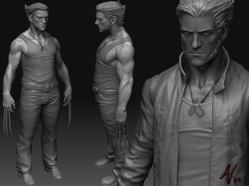
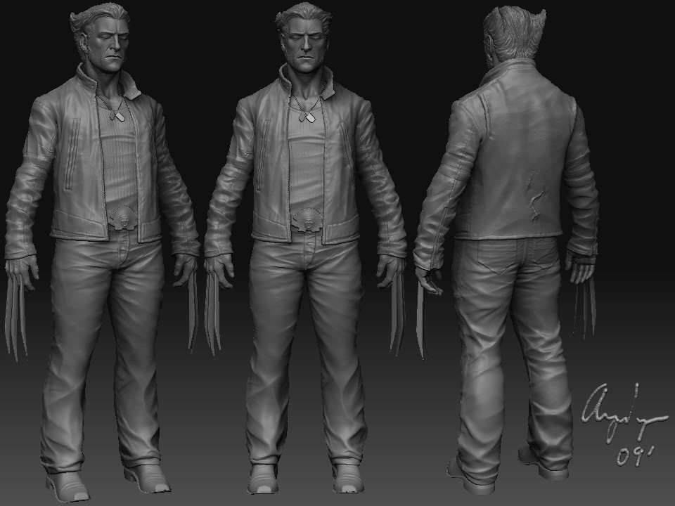
Everyone does a Wolverine model- I know, but this is going to be joined with another model to make a cool little statuette. I'm going for a Stocky and eventually very feral Wolverine, combined with a bit of the films.
I need a little feed back on the sculpt. You guys have been great help so far.
Thanks in advance.
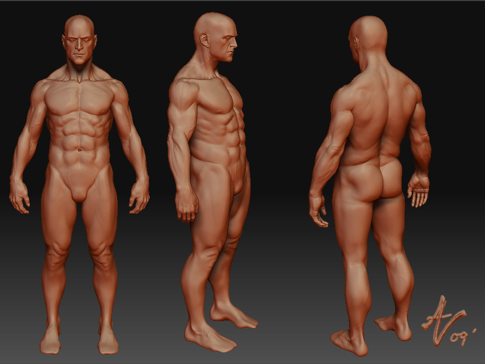
Edit: I'm also submitting the figure sculpt for review.
Feet were not modeled. I flaked out.
Be Brutal. ----maybe not too brutal. :-)
I need a little feed back on the sculpt. You guys have been great help so far.
Thanks in advance.
Edit: I'm also submitting the figure sculpt for review.
Feet were not modeled. I flaked out.


Be Brutal. ----maybe not too brutal. :-)
Replies
i would:
broaden his shoulders a bit, they seem too tapered...especially relative to his hips. his hips are fairly broad, sort of feminine. also, feet don't stand parallel to each other, rotating those out a bit will make his stance feel a lot more natural.
and lastly i'd move his blades slightly out from his body (meaning left/right relative to this pose). just move them closer to the top of his hand i think.
as far as likeness to the movie character, the face isn't exactly there. but you have all the stereotypical characteristics that would identify a character as logan, so no you're fine in that sense. i just don't really know which you're going for.
but ya other than that i like this
Yeah, I used references and they were all Hugh Jackman. even though I wasn't really going for an exact copy from the film, some of him is in there. The coat and other details I wanted, that's all I tried to stick to. The face was a touch and go type of thing.
just to recap, narrow the legs. Widen the shoulders. Thanks!
i agree about the shoulders. his neck feels a bit thin, i would thicken that up a bit. and i agree also about moving the blades a little more to the top of the hand instead of closer to the center.
i think he has a lot of character to him right now and the only beef i have with the face is his nose. it's too long imo. really, if you want to do him real justice, give him the "should've been wolverine" glenn danzig personality. that guy has a great face for the part, and he's also built for it to boot... something about schedule conflicts or somethin'... i can't remember, but they should have just done everything they could to get him in that role.... screw hugh jackman reference/mixture... make him really stocky.
Yeah! that's the kind of thing I'm going for. I'll look that guy up and see if I can adjust the face a bit.
Thanks for the help:-)
Nah I'm just kidding. Looks really cool, though, in addition to seconding ralusek's comments - I'll just say that his sleeves look to be too much on the wrinkly side. It reminds me of how the delicious chocolate forms little ridges on the top of Twix bars.
Wolverine is not a Twix.