Mur_Concept
Hello, I'm new to Polycount and I need crits on my 3D work.
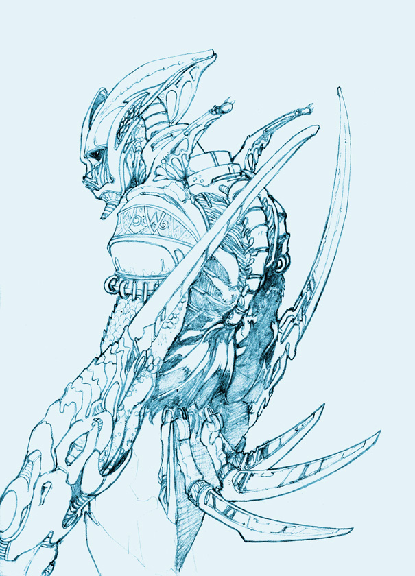
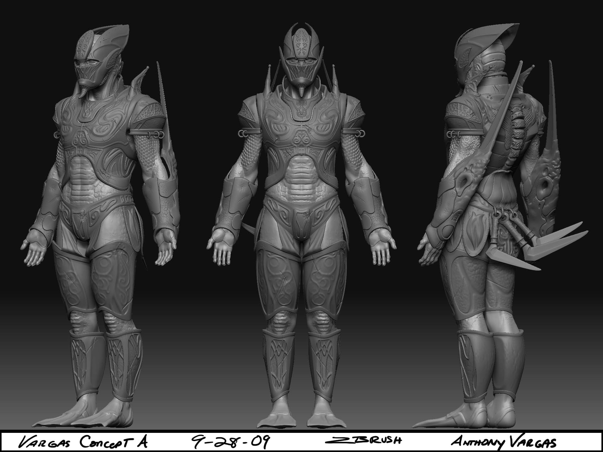
This is a Character concept that I wanted to turn into a low-poly Character.
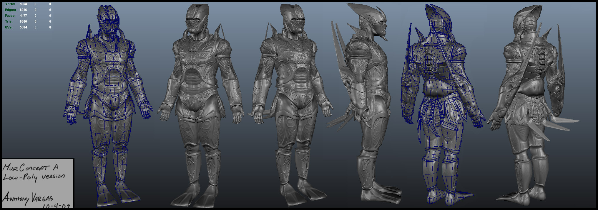
It went from 11million to about 4477 polys.
There are still somthing that I think can be improved on the low poly. mostly in the topology. If anybody has any tips they'd like to share please do.
(The Concept)
(The High Poly Version)
(Low-Poly Version)
This is a Character concept that I wanted to turn into a low-poly Character.
It went from 11million to about 4477 polys.
There are still somthing that I think can be improved on the low poly. mostly in the topology. If anybody has any tips they'd like to share please do.
(The Concept)

(The High Poly Version)

(Low-Poly Version)

Replies
oh well, concept looks cool, reminds me of yoshimitsu.
the model.. dunno. it doesn't have the.. "edged feel" of the concept.
for example, look at the "beard". in the concept drawing its angled, pointing forward at a slight angle, but in the model, its curved.
the concept gives off a much more slender and tall feel as well. it reminds me a lot of sagat or vega.
those spikes on the back, i think it would fit the concept a lot better to have long claws like that, instead of human hands.
............
looking some more at it, and comparing with some proportion drawings on the net.
i think you ended up giving him bowling pin proportions:
slender up the waist, and reduce the width of the legs.
Yeah When I had first drawn the concept I wasn't thinking about turning it into a model, but then I went for it. half way through designing the details I realized that each piece of armor had a different touch.
I'll see what I can do to change that.
Thanks for the help!
LoL, I guess I did! I've always prefered that look I guess, but I've had several people tell me that exact same thing. I'll see what I can adjust to make that more suitable for the model.
Thanks for the help!
Well if ten people say it then it must be true.
It shall be adjusted.
Thank you:-)