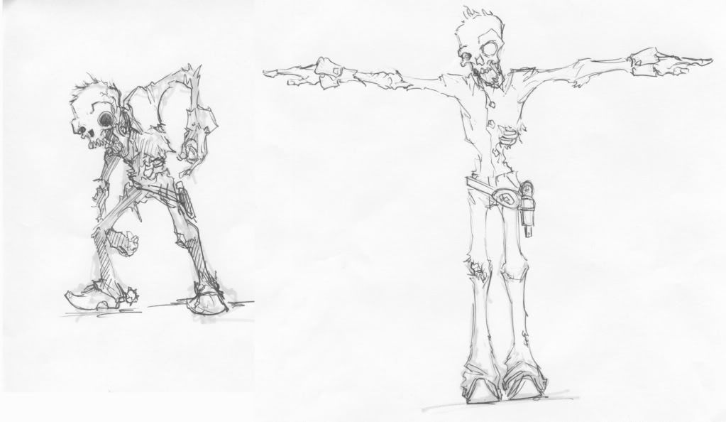
Gold Rush: zombie enemy
I am working on a student made game called Gold Rush. The story of the game is you play as an old gold miner who stumbled on an amazing abandoned mine that was filled with gold. While taking on the gold you find an old artifact which, since you disturbed it, unleashes a zombie outbreak. The whole premise is that you are trying to deposit all of your found gold into a bank while fighting through the zombie legions.
The character I'm currently starting work on is the basic zombie enemy. Here are the concepts:

Please feel free to critique as update my work progress.
The character I'm currently starting work on is the basic zombie enemy. Here are the concepts:

Please feel free to critique as update my work progress.
Replies
Looking forward to seeing all this Gold Rush stuff
Here's the first updates:
This is a great place to get a lot of professional feedback on your work, so have fun, get to know people, and always take everything with a grain of salt.
As for your project, the skull is looking pretty hysterical so far
Nice work so far
Looking forward to more progress.
Thanks to everyone for their comments, I really appreciate that feedback
-Woog
hey how did u do the stitches?
@ Lonewolf - I used a combination of the stitch brush that is in zbrush and the basic brush. I just changed brush sizes and the stroke type to get the desired effect.
There is a combonation of things that make issues with this model if you can't see the baskside of faces. The main problem is that I overlapped the hands and feet of the UV layout since they weren't going to be unique. The problem with this is that with a normal map, it inverts the shading and lighting on the right hand unless I reverse the normals on said parts. Also, the polygons are all flat plains and will only be seeable from one side.
Does anyone have any work arounds for the textures so that I don't have to completely rework the character?
The only problem that I'm having now is getting my alpha to work. Anybody have any info on how to correctly use an opacity channel in unreal 3?
//mason
@ Lord_Mason - I'm actually kind of confused as to what you are refering to. Leather texture on the waste? Are you talking to the belt? I'm not sure how you're envisioning bone protruding out of that particular space.
symmetrical he yes. mmm.
Otherwise It's coming out pretty nicely, the textures could use a little love like the other said. great start w/ the skull on that front.
and my newer diffuse:
yeah that is the area I was talking about. It just feels like the character is covered in leather shrink wrap, because of the jacket, I'd add some more rips and stuff, maybe a big patch or something sewn on, just feels a little dull down there. Don't get me wrong though, it looks great, but it can go further.
//mason
I agree with mojokey about the teeth They kind of blur into a jagged edge of bone instead of teeth. I'm not sure sharp and pointy would really reinforce, old and zombie. They do a lot of chewing and nibbling on things.
I think about the rip in the denim you could add some white bits to help show that its frayed.
I also think you could desaturated the pants quite a bit, they look a little bright and cheery even for someone who would be alive. Cowboys where notorious for never bathing let alone washing or changing their cloths. I don't imagine that changes much after they die.