The BRAWL² Tournament Challenge has been announced!
It starts May 12, and ends Oct 17. Let's see what you got!
https://polycount.com/discussion/237047/the-brawl²-tournament
It starts May 12, and ends Oct 17. Let's see what you got!
https://polycount.com/discussion/237047/the-brawl²-tournament
Library environment
wow, its been long since ive posted anything here.. anywhoo
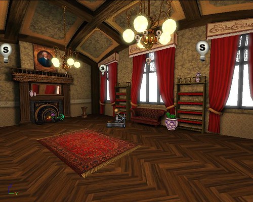
i started modeling and texturing this small room using 3dsmax and photoshop and i just began learning how to use unrealed for unreal tournament 3. I love the material editor!! so its been a little more than a week since ive really started to learn how to use unreal 3.
i guess im just posting here to ask some people for a critique. There are still plenty of more props to texture and import, but i plan to go back.. i just need some advice to help polish this up.
heres what i have so far:


this image is kinda small, how do i get a bigger screen shot??
id be very happy to hear from you guys, thanks
i started modeling and texturing this small room using 3dsmax and photoshop and i just began learning how to use unrealed for unreal tournament 3. I love the material editor!! so its been a little more than a week since ive really started to learn how to use unreal 3.
i guess im just posting here to ask some people for a critique. There are still plenty of more props to texture and import, but i plan to go back.. i just need some advice to help polish this up.
heres what i have so far:


this image is kinda small, how do i get a bigger screen shot??
id be very happy to hear from you guys, thanks
Replies
nice scene so far...
A: A alleyway
or
B: A destroyed something
With my personal preference out of the way , I really love the scene but Im not a fan of the floor at all..
also theres commands you can type to make your resolution window bigger by running the project file (running the game) and hitting Tab to open command prop
Ghost to fly around
I forgot the command for the resolution but I think its
Set Rez 1280X1024 for example? (check ude website to clarify this)
ok a few things I suggest//have to ask
1- Do you have light maps on your scene? (if the answer is no, or whats a light map go look it up and do it now!)
2- are you intensifying your normal maps in your node window? (a multiply node goes a long way!)
3- are you gonna put a cube map on your glass objects? I believe having that glass reflect alot more (espcially the scene itself) will make those glass urns look absolutely GREAT on zoom in's (this is a really advanced process so dont worry if you cant do that, instead make a nice spec map to sell it more, right now its really bright and not looking glassy//fine china to me at all)
4- I need to see more top hat and monocle and pipes in that scene!
5- Glass on the wall is a nice effect good job getting that working!
6- are you planing on sculpting that moose head you have in max?
Great start on this keep pushing GOGOGO!
1 - yes i have light maps on the floor and the static mesh walls, maybe i should change the resolution of the shadows?
2 - no i am not intensifying normal maps and i will now that you've mentioned it
3 - hmm i dont think i know how to do that, any good online tutorials??
4 - lol! cool, yea its not too late to add to any of this
6 - oh and yes i plan to sculpt that moose head
cody: yea im glad you said something, i had doubts about the base of my walls but i had no idea what to do with it.
Thanks you guys, i really needed a fresh pair of eyeballs to look at my scene. Soo now i will continue working on it and i will definetly go back to make those changes. it will probably be another week till post an update but the next time i do the images will be bigger.
Thanks!!
Press 'Play from here' inside unreal, then press tab to bring up the console.
type: showhud - to remove anything on the screen.
Fov 60-100 for field of vision of the camera. And for your own screen resolution type: Tiledshot 6 x 128. Go inside my doc, games, ut3, etc. until you see folder named screenshots- it will be in there.
Good luck!
so i played around with the lighting, added god rays, and changed my floor.
i really like that wood workshop program, works good.
there are still a few things i havent made changes to, like putting something at the base of my walls or making the grain of the wood smaller on my ceiling.
for those of you who are following this, thanks. i really appreciate all your comments and crits
color the lighting! windows maybe blue? lights yellow?
the model and texture stuff is gorgeous man.. but the lighting is flat.
its funny cause the lighting and color looks a little different on every computer i go to
The lights are throwing me a little, during the day time the lights might not be on so bright. Haven't worked in the unreal engine so not sure how feasible it would be to turn it down, or how it would look but just a suggestion.
also some of your gold trim in the "boxes" in the ceiling are not matching to the wood exactly. there is a small space of texture between the gold trip and the wood framing.
also maybe consider using a different texture on the ceiling so it doesn't look the same as the wall?
but yah other than that which is really my personal preference great work man, keep it up
agreed with this
Its not the carpet that looks small, its the room that is so huge. I think the size of that type of rug is fine