UC 2009 'END GAME' | All For Boxes| 2D
Edit:

Pretty excited about this contest. I drew up my first concept in a notebook yesterday but since I don't have a functioning scanner I'm going to have the post the notebook/notecard doodles later.
I spent an hour or so last night and several tonight working on this first go.

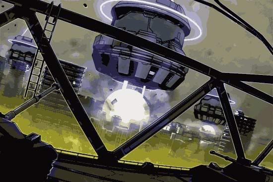
I like to run my images through a good gamut of filters and have worked out a methodology where the images start alot cleaner than they end up. I like to go for a gritty textural look. this ones still in the early stages, but so far i'm pretty happy with whats going on.
more to come : )
p.s.
the shadows won't be so start on the tanks

Pretty excited about this contest. I drew up my first concept in a notebook yesterday but since I don't have a functioning scanner I'm going to have the post the notebook/notecard doodles later.
I spent an hour or so last night and several tonight working on this first go.

I like to run my images through a good gamut of filters and have worked out a methodology where the images start alot cleaner than they end up. I like to go for a gritty textural look. this ones still in the early stages, but so far i'm pretty happy with whats going on.
more to come : )
p.s.
the shadows won't be so start on the tanks
Replies
Quick idea: Are the blue things Spaceships themselves or weapons sent from a ship. Might be nice to have large cables or something going up into the clouds. Suggesting that they are attached to something much larger.
Will be watching.
Btw. That ladder aint much use :P
stinger88: originally the machines were drawn with energy tethers attached to a smaller dense orb above but because of the way i put in the foreground structure i ended up obscurring them. i like the idea of a solid tether going into the clouds though.
back to work for me
Working out lighting and force-tethers.
Working out implying that the light spheres are in fact sucking things inward and not just explosions. The directional lines are too much at this point so i think i'll work off smoke seeming to crawl towards the spheres and appear pulled from more static columns near the foreground.
for the sucking in effectt, why not have some buildings where the middle parts or being pulled in. like a big jenga stack thats bent.
I really liked your composition, rendering and overall concept but the colors were driving me crazy, way too saturated and not much harmony.
For the sake of the explosion filling light everywhere keep the color scheme more monotone. When there's a giant explosion illuminationg everything, you're not going to see a broad range of color.
To make it a bit more obvious if you could try having one of the building crumbling toward it. Probably the large one to the right would work best. Also try adding something that would indicate wind direction to the foreground....Flags on the tanks, cloth or something hanging from the girders...
Keep it coming...
Thinking this feels much more "implodey". Starting to work out a few more details (including the polycount logo...which i think is suppossed to be in our entries...or is it just a team logo?)
More to come.
the rules seem to say further detail the points of interest/centerpiece so i made up other points of view for the "pillars" which hopefully flesh out what they are. i figured the tanks were a point of interest so i made up what they might look like from other directions.
i think the last thing i should put on the sheet is the bridge that the viewer is on since the idea of the level to me is trying to escape being sucked in and trying to traverse the area without falling into the machines. it'd be as though gravity began to pick east or west of your location as it's new direction and being you don't weigh several tons (like the objects that haven't flown in yet) you need to move between larger objects and climb/traverse the area to get away (making the zigzagging girders of the bridge like a floor, the hand railings like a ladder and the ladder...like a temporary platform/deathtrap to traverse to the next safe spot.)
so is drawing out the idea of the bridge the way to go? seems like it's the best option but i'm open to ideas.
edit: just noticed my top view of the machines look like the floatmines from phantasy star 4...man i love that game.
still need to work out some lines on the machines. that and a few more lighting tweaks. oh yeah, and this logo thing...which i'm not sure on and i still have yet design a logo. i really need to wrap this up especially since i want to do one more before the contest is over.
need to bring a little more brightness to the foreground border to make sure it pops from the background.
the final image isn't going to be much different from this.
So I finished my first entry (maybe only entry depending on time.) Here are the components;
Finally got around to signing up on gameartisans so I could actually submit this stuff.