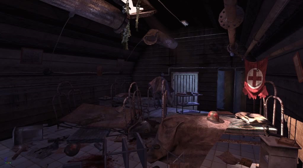
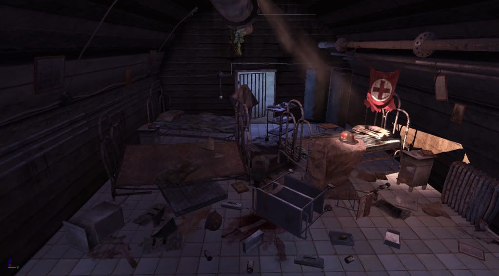
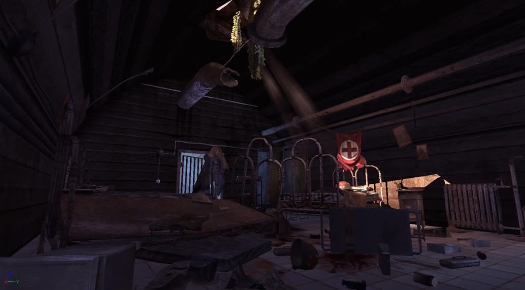
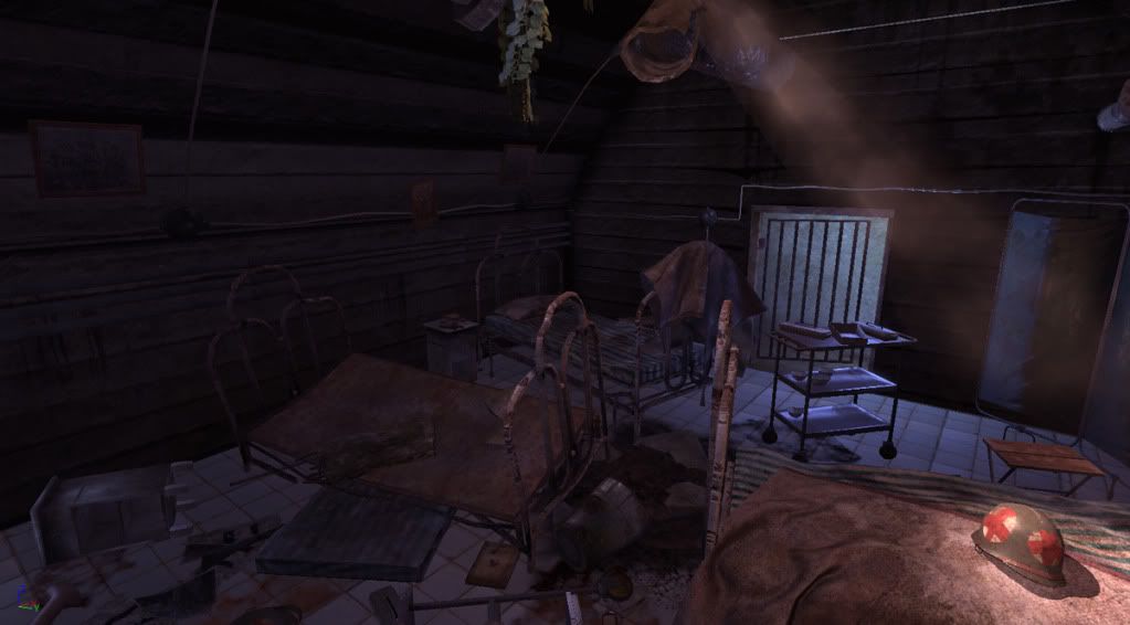
Hi everyone, recap: 'This is an environment I did for my portfolio- I am still looking for work. Please feel free to give constructive criticism if needed.
This is an Underground german hospital that was abondoned during WWII after it was bombed by the United States. This place had a lot of tunnels and rooms for injured soldiers to heal up.'
I took everyone's constructive advice and tried to implement it in the updates as you see below, I am truly grateful that you guys helped me get this done. I am calling this done, worked on it enough
I will be posting the beauty shots for the props by Thursday. Enjoy!
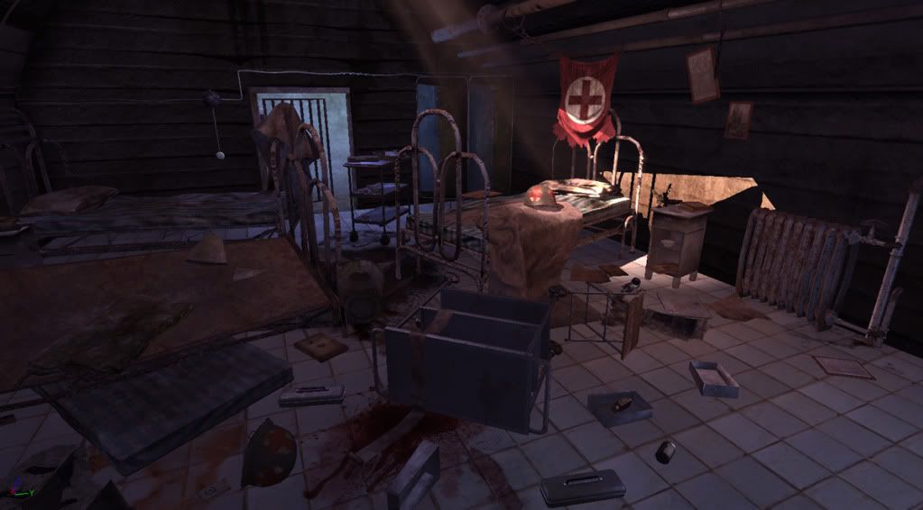
Thanks for pointing that out, it is very odd that I didn't notice that because before I changed things around shadows were there. Anyways I will check it out thanks.
lol I agree LOM, only if unreal had a setting...but I did add ao to the props just gotta get the shadows like Don said. I tried everything and I beleive the problem is the sky light its at 0.4 and its washing out the shadows after the bake. But I need the skylight at that brightness to light up the walls of the room, any suggestions?
But I need the skylight at that brightness to light up the walls of the room, any suggestions?
You need to take a step back and think about how the room would really be lit. The ambient lighting is killing everything, as you've already noted. Really, the light coming in from the roof would hit a surface and scatter. The bounce light from that scatter should fall off, meaning your walls should not be lit evenly. Try removing the skylight or setting it to 0.05 or lower. Then, around the hot spot where the light from the ceiling makes contact, try placing a point light w/ a low intensity and and falloff set to 2 or 3. Scale it up so it covers about halfway of the width of the room. This will simulate some bounce light.
Your floor and other assets look flat because you have not baked lighting (correct me if I'm wrong). Dynamic lighting in Unreal will just give you harsh shadows and direct light. Provided your books and other objects on the floor are set to cast shadows, once baked, the floor will have nice AO / shadow where the books and floor meet. You should note that a set of lightmap UV's should be created for the floor and walls to start.
gamedev: Thanks for taking the time to help me out. Everything does have a lightmap UV channel. I use dynamic lighting for filler lights, and a lot of times when you bake props ontop of props it doesn't show shadows, because it sometimes depending on the object ends up smering the shadows making it dull.
I will take your advice and start from scratch again, I am always learning something new, thanks.
a lot of times when you bake props ontop of props it doesn't show shadows, because it sometimes depending on the object ends up smering the shadows making it dull.
Baking shadows on static objects is a multi-part test to get quality results. And generally speaking, the results that look the absolute best would never be actually used in a game setting due to budgets. (Depending on the circumstances, of course.) However, it doesn't mean you can't do it for portfolio / beauty renders if you wanted to. The reason you are getting muddy shadows is likely one of a few reasons:
How well are the 2nd UV channel's UV's?
How big do you have the lightmaps rez set to?
If you have a good 2nd UV channel and know how to setup the lightmaps, for your ground surface (if it is a static mesh and not BSP) as a test, set the rez to 1024 or 2048 and see what you get. Most likely it is set to something much lower and is the reason you are getting muddy / no shadows. Once you see how it looks at a much higher rez, start scaling it back a little.
You can probably turn off lightmaps for the props just as a test as well. (Will speed up your baking times and help you determine which ones really need it and which ones don't) Simply getting good shadow quality on your floor and walls will make this scene come alive.
After hours of trying to fix different problems everytime, and switching up different lighting set ups I came up with this. This is a quick test render and thank God I got the shadows working, let me know what you think.
Not bad. Don't forget the side walls as well. The place where the white nightstand is next to the air vents and the big light is hitting it doesn't look right without the shadows as well...same as the bed. That big spotlight should be casting rays onto the back wall.
What are the problems that are taking you hours to debug? Ask here and someone might be able to save you some hairs
Hey Don, thanks for your support. I agree on everything you said. I combined the left and right wall with the door wall together as one mesh in 3ds max, maybe thats the problem why it isnt receiving any light or shadows? All 3 pieces combined have a lightmap resolution of 2048, not sure why it is acting that way.
I changed the walls from dynamic like the before renders to everything being static, and used a spot light to get the effect on the bed, directional light wasn't cutting it for me. Ya the walls do receive a nicer gradiation from the lights but as you saw the light from the cieling bakes itself on the wall after the building all lights, but if I move a light around which I am sure everyone knows about it, it receives lighting fine.
Personally, I am not sure if the scene is too dark or right on, because in order to get that mood, light has to be light mixed in with darks or else everything will get washed. Wasn't sure if the shadows are good enough as they are now or darken the ambient overall in the scene to get darker shadows.
Keep me updated, hopefully what I mentioned lends a hand for my saving! Thanks again.
I would suggest separating the walls and floors into more manageable modular chunks if possible, and examine whether or not BSP is an option for the ground surface. (Or an equally modular set as well.
I'm not a level artist (Ask Mr. Wanlass if I am wrong) but if you can break the objects into smaller pieces (doing the entire room walls, ceiling, and door as one object is a bad idea) you should be able to get better lightmap quality overall. I would also start with just ONE light source, fiddle with your lightmap rez as high as you can stand waiting for it to bake, and go from there.
Throwing a bunch of lights and extra props at a single giant static mesh and hoping for decent lightmap rez is highly unlikely to give you what you are looking for.
And the reason it "lights fine" when you move a light around is because Unreal turns the lighting dynamic - giving you a rough sample of what the lights could look like, but as you know, when you bake, they don't look anything like that normally.
If you really want this to pop, I would say post up your breakdowns showing us the biggest shapes in your room (floors, walls, and the biggest prop or two) and their 2nd UVs. It's likely just a matter of UVing them better, and breaking them into more manageable chunks.
And lastly - remember that to get really "great" lighting from vanilla Unreal, you have to go overboard sometimes with the way you setup your scene. Don't forget to add a subtle post process as well.
Looking good so far, though if it were my scene I'd focus a little more on the composition. It's looking very cluttered, and it's difficult for your eye to naturally progress inwards towards the center of the scene.
Granted, an abandoned hospital wouldn't be as 'orderly' (pun most definitely intended) as most, but it looks a little too chaotic to me. I think you could rearrange some of your props to still look abandoned and disused, but still draw the viewer's eye into a strong focal point of the scene. Also maybe try doing something different with the perspective - although this looks like it's taken from the player's perspective, maybe it'd add some more visual interest and atmosphere if you rotate the camera forty degrees or so to the left.
Earlier on the floor was a mesh but that had problems of its own so it is a bsp atm. As for the walls I agree I will separate them and re-import them. It does have a post process on it, which is why it has a reddish tint to it, I will go back and mess around with the bloom I personally didn't think it would fit my scene properly but who knows.
I will post the breakdowns later and I will take your suggestions Ott. Lom, I will definately force feed you the post process :P - Hi dan thanks for the 2 cents! The only way I took the screenshot like that was to show off the entire thing all at once, after I get past the technicality of the scene I will rework the composition. Thanks a lot guys for the help and your supportive criticism.
I finally made peace with unreal . Everything is working great thank God, and offcourse I thank you guys for supporting me this far. One question I have, when I take a screenshot from real time after the bake, the PP effect shows. But when I take a screenshot through the console command it doesn't show up...On my screen PP effect made the scene look amazing, and I am it isn't carrying that through either options that I mentioned.
I might have to increase some settings to make it seen more in the render. Personally I am very happy with the result, BUT I am not calling this done until I fix the composition like you guys suggested, as for lighting and PP it is good to go, besides the problem that I mentioned offcourse.
I am open to any suggestions concerning the PP effect, thanks again here are the 2 screenshots so you can see what I am talking about.
The scene is looking good Mazvix. The only thing I wanted to point out is that the shadows from the pipes are incorrect (based on where the only visible light source is). I believe there is an option within the light to enable/disable shadows, maybe try play with that.
Disco Stu: hey, thanks Don't we all want a germaness....xD
Brandoom: Hey man thank you, the shadows are normal because the light hits the bed area then bounces up, is brandoom the only one that finds it akward on the pipes? Let me know, thanks.
I agree w/ brandoom - the shadows look awkward. They should only be coming from your main light source (the ceiling) and not from bounce light. I also still feel as if your scene still has too much bounce light / ambient light.
The new blue light source I feel also muddles your focal points.
For your post process, try playing w/ the Scene_Shadow parameters to add some contrast to your scene (values around 0.001 - 0.005 should work).
Hi Tyler.
thanks for the input, the pipe shadow are very easy to fix, I will take care of that. As for the bounce light, I get so many complaints that it is too dark, and that it doesn't show off my props and such. Honestly I am like stuck between decisions because originally it is darker, I just lighten it up a bit in ps to see the difference. I will work on the blue light and try to find another solution for it.
Replies
Thanks for pointing that out, it is very odd that I didn't notice that because before I changed things around shadows were there. Anyways I will check it out thanks.
Will add realism and depth.
I will keep on trucking.
Your floor and other assets look flat because you have not baked lighting (correct me if I'm wrong). Dynamic lighting in Unreal will just give you harsh shadows and direct light. Provided your books and other objects on the floor are set to cast shadows, once baked, the floor will have nice AO / shadow where the books and floor meet. You should note that a set of lightmap UV's should be created for the floor and walls to start.
Also - I didn't know this was available in UT3, thought it was a licensee only feature. Cool if not.
I will take your advice and start from scratch again, I am always learning something new, thanks.
Baking shadows on static objects is a multi-part test to get quality results. And generally speaking, the results that look the absolute best would never be actually used in a game setting due to budgets. (Depending on the circumstances, of course.) However, it doesn't mean you can't do it for portfolio / beauty renders if you wanted to. The reason you are getting muddy shadows is likely one of a few reasons:
How well are the 2nd UV channel's UV's?
How big do you have the lightmaps rez set to?
If you have a good 2nd UV channel and know how to setup the lightmaps, for your ground surface (if it is a static mesh and not BSP) as a test, set the rez to 1024 or 2048 and see what you get. Most likely it is set to something much lower and is the reason you are getting muddy / no shadows. Once you see how it looks at a much higher rez, start scaling it back a little.
You can probably turn off lightmaps for the props just as a test as well. (Will speed up your baking times and help you determine which ones really need it and which ones don't) Simply getting good shadow quality on your floor and walls will make this scene come alive.
What are the problems that are taking you hours to debug? Ask here and someone might be able to save you some hairs
I changed the walls from dynamic like the before renders to everything being static, and used a spot light to get the effect on the bed, directional light wasn't cutting it for me. Ya the walls do receive a nicer gradiation from the lights but as you saw the light from the cieling bakes itself on the wall after the building all lights, but if I move a light around which I am sure everyone knows about it, it receives lighting fine.
Personally, I am not sure if the scene is too dark or right on, because in order to get that mood, light has to be light mixed in with darks or else everything will get washed. Wasn't sure if the shadows are good enough as they are now or darken the ambient overall in the scene to get darker shadows.
Keep me updated, hopefully what I mentioned lends a hand for my saving! Thanks again.
I'm not a level artist (Ask Mr. Wanlass if I am wrong) but if you can break the objects into smaller pieces (doing the entire room walls, ceiling, and door as one object is a bad idea) you should be able to get better lightmap quality overall. I would also start with just ONE light source, fiddle with your lightmap rez as high as you can stand waiting for it to bake, and go from there.
Throwing a bunch of lights and extra props at a single giant static mesh and hoping for decent lightmap rez is highly unlikely to give you what you are looking for.
And the reason it "lights fine" when you move a light around is because Unreal turns the lighting dynamic - giving you a rough sample of what the lights could look like, but as you know, when you bake, they don't look anything like that normally.
If you really want this to pop, I would say post up your breakdowns showing us the biggest shapes in your room (floors, walls, and the biggest prop or two) and their 2nd UVs. It's likely just a matter of UVing them better, and breaking them into more manageable chunks.
And lastly - remember that to get really "great" lighting from vanilla Unreal, you have to go overboard sometimes with the way you setup your scene. Don't forget to add a subtle post process as well.
lol, bloom effect and such. : )
Granted, an abandoned hospital wouldn't be as 'orderly' (pun most definitely intended) as most, but it looks a little too chaotic to me. I think you could rearrange some of your props to still look abandoned and disused, but still draw the viewer's eye into a strong focal point of the scene. Also maybe try doing something different with the perspective - although this looks like it's taken from the player's perspective, maybe it'd add some more visual interest and atmosphere if you rotate the camera forty degrees or so to the left.
Just my $.02.
I will post the breakdowns later and I will take your suggestions Ott. Lom, I will definately force feed you the post process :P - Hi dan thanks for the 2 cents! The only way I took the screenshot like that was to show off the entire thing all at once, after I get past the technicality of the scene I will rework the composition. Thanks a lot guys for the help and your supportive criticism.
I will keep you posted.
I finally made peace with unreal . Everything is working great thank God, and offcourse I thank you guys for supporting me this far. One question I have, when I take a screenshot from real time after the bake, the PP effect shows. But when I take a screenshot through the console command it doesn't show up...On my screen PP effect made the scene look amazing, and I am it isn't carrying that through either options that I mentioned.
I might have to increase some settings to make it seen more in the render. Personally I am very happy with the result, BUT I am not calling this done until I fix the composition like you guys suggested, as for lighting and PP it is good to go, besides the problem that I mentioned offcourse.
I am open to any suggestions concerning the PP effect, thanks again here are the 2 screenshots so you can see what I am talking about.
Console SS:
Screen grab:
The only thing im missing is the germaness in your underground hospital ^^
Brandoom: Hey man thank you, the shadows are normal because the light hits the bed area then bounces up, is brandoom the only one that finds it akward on the pipes? Let me know, thanks.
The new blue light source I feel also muddles your focal points.
For your post process, try playing w/ the Scene_Shadow parameters to add some contrast to your scene (values around 0.001 - 0.005 should work).
-Tyler
thanks for the input, the pipe shadow are very easy to fix, I will take care of that. As for the bounce light, I get so many complaints that it is too dark, and that it doesn't show off my props and such. Honestly I am like stuck between decisions because originally it is darker, I just lighten it up a bit in ps to see the difference. I will work on the blue light and try to find another solution for it.
Thanks
Check it out-
www.MarkAbadier.com
I am going to start applying now and then enter UC2009. Thanks for everybody's help and support.
I wish you the best of luck man!