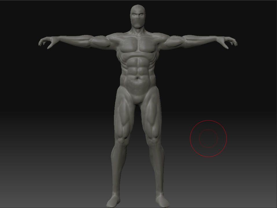
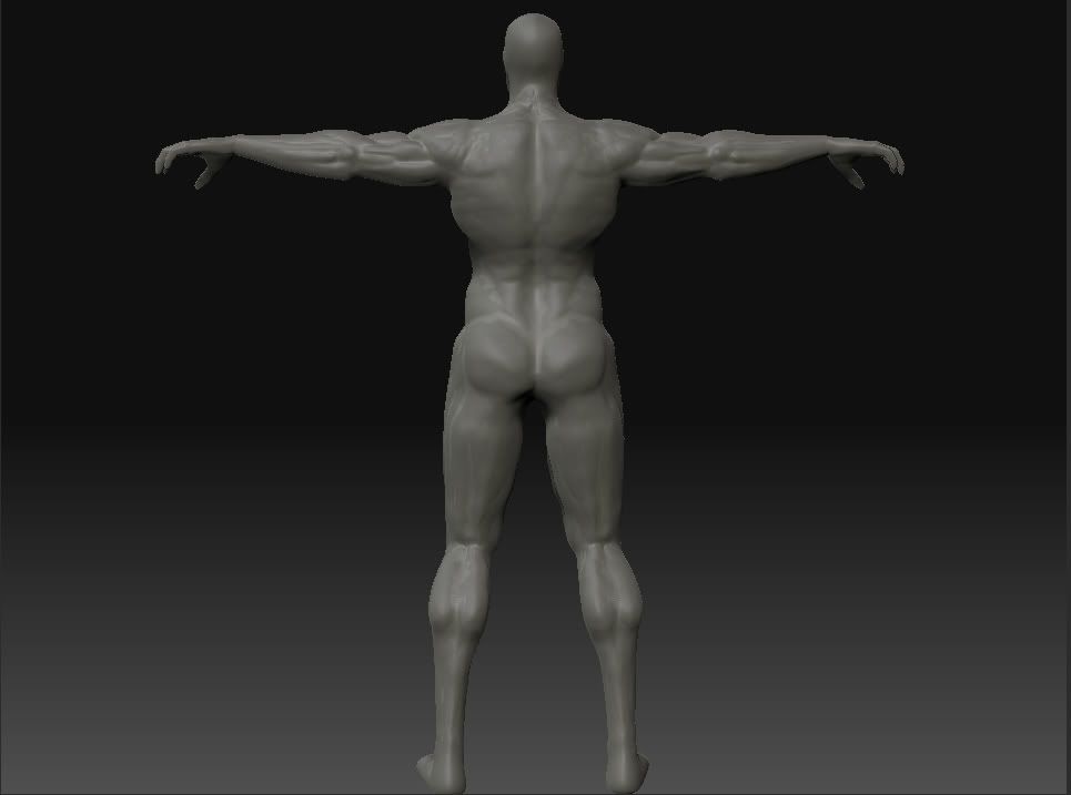
Deadpool WIP
So I wanted to get his muscle structure critiqued before I started on the actual detail. I'm not done with the muscles yet but I just wanted to make sure I'm headed in the right direction. I have my own concept of him drawn up but haven't had a chance to scan it in yet. So that will be up eventually.


Replies
The major problem I have with your anatomy atm is the legs/pelvis/hips. The legs start off too far apart from each other, and with muscles that huge they'd probably be touching. Not to mention how the thigh muscle suddenly juts out.
Either way, just check some refs on that area. (gay porn)
You want to get a nice "V" shape going, by narrowing the hips drastically. The reason Deadpool looks "beefy" in that picture, isn't actually the size, its by the cuts and definition he has.
Therefore, I believe you moved up in sub-diviisions too quickly. Go back down a few sub d's and work on the basic proportions, shapes and sillohette. Just keep playing with it till you get it right, get lots of references, and take your time.
Good luck man!
[edit] and here is a hint about the hips, if you simply smooth out the upper thigh with the hip bone area it will look much better.
i suggest goin over to zbrush central and browse their top row gallery for muscle men and get some ideas to where you can push thing thing to the next level
If you threw in a side view, I think we could give you better crits.
I was thinking of adding the deadpool symbol on his teleporter, and also on his hands. Or maybe on the forehead of the skull.
Right now the clothes look like silk (i have no idea what material it should be...) and he is more pink than red. push the saturation of the red material up a little and push the hue til its red and maybe darken it abit and it will be more like the pics i just found on the internet.
(oh and i notice that his gun looks a little flat at this angle I'm going to have that fixed later)
And also, the front facing model has some issues with his nose.