metalliandy - Art Dump
Hey all,
I thought it was about time i finally posted some stuff on here :P
I have been working on some assets for a scene for the portfolio and this bed has been a a great way for me too define a good pipeline between Blender, Zbrush and UE...its taken a little bit too long to do but everything else should be much faster now its all in place.
The LP beds are 1361 tri's with the pillow and cloth and 973 tri's for the one without.
All the AO is done within UE shader via a 2nd UV set (thanks Eat3d ^^), so i could get maximum modularity from the asset and add extra sheets later if they are needed without having to make another set of textures for the rest of the bed.
I still have to make another bed instance to keep it all in 3's though.
The base meshes were all modeled in Blender and then sculpted in Zbrush, with the exception of the sheet which was part done with a cloth simulation and then refined in Zbrush.
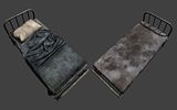
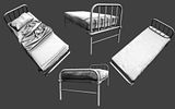

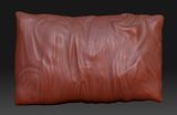


(The spec is still WIP)
Any comments and critique would be great
Thanks for looking!
I thought it was about time i finally posted some stuff on here :P
I have been working on some assets for a scene for the portfolio and this bed has been a a great way for me too define a good pipeline between Blender, Zbrush and UE...its taken a little bit too long to do but everything else should be much faster now its all in place.
The LP beds are 1361 tri's with the pillow and cloth and 973 tri's for the one without.
All the AO is done within UE shader via a 2nd UV set (thanks Eat3d ^^), so i could get maximum modularity from the asset and add extra sheets later if they are needed without having to make another set of textures for the rest of the bed.
I still have to make another bed instance to keep it all in 3's though.
The base meshes were all modeled in Blender and then sculpted in Zbrush, with the exception of the sheet which was part done with a cloth simulation and then refined in Zbrush.


(The spec is still WIP)
Any comments and critique would be great
Thanks for looking!
Replies
I'll send him your webpage, and tell him his doppelganger is in Cali.
^_^
Anyways, sorry for the thread hijack. The bed looks disgustingly awesome.
I still think there's a bit too much noise in your textures, you could make some bits smoother and leave the noisier parts for the dirt, so you get more material contrast (eg. areas of smooth, unworn surface contrasting with tighter areas of wear and dirt).
I also think the specular for the sheets is pretty strange, the colour seems ok but the brightness contrast seems too much - what kind of surface are you trying to indicate with the shinier spec on the sheets? A big patch of grease or something? As long as that's your intention then it might be ok, but in general I'd even out the specular values on the sheets to make them read better as a continuous single surface.
Good stuff though, I look forward to seeing more of this "art dump"!
Sorry Andy.
But how would the quilt end up creased like that ? not trying to be nit picky :P
@MoP
The spec. colour is to suggest a mould/mildew growth on the stain, but i have toned it down some and reduced the noise in the metal.
I think its looking better than it was but the metal may still need more pop.
@iWeReZ
The sheet is supposed to be just thrown down and left like it for years.
That or a wizard did it. :P
Here is something else i have been working on.
Modeled in Blender and sculpted in Zbrush (got to love the surface noise :P)
Thanks for looking
I have just moved house and am stuck on a puny laptop with a 200k connection.
As soon as i get a desk and my main PC up and running i will post some more stuff
Here are a few more small WIP updates on some stuff i have been working on since my last post
I tried to make the cabinets detail a little generic as i want to texture a few different versions (metal and wood) so i can reuse them later.
C+C is welcome
I have added the connector for the hose and messed around with the placement of the dials.
Im going to start on the LP now and see where that takes me.
C+C would be groovy