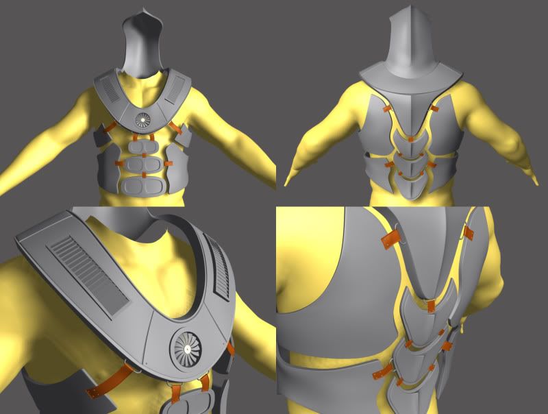
Character for Class, WIP
So, we got an assignment in class to design a character. This is what i have so far. We only have 1 week to model the majority of it. They didnt really say high or low poly, so im doing high this week, then the low after.
any crits on the design? Im going to add more detail to the side pieces.
Keep watchin over the next week as ill post more updates. Like i said, has to be done by thursday.
The yellow body is not mine. Just a dummy model i use for proportions

any crits on the design? Im going to add more detail to the side pieces.
Keep watchin over the next week as ill post more updates. Like i said, has to be done by thursday.
The yellow body is not mine. Just a dummy model i use for proportions


Replies
Either throw some bevels on it, or if it's already beveled, soften it up to let the hard edges catch a good highlight.
~P~
mLink, i definitely agree they need to be bigger, i was just worried they would be too big for the small area they are in. Ill definitely rework them, just dont know if ill have time before its due
prax, yaa, im workin on the undercloth now, and im trying to make it look as though its popping a bit. but you are right about the straps being too loose. right now im just trying to get the character blocked out as much as possible with some detail. even if i dont finish all the details in time, im going to go back and touch it up after, as i want to rig it and use it for my animation reel at the end of the year.
straightened some of the straps, tried to make it look as though the armour is secured to the body.