Underground German Hospital
What's up guys!
This is an environment I did for my portfolio- I am still looking for work.
Please feel free to give constructive criticism if needed.
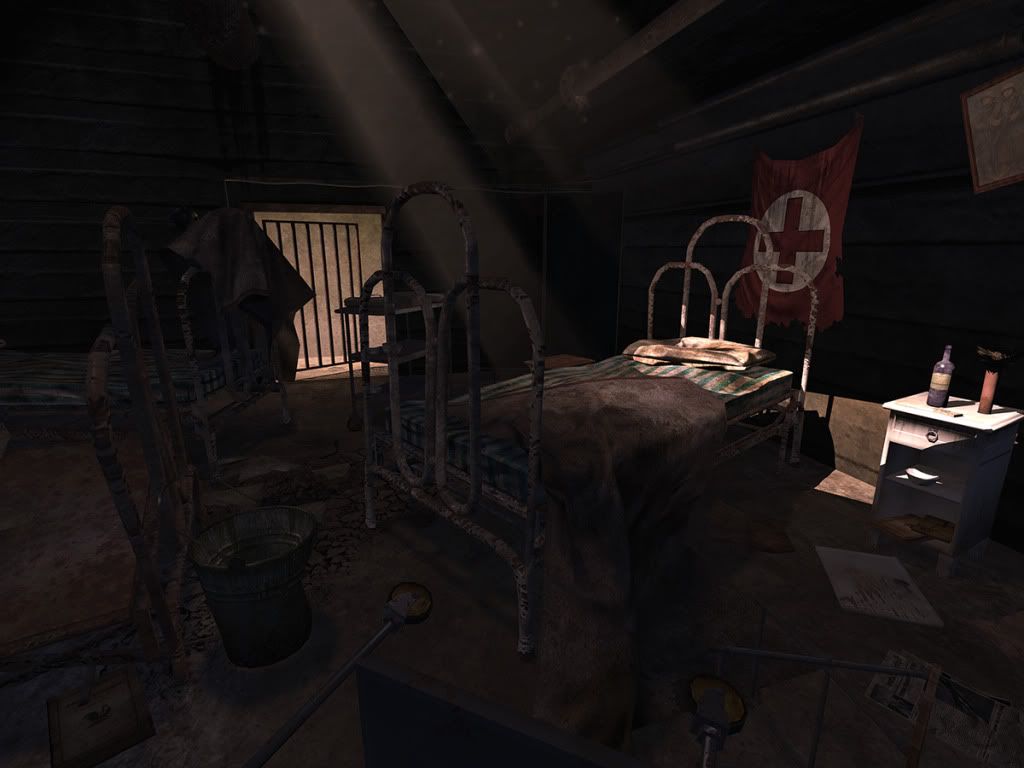
This is an Underground german hospital that was abondoned during WWII after it was bombed by the United States. This place had a lot of tunnels and rooms for injured soldiers to heal up.
I need the green light to polish it up in photoshop and post it on my website with the props that I will link to this thread later and then start applying again.
Thanks again.


This is an environment I did for my portfolio- I am still looking for work.
Please feel free to give constructive criticism if needed.
This is an Underground german hospital that was abondoned during WWII after it was bombed by the United States. This place had a lot of tunnels and rooms for injured soldiers to heal up.
I need the green light to polish it up in photoshop and post it on my website with the props that I will link to this thread later and then start applying again.
Thanks again.
Replies
Id say the floor texture seems out of place, cant really make out what it is, and it doesn't follow along with the stories your telling with your props(as in your props and floor have no connection as far as grit, stains, damage ect.).
I like
If the doctors ran away, did they try to take everything they could carry with them? A trail of bandages, syringes and pill bottles could lead out the door. Drawers could still hang open from the cabinets with stuff spilling out of them.
Maybe the staff was executed? Blood stains, a smeared hand print, broken eyeglasses, a nurse's shoe...
Did a bomb actually hit here? Everything could be shattered, charred and chipped. Rebar could poke in from the ceiling. And that bottle would definitely not be standing there intact.
If it has been abandoned for a long time, then maybe a forest above ground has started to reclaim the space. Like AnimeAngel suggested, maybe plants hang down from the ceiling. Plants and fungus have started to grow on everything like this: http://www.flickr.com/photos/slaterspeed/2556131046/sizes/l/
If you do want to keep the random, chaotic look then you need to at least push it more with A LOT more junk on the ground. Layers and layers of paper, debris and stuff on top of each other. I would also cluster things more instead of evenly spacing the pieces from each other.
I feel like the modeling and texture work on this is pretty solid. It might help to refine some things here and there, like the wooden drawers could use more grundge to help match the rest of the scene, but thats a knit pick.
Id say the number one thing that would really help sell this scene is a slightly furthered understanding of how light works. Right now you have 1 major light source, and a secondary (the door). Whats important to take notice of, is when you have a bright light cast into a dark space, the space will light up like crazy via bounce light. Right now you have the one light source coming in from the ceiling. Where ever it hits, - (based on the surfaces which it hits), turns into a new light source, which then bounces lights in other directions. You don't even need to use any fancy software/rendering to achieve this, you can simply drop in some new lights that simulate some bounces. The human eye isn't as critical of bounce light accuracy as it is something like, proportion ratios on a human face.
the door way could be another light- but it might be cool to take it one step further than whats in my paint over, and make it a cool light. So you have the warm light coming in from the top, then a cool light coming in from the side. I feel like that will make your scene pop like crazy
The bright thing on the floor is supposed to be a reflection of the hole in the ceiling. All specular highlights are really just a reflection of the light in the surrounding area. (but the way I painted it, its way too bright for a dirty mud floor, probably in the wrong spot, and fights with the paper,- so its not a very good example of this)
:also it might be worth saying that the scene seems very dark. there is a small pool of light around the bed, then the rest of ths scene seems to be ambiently lit, which causes you to loose all kinds of cool information on you assets, textures etc. Its such an extreme darkness that I feel like my monitor might be set wrong. Is anyone else seeing that?
Konstruct: yo! WOW you definately know how to give a good critique haha. I agree with you, when I am sitting down monitor DOES darken the image especially on an LCD or plasma which is why I stand up. I agree and few of my friends told me my lighting isn't giving my props justice.
One thing about me is I focus 2 much on how close I can get to realistic lighing to the point that its all subtle and you won't see it in the renders but you notice it if you are running around. I definately agree with you, one thing I learned in 3D is over exaggerate lighting/ other things to pop it out more. That lighting that I did ended up like that because I am afraid the shadows will end up getting washed out, but I know what I need to do- simply bump up the brightness intensity on the bounce lights and offcourse do the drawer and balance between high intensity lighting and color of the prop. Thanks again man I always know I can count on polycount
I need to still add AO maps. here is some screengrabs from the mesh viewer in unreal, enjoy!