Air Surfer
update:

Hi here is a character I have been working on for a little while now
I am trying to make some decisions on poses for a beauty shot for my portfolio.
also, while it may be too late to make any major changes to the design , post marten comments are appreciated , so that I may improve the next character I make .


here are some images for poses that I picked out for a beauty shot
note fine details like digits haven't been posed, and when I find a couple I (you) like I'll adjust them


Hi here is a character I have been working on for a little while now
I am trying to make some decisions on poses for a beauty shot for my portfolio.
also, while it may be too late to make any major changes to the design , post marten comments are appreciated , so that I may improve the next character I make .


here are some images for poses that I picked out for a beauty shot
note fine details like digits haven't been posed, and when I find a couple I (you) like I'll adjust them


Replies
nice work man
thanks man
But if he can be more handsome?he
LOL
yes , Boy Band Mustache
Thanks !
eye level should be on the middle of the head, excluding hairs.
overall looks good.
simply design/anatomy suggestions though, the execution is pro, good job.
5-7 not so much
the theme I was going off was that there is a defense unit comprised of youth from extreme sports whom had been asked to join elite agency to fend off a new breed of creatures invading the earth world.
the adornments that he carries with him are those from his roots. he can't fully take his responsibility serious without bringing things from the past.
he has a surfboard comb, rabbits foot , shark necklace, and sex wax T-Shirt
I believe I brought down the forehead a bit from the sculpt ver on the low poly. but it is an easy enough fix to do some more , minus some re rigging of course.
anyway, I was straying away from the typical look of most heroes, and going with more of a final fantasy pretty boy look (mostly due to what recruiters have been asking of me, for this type of job and that type of job)
thanks a bunch for the suggestions, seriously thoughtful and helpful
I'll see what I can do to remedy, but ultimately , I would like to finish it soon and move on to something else
perhaps these images can help isolate the issues that you are seeing
TIA
it is a little off, but not middle of the forehead off
I like the pose in the middle...nice job. And add some life to his skin textures, they are wayyy too pale right now (red,organes and yellows. Less grays plis)
I can see what you are saying, I'll see what I can do
he is an air surfer not the conventional water surfer different elements act differently on the body that is just a thought though i might be wrong
my only crit is that the he seems scrunched down in the orthos and top renders (action shots look fine though) something to think about for future builds great model otherwise
Both of your opinions are correct, definite design considerations I need to keep in mind.
Polycount fucking ROCKS !!!! great feedback
At this point I am moving on to presentations shots, I have started to modify #2 . I should have some examples soon .
his face seems round and undefined, and his eyebrows are kinda bushy an sloppy
now he looks almost exactly like ron howards brother which i'm sure you are not going for
btw the penultimate image and the one before you posted really rocked hard, please, please, go with that:poly142:
OK I get the point, redu the head
there is a connection point around the neck area that could be addressed as well
sort like a body suit ( much needed wear in the NW surf scene for the cold ass pacific)
here is the presentation shot I was working on
maybe finish it up, and it will give me time to make decisions about the face
this way the face is covered and doesn't matter at this point
btw which one is the "penultimate image" ?
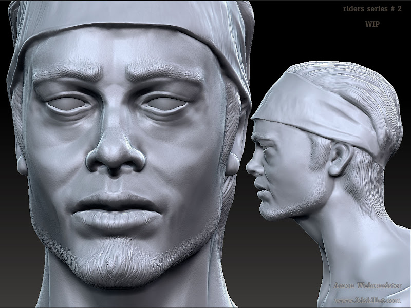
So to beat a dead horse I started a new head.
right now I am just trying to establish the planes of the face. I figured if people see problems with it . It will be easier to solve at this stage than later down the pipe
looks much better so far, not as scrunched into the bottom of the skull
The lips look like they "pucker" a little strangley, however I'm just trying to find something to mention, even if you didn't change it the model looks great.
here is an update on the face
thnx for the Brad Pitt references
I lived there for about 8 years
I'll look into the thanks for the quick reply
Also for pushing me to do better.
So right now I am working on an anatomical reference model. I am going to take it a bit further than necessary , mostly for self improvement.
Right now the head is just projected onto the model. How I develop the clothing, and other character surfaces will determine if I use this technique on the final. Or weather I use the high rez head model.
For now the head projection is only a reference for the creation of the rest of the model.
anyway I thought this would be a good place to post to allow people to comment on some of the more major forms.
TIA