Mercenary Soldier redux
Hi folks-
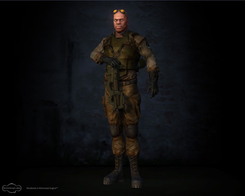
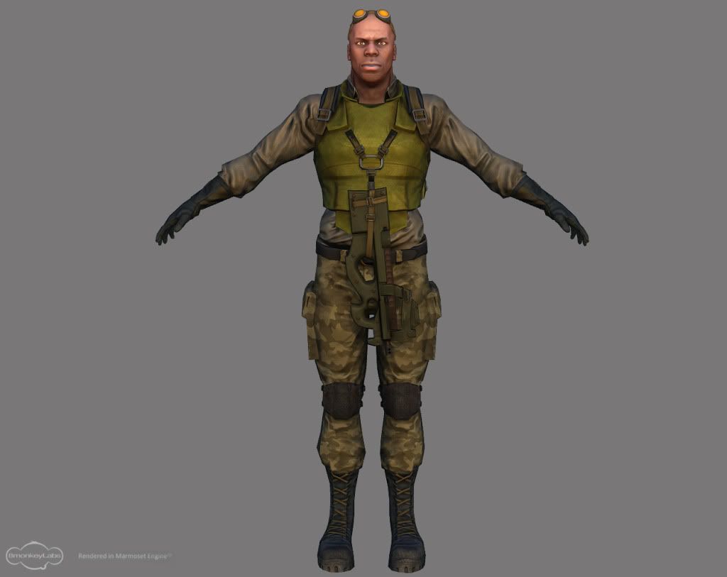
a while back I posted my first completed game piece, which was a soldier, The feedback generally indicated that the texturing on his clothing was bland and uninteresting, but the sculpt was fine.
I've moved onto other things but this has nagged at me so I took a second pass at the clothing yesterday, and wondered how people felt this version compared. I mainly added tonal shifts and variation plus grime, and reworked the normals and specularity to suggest more interesting surfaces. I've posted the new one and the original:


Thanks!
~P~
a while back I posted my first completed game piece, which was a soldier, The feedback generally indicated that the texturing on his clothing was bland and uninteresting, but the sculpt was fine.
I've moved onto other things but this has nagged at me so I took a second pass at the clothing yesterday, and wondered how people felt this version compared. I mainly added tonal shifts and variation plus grime, and reworked the normals and specularity to suggest more interesting surfaces. I've posted the new one and the original:


Thanks!
~P~
Replies
However you have some underlying proportions issues that should be fixable in the lowpoly - notably his arms are too short, his legs are to long and his feet are huuuge. Given the fact that his face and clothing are fairly realistic rather than stylised, it would definitely help to have more believable proportions to his body.
I like big feet though! :P
~P~
On a lovely additional note, my subscription copy of 3DWorld just fell through the letterbox and they included a letter I wrote regarding some ZBrush training they'd reviewed- and included 6 images of my soldier to accompany the letter
It's the crappy bland texture version but oh well
~P~