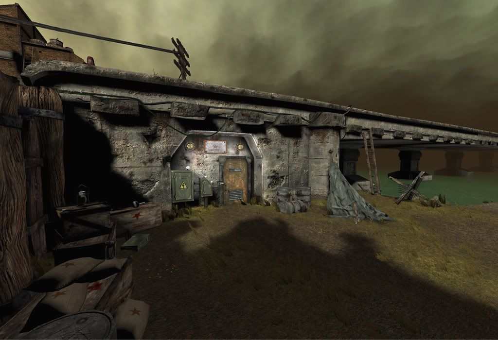
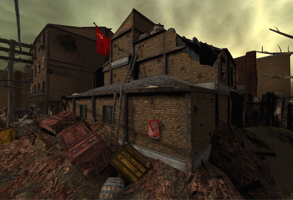
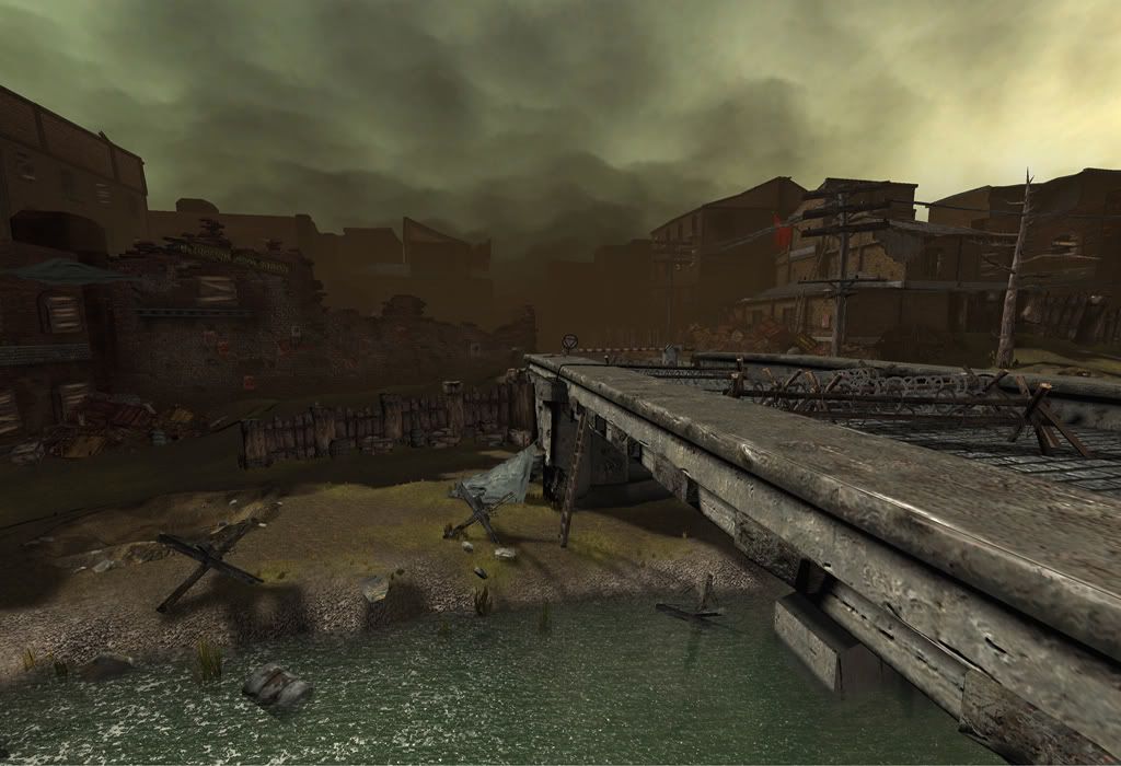
hey pc, here's some shots from my most recent project. I finished it just in time for GDC
It's in unreal, first scene I've ever assembled on my own in the editor.
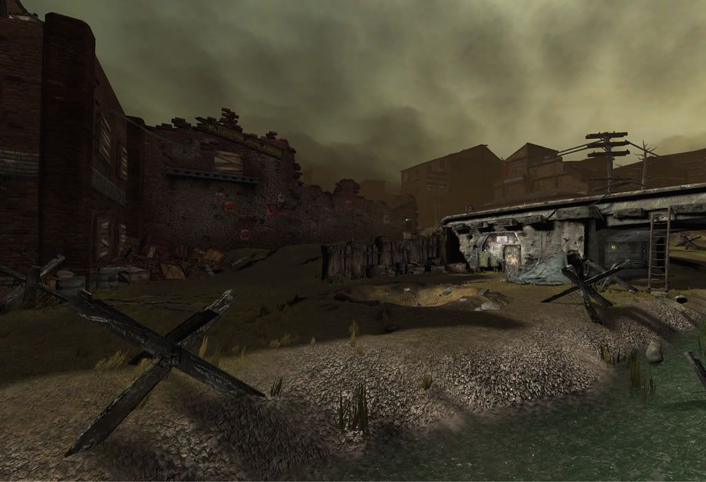
Looking good Chad. The new water definitely looks a lot better. I really like how the whole scene turned out.:D I'd probably use a more washed out red for the flag that seems to be left out in the open, cause it looks damaged but it'd be nice if the color of the flag showed that too. Maybe the same thing with the poster, it just seems to clash a little to much with the more neutral colors in the scene. Great job man!
really rad. . .you know. . those Beach barricades are supposed to be metal, yes? Cause it's sort of reads like a burnt wood... but if it's burnt good. Excellent.
Lookin good. I agree with erich... the beach barricades do look like burnt wood. I think the up close shots look good, but for some reason, the second picture just looks off to me. I dont know if its just the render, or if there isnt enough damage around the terrain, or maybe the grass just looks too clean... just looks.... off to me.
Replies
For now the lighting is too bland and uniform. Some extra work there would do wonders.
and nope beckman, its suppose to be metal. Ill play with the texture.
and thx andreas!
and lighting.. time to start playing with it..
thanks everyone
Looks like this would be fun playing around in. Keep at a bit and it'll be legit. Best of luck at GDC.