White Tiger
Well I think this is the first time I have ever posted in the finals section! :O
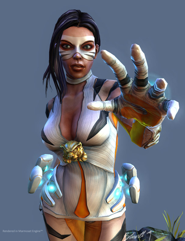
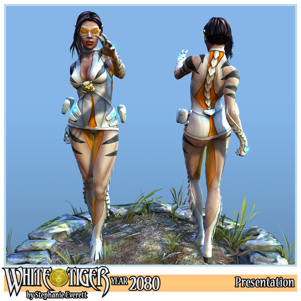
Here I will present you with my version of White tiger (Angela Del Toro) in the year 2080!
I had so much fun with this character and her little base. I think I had just as much fun making the base as I did the character xD.
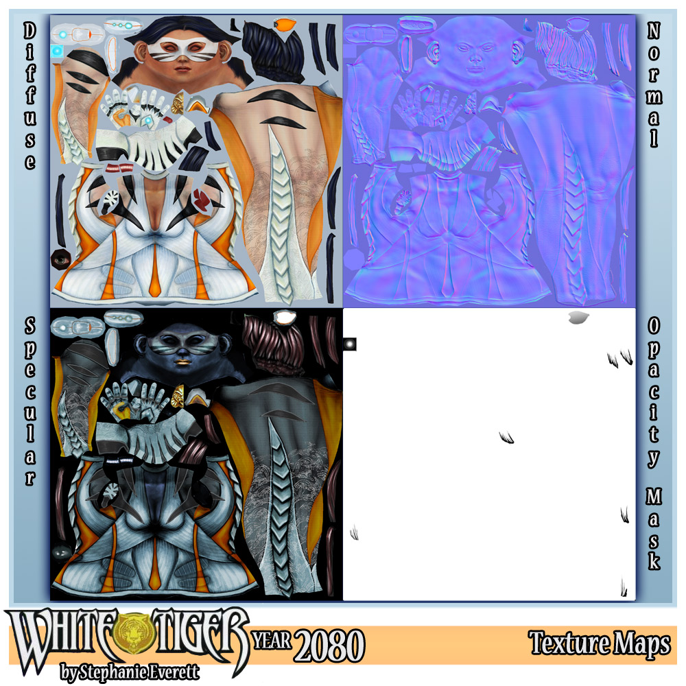
What was really challenging for me was painting the textures by hand. I really enjoyed it and definitely will pursue hand painted styles for future art


Replies
Poop: Oh the little hover pouches? No they aren't part of the original design. In the original design she has "Default Superhero Belt Thing", which looked totally 90's. And I couldn't get rid of the belt as she uses the pouches to store stolen drugs.
So I made them floaty to make her look more futuristic.
If you are interested, here is the reference I used: http://i28.tinypic.com/2rrs5ea.jpg
But thats just me being fussy, great job mate.
Well in that case I'm even more impressed. Awesome job of updating the concept to be more modern. It really makes her design work much better, the belt of the original looked really out of place.
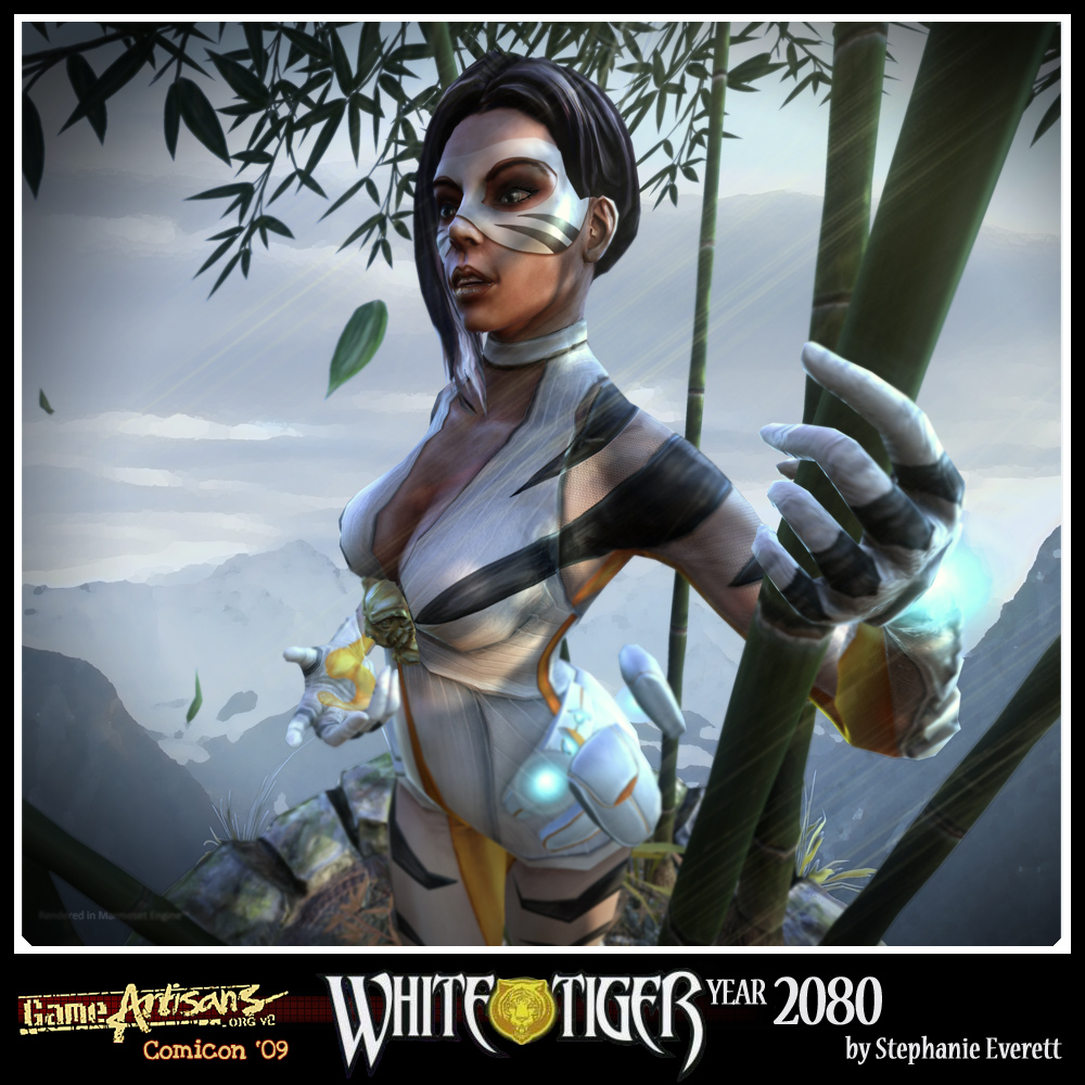
in the last beauty render i don't think the sunrays are quite working - they're too sharp and too many
The eyes seem to lack something to me... a bit empty. It's hard to put my finger on but I think it's the shape because it's in the original sculpt as well. You're probably way done and don't care but there ya go
Welcome to polycount.
TWilson: Yes the eyes! Ack I hate doing eyes! I can never get them to look right. I guess I need more practice with them
I think they were just too long and flat, so then the iris was painted it, it just didn't fit properly ><
Sectaurs: oh my! You are right! I should have just removed them. Thanks for the pointer. I will have to look out for them next time. Curse you godrays! *shakes fist*
JasonLavoie: Thanks! I actually wish I spent more time on that, I was only able to rough in some hair highlights, but I should have paid more detail to them, cause they just look like brush strokes now
Poop: Cheers! That old belt totally reminded me of April from the early TMNT cartoons xD
NiGHTS2o06: Oh dude! You have some sharp eyes! xD Yes I see those seems! Damm seams! I though I got them all! haha. Always something that eludes you at 2am
Acid: Yeah Its a shame about the courses in Aus, I did the qantm course in 03 and its was alright, but I learnt most of my stuff from my own study and my own experiences. I wish the courses went so focus on that the Government thinks should be in them, and just teach the students the core stuff to work as an artist in a games company.
Hazardous and I always get into big discussions and rants about how poor the schooling system is for game dev courses are in Australia xD
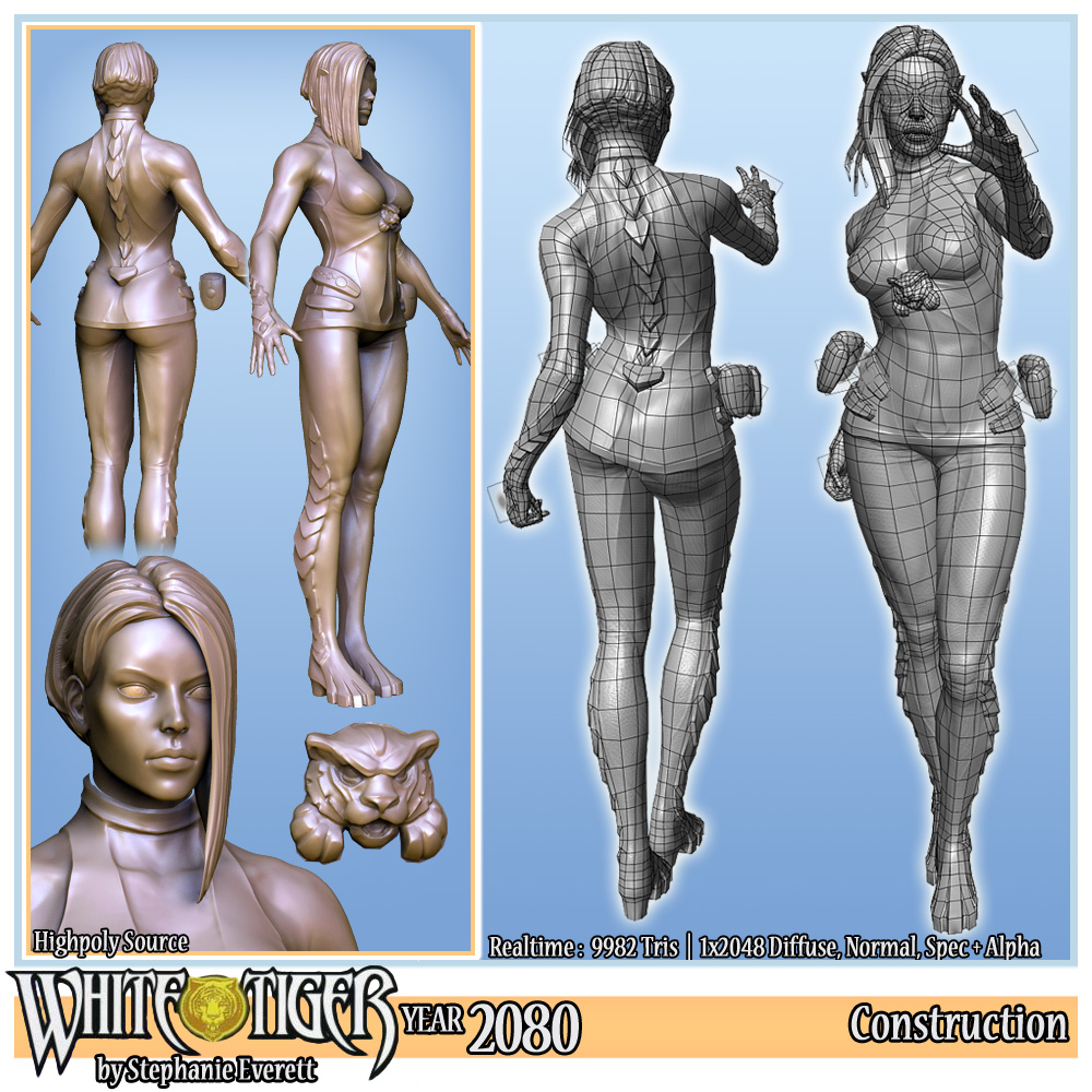
I think some of the things could have benefitted being seperate meshes in the high poly scupt, when it is done like this leads to soft edges where the clothes meet the skin, probably the biggest example is the neck ring. That being said it can take alot more work than is realistic with negligable improvment, especially for such form fitting clothing
Really good to see some aussie artists doing very well for themselves, just glancing over your linked in.
Also cool to see you went to qantm. I'm almost finished a bachelor there. Though i do hold the same feelings towards aussie art education as you do.
Btw, in your linked in it says qantm collage instead of college.
Keep it up!
EDIT: just found something that shows the reults of having clothes seperate .
http://en.9jcg.com/comm_pages/blog_content-art-180.htm
Notice how sharp the changes between the pants and shirt are.
I know what you mean about the edges, but I figured that it wasn't such a big deal and would eat up too much time as most of that normal map detail can't be seen most of the time, and you can usually get away with some spec and shadow shading. Like what I did with the boots xD
Ahh A bachelor eh? I only did the 9 month dip or Screen. It was supposed to join onto the Game design Degree but after 9 months I thought I could be better off spending my money elsewhere. :P
Motives! ahaha yes! that was my lazy masking abilities! xD
I was that young guy with red hair that tagged along to that one sketchgroup at the end of last year. Since then ive taken the sketch group over ccomepletly and have been running it at the myer center starbucks all year :O.
I thought that the clothes thing was probably a matter of time. Actually just looking at it again, if you could get rid of the ao shadowing at the material breaks, it would probably help it immensley
I just dont realy like the material definition on those transparent/plastic areas covering her body. Couldnt really tell what it was. Is it like a transparent covering? if so, i think you should have maybe brightened up the speculars, add some glossiness and maybe destaurared the area a little bit. I could be wrong 100% though :P