The BRAWL² Tournament Challenge has been announced!
It starts May 12, and ends Oct 17. Let's see what you got!
https://polycount.com/discussion/237047/the-brawl²-tournament
It starts May 12, and ends Oct 17. Let's see what you got!
https://polycount.com/discussion/237047/the-brawl²-tournament
Spec Ops Character
Hello everyone. I've been reading polycount for a number of years but didn't post before, so here it is.
I'm looking for a job at the moment and I thought it would be a good idea to work on some game content.
This character is made after a concept by Nick Smith. I think that I'm finished with the high poly and hoping to be able to bake it next.
It's modeled in max and zbrush.
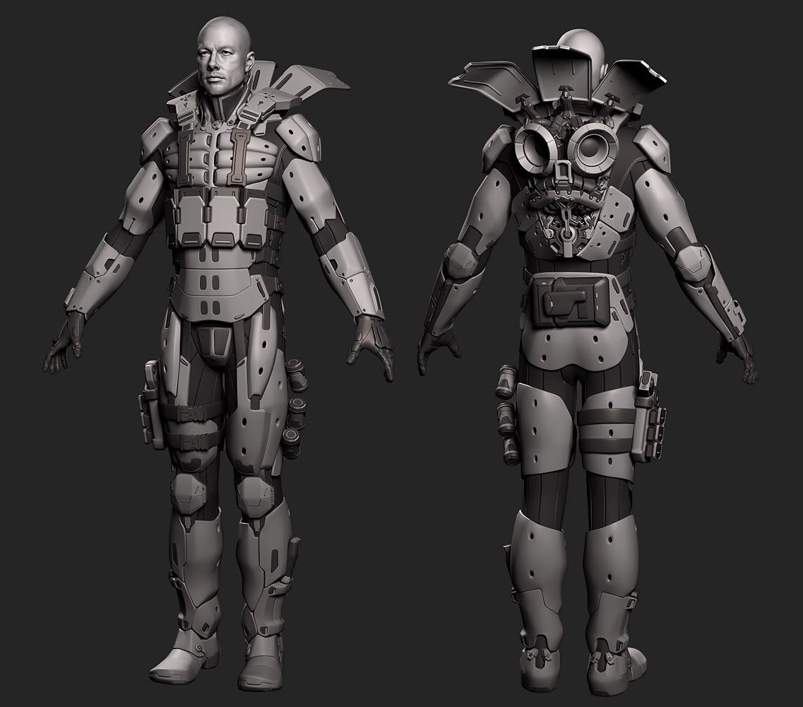
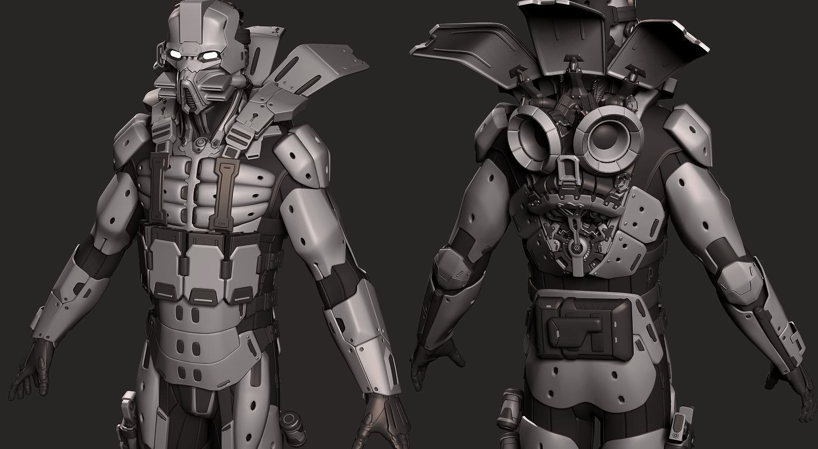
I'm looking for a job at the moment and I thought it would be a good idea to work on some game content.
This character is made after a concept by Nick Smith. I think that I'm finished with the high poly and hoping to be able to bake it next.
It's modeled in max and zbrush.


Replies
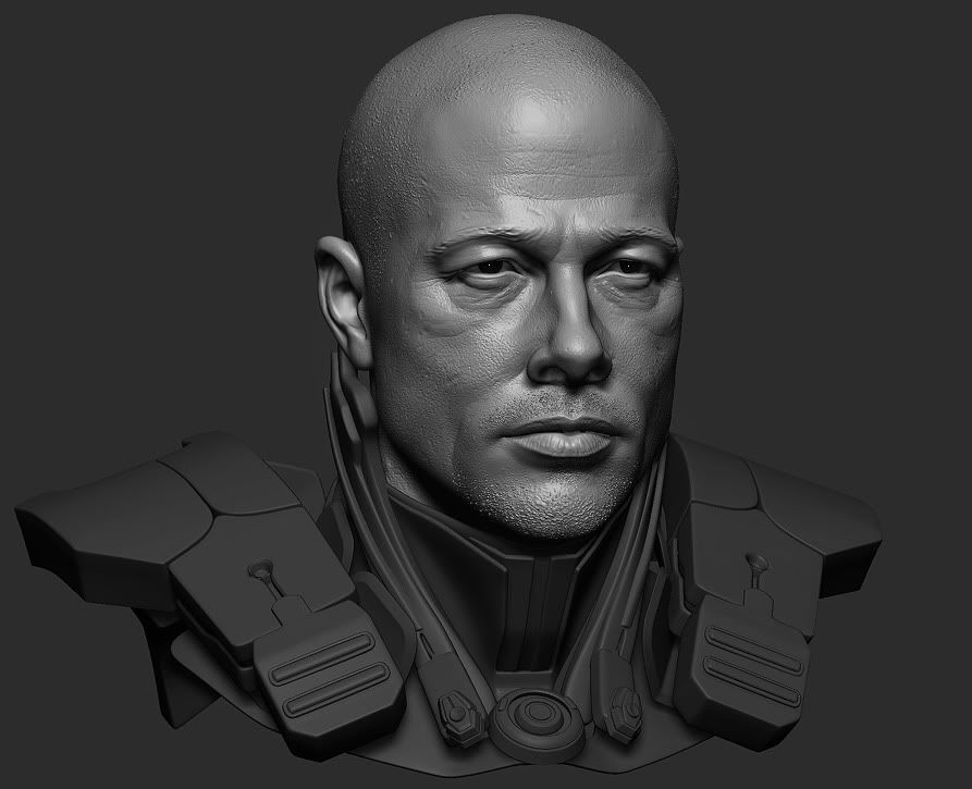
Face is nicely done, did you use Brad Pitt as reference? I'm getting reminded of him a lot in that last image there.
Ditto what MoP said about the Brad Pitt likeness.
I'm not a fan of the techie horizontal gas-mask things on the helmet. I think you could come up with a more compelling design that works better with the form language you've established with the rest of the outfit.
I'm with MoP on the Brad feel to the face. Love the vent system on the back- I assume it hinges shut as well? And I like the way the gun carrie sthe same aesthetic- clearly part of the same world!
My only thought would be to wonder if the armour allows enough movement at the hips- it looks very constraining....but it's still really well executed!
~P~
perhaps make the eyebrows more detailed if I was being really nit picky
I really love the mask, at first it didn't sit well... but I took it in a bit more and it defiantly adds character.
Only thing that bothers me is torso, which is a bit too long
What kind of colors are you going to use for the texture?
Thanks everyone!
MoP: Yes, I've used Brad as reference. I wated to make him a bit grittier.
ScoobyDoofus: Those are the things that attracted me to this concept. I think it's a matter of love it or hate it
praxedes: Yeah, the back hinges shut over the engine. Hmm, I think you are right about the movement, it's on the limit at the moment.
ZacD: I'm glad to hear that. I like the designs of Mass Effect very very much.
Ruz: I agree with that.
JasonLavoie: I thought it was a pretty bold design from Nick.
Sandro: It's possible that it's too thin width wise, because on the vertical it should be at the right scale.
jocose: I think it's going to be dark/black .. similar to the concept.
I think that I'm going to have a lot of headaches with the low poly next
You can check out Nick's art here
Cheers!
awesome work on this, man, so clean. top stuff.
But one thing: His Jetpack looks somewhat like a car-soundsystem. ;p Although having a soundsystem in your specops suit might be a pretty funky idea. But I guess you could make those jet-engines an bit more like real engines.
As I couldn't find the concept on the site you have linked I don't know if the jetpack is supposed to be like this.
Anyway. Great work. Looking forward for lowpoly and textures.
I love the detail work done on the head...all of it!
I do have a few nit picks :P
The musculature tube shit(pecks, delts, thigh feels a little too stiff as where it should feel more soft almost like a inflated balloon.
The 4 big ammo packs are different in the concept outer most left and right ones are taller and don't have the top grey part(ref concept)
last one is the inner thigh gortex suit part has more interesting lines/patterns on the concept
torso seems to long. specially if you compare his arm lenghts against it.
also as has been pointed out, the armor around the groin/butt area is way to restraining,
instead of the saddle on his butt make it two plates.
the armor on his groin should either sit higher, as atm he could barely crouch and it would be pretty uncomfortable getting your blood cut off ^^
eventually go for a groin guard like this:
but i think u need to fix 2 things
1. his neck looks too long
2. stomach too long as well
love the head!
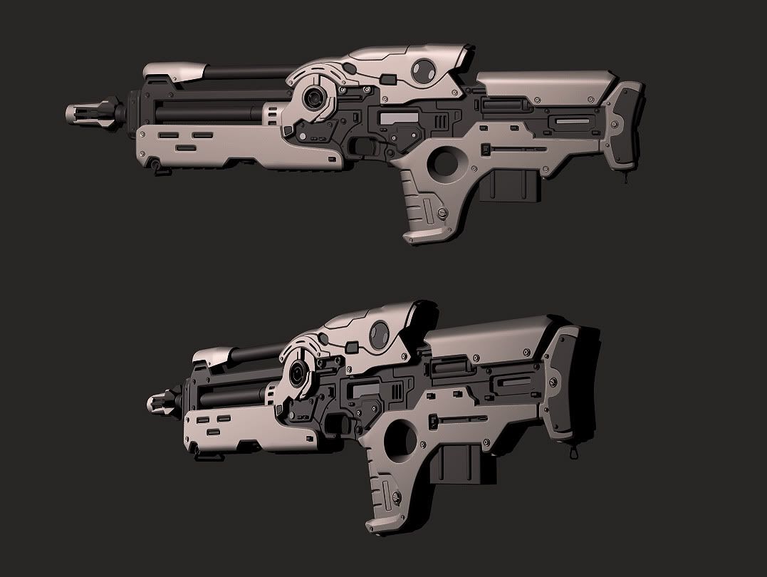
hmm also on the gun, the grip hole and the trigger are too far away,
I'll try to address the things mentioned.
poopinmymouth: I think that the head will smoothen up with the normal map shader and textures and the reverse will happen with the armor.
Amazing stuff though dude, loving the bust render especially. Great work.
If anything I agree that the armor design creates the illusion of an elongated torso. If you only had 2 plates in the front I think it would fix it.
PS Great portfolio and welcome to Polycount!
For the cuts that I have on the main body of the weapon I used low poly splines converted into poly, to get the topology of the creases in, then I filled the gaps between the cuts and the outer border.
UglyMuffin: thanks man. It looks pretty good there, I like the layout they made.
cman2k: I agree with you. The render also doesn't help very much. One mistake that I made on the entire model is that I made the edges a bit to sharp so it looks like mid poly with smoothing groups on smaller renderings. I'll try to fix that a bit.
TWilson: Yes, I guess that's the problem, because the measurements seem to be ok. I reduced the size of the lower armor to allow more movement in that area and it also reduced the illusion.
Btw, what's the polycount on the weapons these days?
Thanks again to everyone!
Here's the low poly weapon:
QFT
took the words right out of my mouth
4.6K polys- not knowing much about equipment counts as opposed to character counts, is this reasonable for a 3rd or 1st person weapon?
~P~