The BRAWL² Tournament Challenge has been announced!
It starts May 12, and ends Sept 12. Let's see what you got!
https://polycount.com/discussion/237047/the-brawl²-tournament
It starts May 12, and ends Sept 12. Let's see what you got!
https://polycount.com/discussion/237047/the-brawl²-tournament
Commissioner Gordon - Commicon 09
Hey everybody,
figured it was about time i stopped lurking around here and actually join-up proper. the quality around this place is just rediculous but here's my first measly contribution:
GA.org comicon entry, James Gordon all gear'd up to handle Gotham now that Bats is dead (new bats don't count)
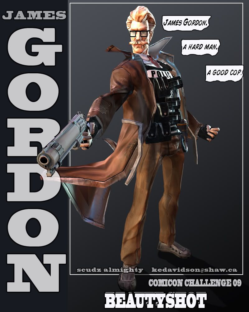
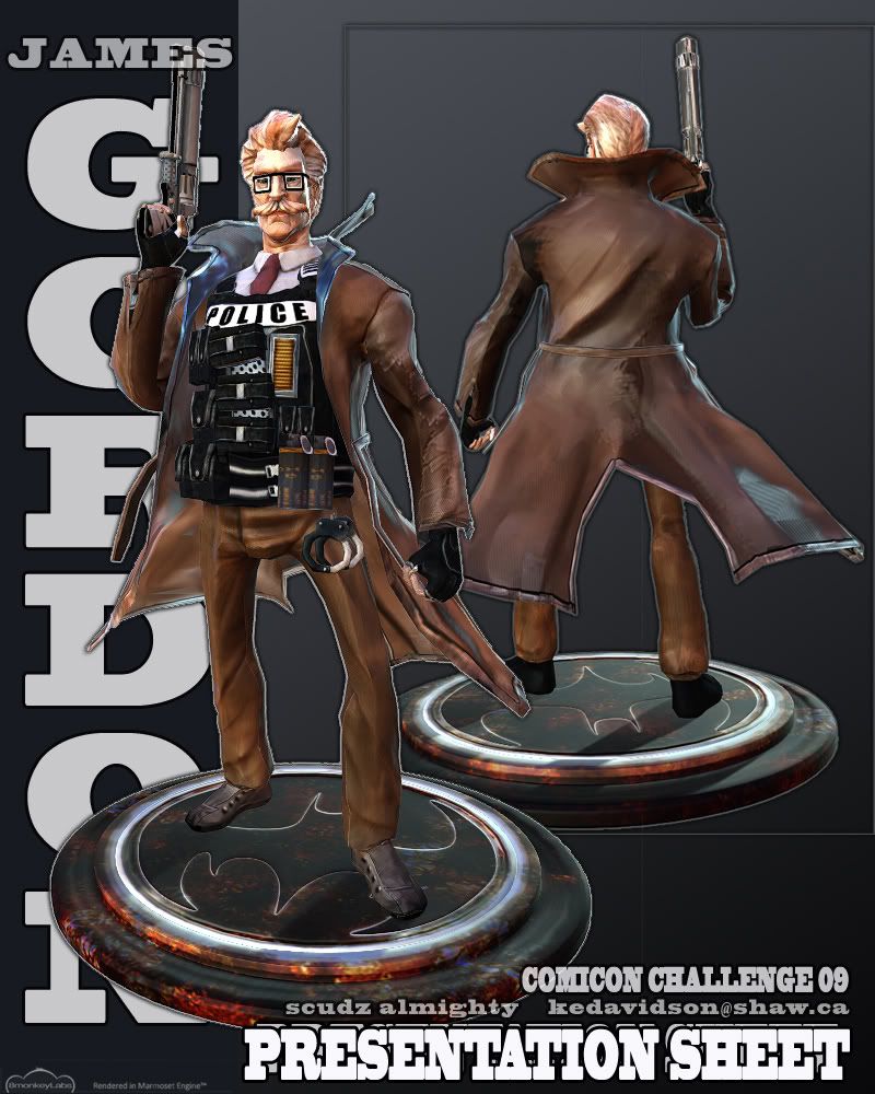
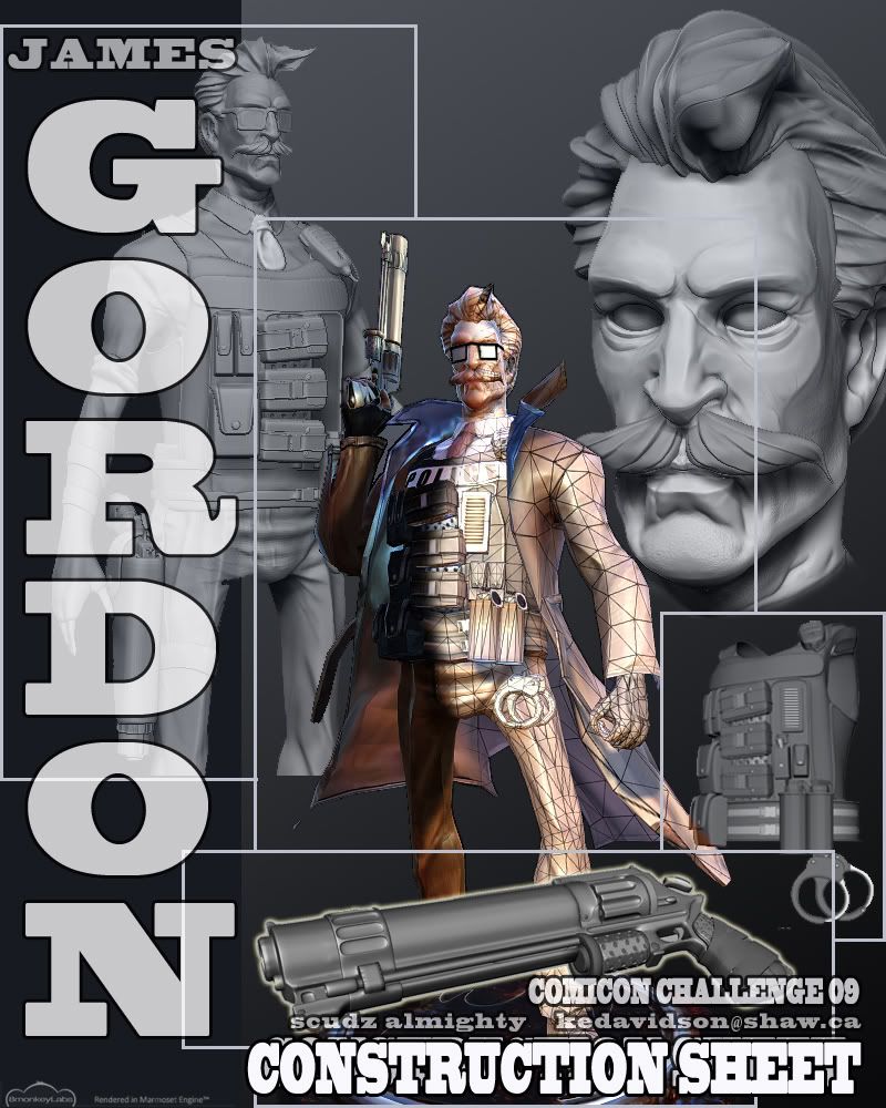
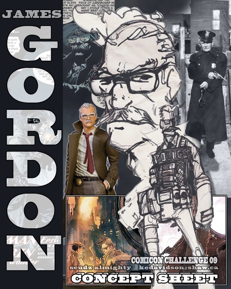
figured it was about time i stopped lurking around here and actually join-up proper. the quality around this place is just rediculous but here's my first measly contribution:
GA.org comicon entry, James Gordon all gear'd up to handle Gotham now that Bats is dead (new bats don't count)


Replies
I love the style of the whole character.
My ony crit is that the crotch area still looks strangly wide to me, but I know its simply design choice you made.
I also think you should include your concept art, because its truly amazing stuff.
Good luck with the judging, I'm sure you will place.
Texture: Super good, but a few seams.
Rig/pose: I agree with Poop, that rig job is killing it. Looks like the spine bones had too much influence over the arms, probably because the arms where modeled so close to the body. 45 degrees!
Brad: add the main concept sheet to the top, the rest can be found in the wip thread,
Poop: wow, been a fan of yours for years and thats how you say hello. ouch, j/k
no, i find rigging incredible frustrating and pretty much try to spend as little time as possible, though you're the first person to mention it:susp:
Vig: thanks man, tried to keep the seams in places where they could be used -around the shoulder, pant legs, etc- but i guess some of em work better than others.
for the rig, is it the way the forearm seem to deform that you guys are seeing? cause it's kinda like that in the sculpt already http://www.gameartisans.org/forums/showpost.php?p=153786&postcount=28.
awesome stylisation, man, nice job!
but what bugs me is this strange jacket shader, where is all that blueish comeing from?