Home 3D Art Showcase & Critiques

deployable turret

polycounter lvl 20
Offline / Send Message
MikeF polycounter lvl 20
Alright, time to get cracking on some animatable pieces for the portfolio
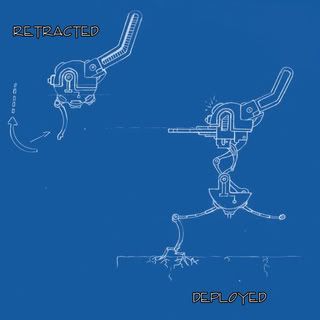
Blueprint-1.jpg

Came up with this idea the other day, starts off as a sphere with ammo clips on the top, toss it and it rights itself upwards and deploys.

I figured i'd throw this concept up to see if anyone notices any glaring problems before i start the front view.
The hinges in the middle that separate the two halves will most likely change in favor of functionality as i begin to model, but this will do for now. Been almost a year since i've done any 2d, so uh be nice heheh (not really, tear it apart for all i care, gotta get better) C&C much appreciated

Replies

  • Shogun3d
    Offline / Send Message
    Shogun3d polycounter lvl 12
    The pieces are all very thin and flimsy looking. I like the idea of a turret sphere, but I think larger forms might read better.
  • MikeF
    Offline / Send Message
    MikeF polycounter lvl 20
    now that you mention it, the legs especially are pretty flimsy, i'l have to rework those. Like i said the hinges in the middle will change, but the other parts are going to have to stay somewhat compact to be able to retract into itself when its in sphere mode. I forgot to ad that in the end i just want this to me a small caliber type thing that a soldier would cary 2 or 3 of in the field, so its going to only be waist high when deployed. Thanks for the crits
  • crazyfingers
    Offline / Send Message
    crazyfingers polycounter lvl 10
    Spherical turret kinda reminds me of the droids from star wars. You might be able to draw some inspiration from these guys.

    My biggest issue with your initial concept is how off center the grounding part is, it's way in front. Unique, but also very odd, as unique stuff tends to go.

    Destroyer.jpg
  • MikeF
    Offline / Send Message
    MikeF polycounter lvl 20
    oh sorry, i should have pointed out that only one leg in pictured there, its a tripod coming from the base. Yeah i started to notice unintentional similarities to the sw droids after i had scaned it in. I'l have to give em' a look, thanks!
  • MikeF
    Offline / Send Message
    MikeF polycounter lvl 20
    alright, been a while since an update here, changed the concept a bit in the legs.
    Blueprint1.jpg

    Then after starting to model i noticed it was looking more and more like a SW destroyer droid so i altered quite a few things.
    side-1.jpg

    front-1.jpg

    My biggest issue is the width of the clips but making them thicker caused some bad clipping issues when they retract into the sphere

    clip.jpg

    Also, i'm using quite a few floaters so if some things look off center or they dont flow well thats why
    Getting close to finishing the HP Comments/Crits Apreciated
  • AlecMoody
    Offline / Send Message
    AlecMoody ngon master
    thats looking really good. How is the front leg going to connect up to the body?
  • jocose
    Offline / Send Message
    jocose polycounter lvl 11
    I love this idea. :) Keep it up I want to see where you take it.
  • MikeF
    Offline / Send Message
    MikeF polycounter lvl 20
    Thanks guys.
    AlecMoody: There's a small panel in the bottom half that retracts and deploy's the front leg which is attached to a few joints connected to the lower half, just cant see it in these shots

    Baking's gonna be a bitch...
  • .Murder
    This is looking really good man, i cant wait to see a low polly + norms, keep up the good work!
  • mathes
    Digging the design. Would be interesting if the lower half of the sphere had a circular bevel on the side that matches the upper half, so it would be one solid circle when closed.
  • dv8ix
    Im not a particular fan of the design. It seems a mix of a Turret from Portal, and a mix of a Droid from Starwars, the droid with the spider legs n the bubble sheild. thing. I just dont understand the mechanics of the turret, let alone the overal design is not fluent. The particular balance seems off as well.. not to say there arnt any real intresting parts to the design. But I think it lacks alot of potential
  • Jojones
  • DrunkShaman
    Offline / Send Message
    DrunkShaman polycounter lvl 14
    Awsome work Mr. MikeF. Thanks for sharing.
Sign In or Register to comment.