The BRAWL² Tournament Challenge has been announced!
It starts May 12, and ends Oct 17. Let's see what you got!
https://polycount.com/discussion/237047/the-brawl²-tournament
It starts May 12, and ends Oct 17. Let's see what you got!
https://polycount.com/discussion/237047/the-brawl²-tournament
Gargoyle [UT3 Char]
I have finished the Gargoyle that I made for the UT3 "The Crucible" mod.
High Poly:

The idea behind is is that a stone structure is under his skin that is pushing against his skin and flesh and also breaking through it at a few places. The wings are more of a stone skeleton which could be used as a weapon because clearly no wings can lift a beast like this in the air.
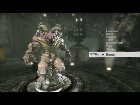
In the Character Selection:

I have also made some fancy material effects. His Skin is pulsating/warping and stone structure is pushing under it against it. The slime, eyes and wings stuff is also warping and slime also drips out of his mouth. It also features a extra effect where the stones are bumping and lots of different horns for customisation.
Can be all seen in this vid:
[ame] http://www.youtube.com/watch?v=07S9pklPqfI[/ame]
Some ingame screenshots:

The Crucible mod participates in the Make Something Unreal Contest, more info about this mod can be found here: http://www.runestorm.com/news.php
The mod is released now:
http://www.beyondunreal.com/view_story.php?id=12939
High Poly:

The idea behind is is that a stone structure is under his skin that is pushing against his skin and flesh and also breaking through it at a few places. The wings are more of a stone skeleton which could be used as a weapon because clearly no wings can lift a beast like this in the air.
In the Character Selection:

I have also made some fancy material effects. His Skin is pulsating/warping and stone structure is pushing under it against it. The slime, eyes and wings stuff is also warping and slime also drips out of his mouth. It also features a extra effect where the stones are bumping and lots of different horns for customisation.
Can be all seen in this vid:
[ame]
 http://www.youtube.com/watch?v=07S9pklPqfI[/ame]
Some ingame screenshots:

The Crucible mod participates in the Make Something Unreal Contest, more info about this mod can be found here: http://www.runestorm.com/news.php
The mod is released now:
http://www.beyondunreal.com/view_story.php?id=12939
Replies
Actually I guess you are just changing different stone pieces in the video. It would be awesome if thy moved :P
@Heart_Murmur
No, I had to rig him to the human rig because otherwise I had to do a huge amount of animations just for him. But it worked fine, also the differnt legs were no big deal. The Necris have a simliar legs structure and also use the Human skeleton btw.
@ torontoanimator
The Stomach is no problem but i had a lot of problem with the stones at his hips. I ended up with a quite a lot of distortion there.
@ Johny
Well, what I wanted for the texture is to have that contrast between the stones/bonestones and the skin/flesh. I have also done a layered colored fresnel effect and slight transmission for the fleshy areas. Except for some slight veins I did not much detailing for the skin in the diffuse because I thought it would be already busy enough with all the stretching skin and warping effect. The bloody stuff is violet because I wanted the thing that powers him to look unatural more magicly like. The yellowish is just there to get more contrast to the other body parts and make the whole thing easier to read.
@ stoofoo
There are already more variations for customisation planed. I guess i will do one that that has huge contrast in color and material and a different color scheme.
@ commander_keen
Its only in the Crucible mod that participates in the MSUC. There is no best character category this time around.
Yea, 2 layers of more rising stone pieces that only get randomly masked. Its all just material effects. :P
http://www.beyondunreal.com/view_story.php?id=12939
I will do a second version later on that sells that difference better.
If you want to give the texture another pass of course feel free, but I think what you have here is really strong, once it is ingame. Which is the only thing that matters.
That drooling stuff is extremley like claymation.
Was that intended?
@ LoM Chaos
the drooling stuff should look like the structure under his skin is moveing