The BRAWL² Tournament Challenge has been announced!
It starts May 12, and ends Oct 17. Let's see what you got!
https://polycount.com/discussion/237047/the-brawl²-tournament
It starts May 12, and ends Oct 17. Let's see what you got!
https://polycount.com/discussion/237047/the-brawl²-tournament
Mr. Smiles
Hello all, this is my first post here. Or on any forum really for that matter. 
My name is Brice Anderson and I am a Game Art and Design senior at The Art Institute of Portland. I graduate this December so I decided that it was past time for me to try to get my name out in the real world. I love creating 2D concepts, 3D modeling, and 3D animation all equally, but I feel I am strongest in my animation followed closely by modeling. My 2D abilities need a lot more work.
Mr. Smiles:
This character is the project that is going to be the main piece of my portfolio. The character himself has been floating around in my head for about a year now, and has undergone extreme changes through out his concept creation. I am going to do a finished 2D render, model, unwrap, texture, normal map(zbrush sculpt), and final fight animation using this character over the next couple months.
The main reason for me posting this is for feedback and input, so please tell me what you think and how I can improve! =D
So far i have my rough concepts and turn around as well as an almost finished model. When complete he should be around 15k triangles. He is not supposed to be a very low poly game model, I am more focused on getting enough geometry to support very smooth deformations for my animation.
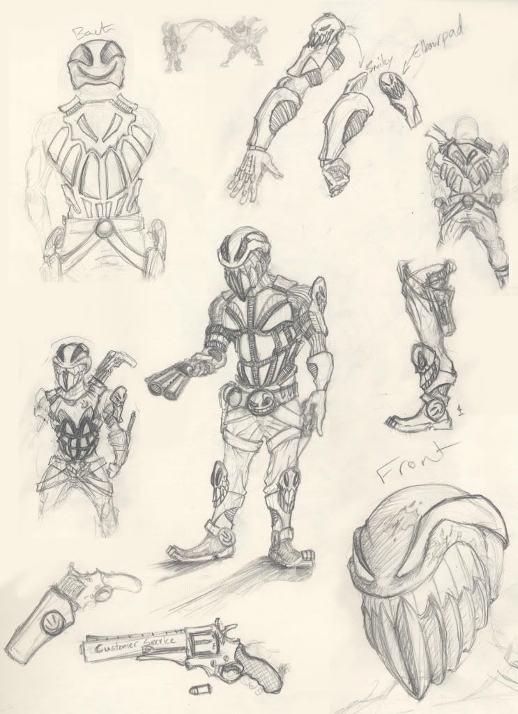
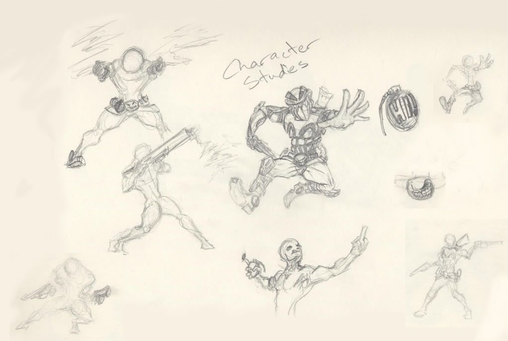
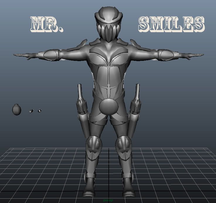

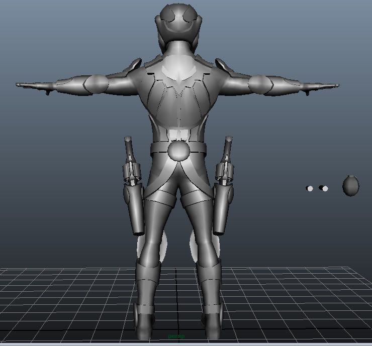
Tell me what you think!
My name is Brice Anderson and I am a Game Art and Design senior at The Art Institute of Portland. I graduate this December so I decided that it was past time for me to try to get my name out in the real world. I love creating 2D concepts, 3D modeling, and 3D animation all equally, but I feel I am strongest in my animation followed closely by modeling. My 2D abilities need a lot more work.
Mr. Smiles:
This character is the project that is going to be the main piece of my portfolio. The character himself has been floating around in my head for about a year now, and has undergone extreme changes through out his concept creation. I am going to do a finished 2D render, model, unwrap, texture, normal map(zbrush sculpt), and final fight animation using this character over the next couple months.
The main reason for me posting this is for feedback and input, so please tell me what you think and how I can improve! =D
So far i have my rough concepts and turn around as well as an almost finished model. When complete he should be around 15k triangles. He is not supposed to be a very low poly game model, I am more focused on getting enough geometry to support very smooth deformations for my animation.


Tell me what you think!
Replies
First thing I'm going to say again, is the helmet. One thing you could try to do to reduce its size is by narrowing the trapezius muscles. The neck is so broad when it goes into the helmet it doesn't seem to be realistic in proportion.
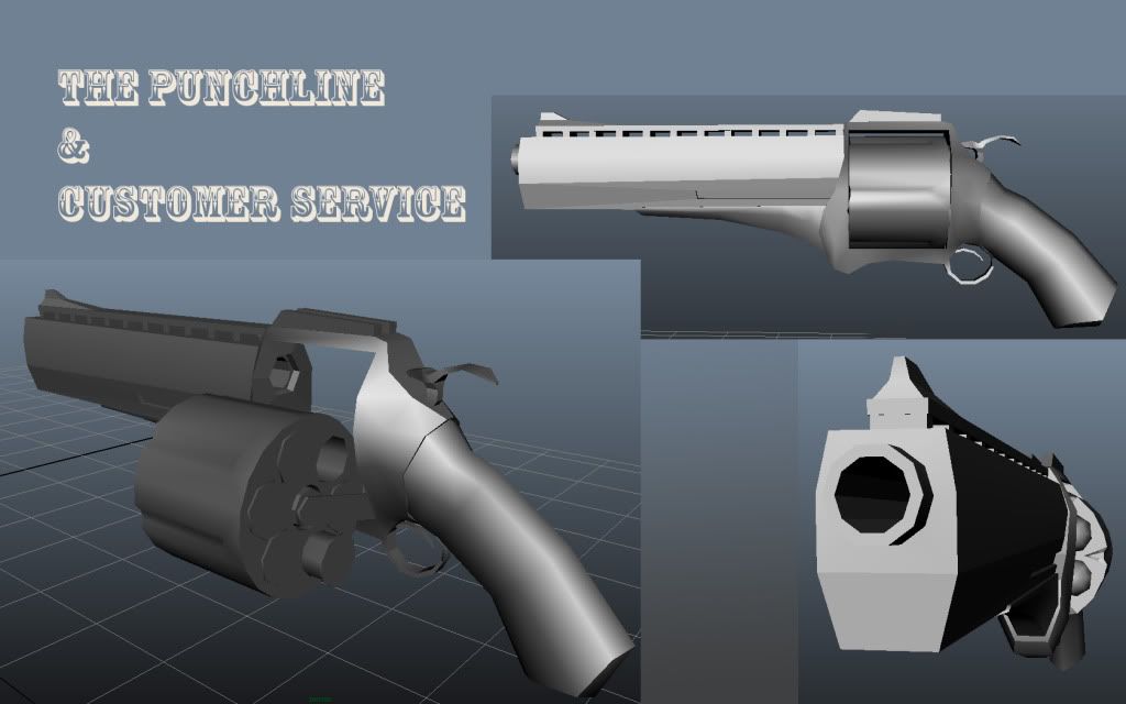
The second thing is I would increase the detail of the barrell, chamber exit, bottom of the handle, and hammer of the gun. Those are key areas that feel like they're way too low poly. The bottom of the handle is the worst part by far.
I've said a lot so I'll leave it to a few others to try and help you out
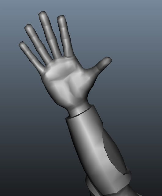
The hips area and legs in general are looking a little thin to me. Great job on the hands though. Looking forward to seeing it textured
The only thing that sticks out to me at the moment is the length of the legs.
It's coming together nicely
Next step for me is creating the to smooth version for the hard surface armor details in maya which i will import into zbrush for my normal sculpt.
Here is a quick idea sketch for an action shot i could bring to a finished painting. Please tell me what you think! Thanks.
I go the critique that the arched back looks somewhat feminine so i did a few others.
This one is a quirky pose which i think probably fits the character the best but probably doesn't translate very well.
Please tell me which you think works best, or if you have an idea that i could try! =D
How about something like this?
-So, the story is he is jumping just out of an explosion over one of those cement barricades in some street or something, with smoke tendrils streaming off of him, drawing his guns. I like this one, what do you think?
This is very rare in the case of the front of the pants. Your character is wearing some pretty tight pants so he should have very very few wrinkles in front.
You should also sculpt more wrinkles at the sides of the legs at the knees. Since knees are a protruding surface, they cause several wrinkles to spread out in a half sunshine fashion along the sides.
And the easiest thing for you to change.... when you take screenshots, turn off the gradient in the viewport. It looks very ugly for presentation's sake when you keep the gradient on.
You can do that by going to Document > Range. Grab that little slider and move it all the way to the left (to zero).
Keep it up!
First, my friend Royal Sybrant who also goes to the art institute of portland with me is doing the entire rig for my mr.smiles character. Here is just a quick screen grab of what he has done so far, but it looks sick and fancy. With blends to different parent constraints between hands, holsters, belts, grenades, and all kinds of coolness. I cannot WAIT to animate with this thing.
Secondly, for a quick scenario i just drew up an idea on some of my brakes at work and then scanned it in, built a quick model with one piece of each thing duplicated over after being quickly unwrapped, and sent it to another friend of mine who specializes in texturing. Gabriella Suseno who is also a classmate of mine is doing all the textures and probably lighting for my scene.
Here is the quick sketch i did.
And here is what Gabriella has already done so far. This is just after a day work in progress. She plans on making the pillars have more then the measly one shared texture space i gave them. I love it so far.
I dented up his shin and forearm gear to hopefully look like he has been using them to block with.
Tell me what you think!
I think that they were over sculpted and too "fleshy" looking. So, i revisited it and came out with a much simpler design which i think works better. Please tell me what you think!!
As well as working on my portfolio and everything that graduation entails, I landed an internship AND contract work at a 3D animation studio in Oregon city. I worked there a lot, and it was awesome!
So, here are some Mr. Smiles beauty renders and... AND
THE FINISHED ANIMATION!
Please feel free to look at my portfolio site and ALL input is welcome!
www.briceanderson.com
ANIMATION LINK
http://www.briceanderson.com/movies/FightAniQT/FightAnimationQuickTime02.mov
ANIMATION LINK