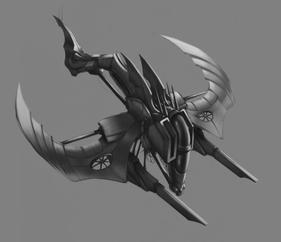
Exitosus - sci fi ship concept WIP
I finished working on this for tonight. I'm just looking for feedback on what people feel should be adjusted. I'm trying to go for a "brushed metal" look.
I understand there is a bit of a perspective issue with the back wing, so that's the only thing I'm not interested in hearing (I've tried adjusting it a thousand times).
Anything else goes! I also put up a thread in General asking about image quality. Please tell me if this image appears to be very noticeably poor in quality so I know to save my images at higher settings.


Replies
As for the material I think u did a pretty nice job, but I cant paint worth shit so dont let me be the judge
Nice work tho dude, looks like it would be fun to model. Keep it up!
Typically siege units in games are very slow and have high defense but I wanted to create a unit that would be quick and agile with siege capabilities.
beartraps, you are correct in the flimsy design. In exchange for the ability to be agile as a siege unit, its sacrifice would be defense. The bars you see everywhere are what I designed to be shock absorbers from the massive blast from the cannons... so in a sense the ship would compress when it fires to eliminate a self-damaging attack.
As for a method of travel, the propellers were designed for extra stability from the heavy load of the cannons rather than its primary source of propulsion.
As for additional critiques, can anyone try to spot lighting/shadowing issues they may see?